Automated Data Plotter
This application dynamically generates many types of graphs derived from various IEM data sources. Feel free to use these generated graphics in whatever way you wish.
1 Select a Chart Type
Visual Overview of All Autoplots
Below you will find an example resulting image from each of the autoplots available. Click on the image or title to navigate to that autoplot. These are grouped into sections as they also appear grouped in the dropdown selection box above.
Trending Autoplots over Past 6 Hours
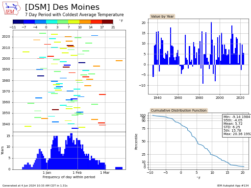
Daily
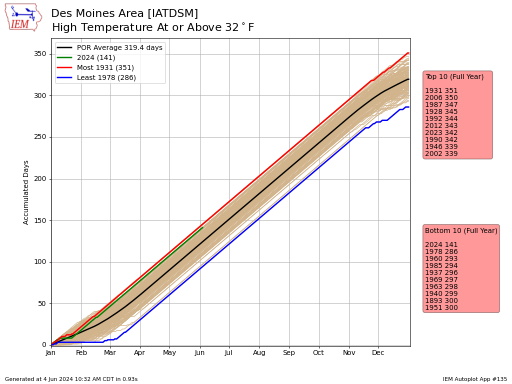
#51. Accumulated Station Departures of Precip/GDD/SDD (Automated Stations)
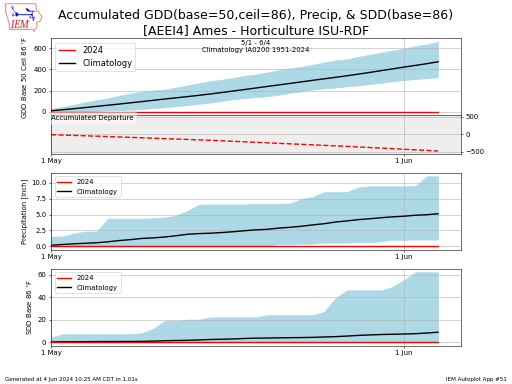
This plot presents accumulated totals and departures of growing degree days, precipitation and stress degree days. Leap days are not considered for this plot. The light blue area represents the
#108. Accumulated Station Departures of Precip/GDD/SDD (Long Term Climate)
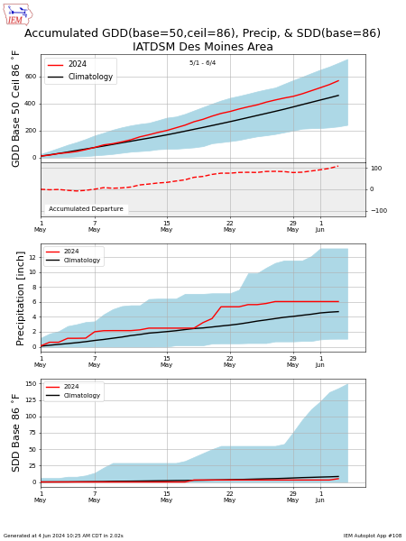
This plot presents accumulated totals and departures of growing degree days (GDD), precipitation and stress degree days (SDD). Leap days are not considered for this plot. The light blue area
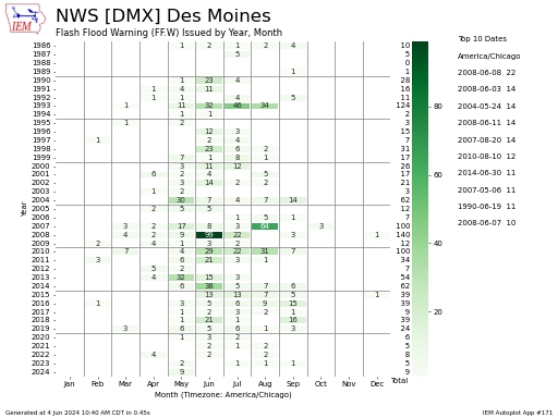
#172. Accumulated Year to Date / Period Precip / Snowfall
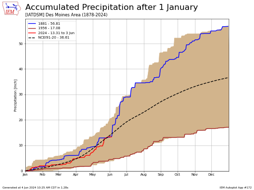
This chart presents year to date accumulated precipitation for a station of your choice. The year with the highest and lowest accumulation is shown along with the envelop of observations
#149. Aridity Index (High Temperature minus Precip Departures)
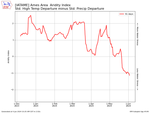
This plot presents a time series of Aridity Index. This index computes the standardized high temperature departure subtracted by the standardized precipitation departure. For the purposes of this plot, this
#11. ASOS Daily Min/Max Dew Point/Temp/Feels Like/RH for a Year
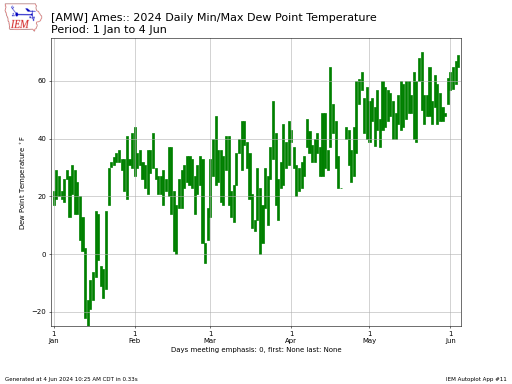
This plot presents the range between the min and maximum observation of your choice for a given station and a given year. Some of these values are only computed based
#94. Bias of 24 Hour High+Low Computation by Hour
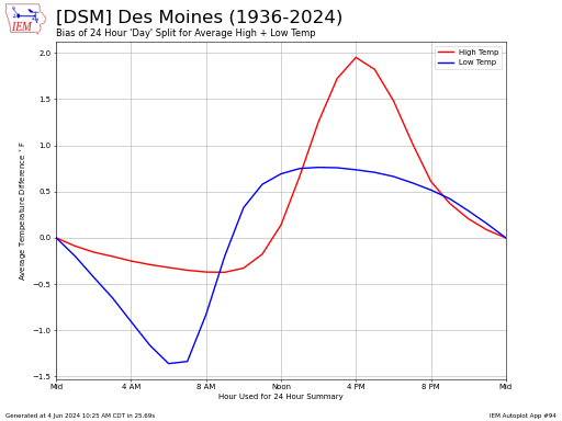
This plot looks at the effect of splitting a 24 hour period at different hours of the day. Using the hourly temperature record, we can look at the bias of
#96. Bias of 24 Hour Precip Computation by Hour
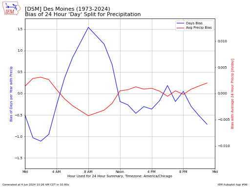
This plot looks at the bias associated with computing 24 hour precipitation totals using a given hour of the day as the delimiter. This plot will take a number of
#82. Calendar of Daily Observations from Automated or Climate Sites
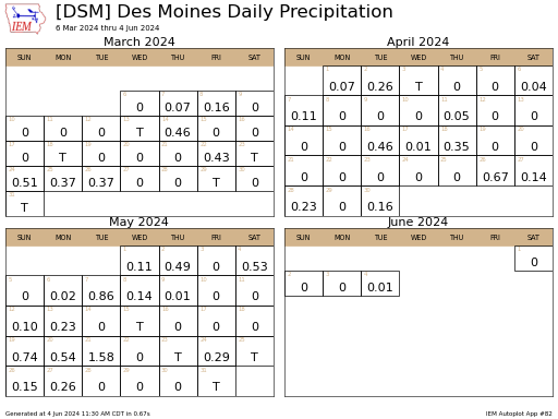
This chart presents a series of daily summary data as a calendar. The daily totals should be valid for the local day of the weather station. The climatology is based
#218. Daily NWS CLImate Report Infographic
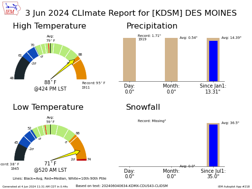
This produces an infographic with some of the information found presented in NWS CLI reports. The high and low temperature gauges contain some extra statistical information based on the period
#180. Daily Temperature/Precip/Snowfall Climatology
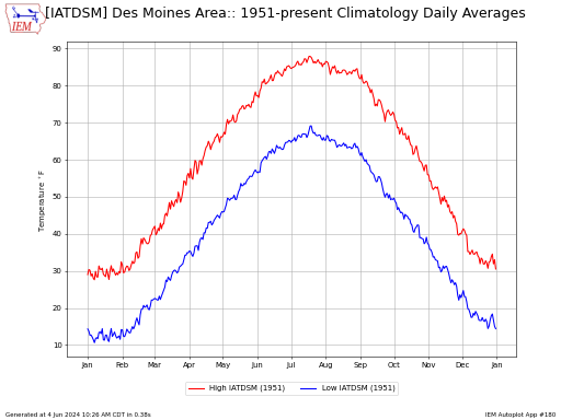
This application plots daily climatology for a location or two of your choice. You can pick which climatology to use and effectively build a difference plot when picking the same
#32. Daily Departures / Percentiles / Ranges for One Year
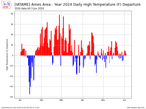
This plot presents a daily time series of variable of your choice. The average temperature is simply the average of the daily high and low. The daily climatology is simply
#21. Change in NCEI 1991-2020 Daily Climatology over X Days
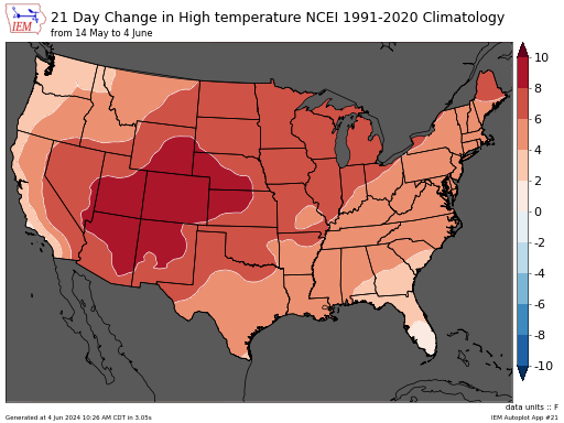
This autoplot intends to show the spatial distribution of the change in temperature or precipitation climatology over a given period of days. The climatology is based on the 1991-2020 period
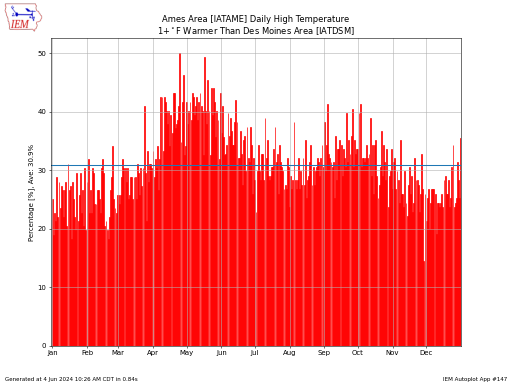
#174. Compare Daily High/Low Temps for ASOS Stations
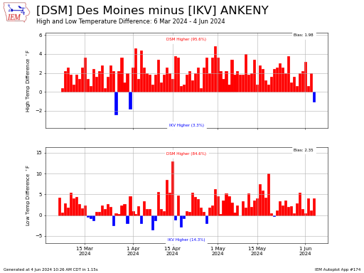
This application generates a comparison of daily high and low temperatures between two automated ASOS sites of your choosing.
#215. Compare Daily High/Low Temps Distributions over Two Periods of Years
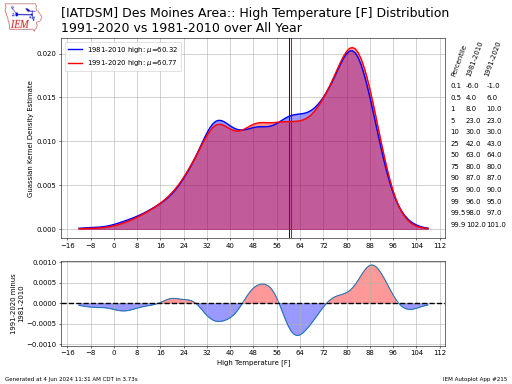
This autoplot generates some metrics on the distribution of temps over a given period of years. The plotted distribution in the upper panel is using a guassian kernel density estimate.
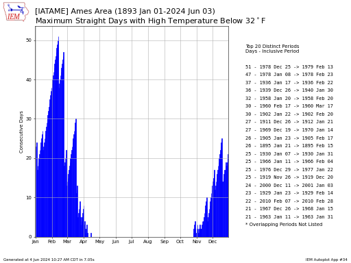
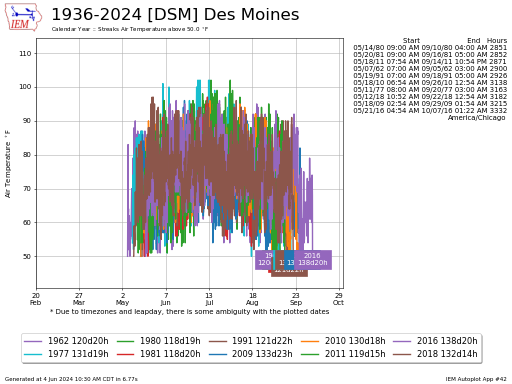
#91. Consecutive Day Statistics of High+Low Temps / Precip
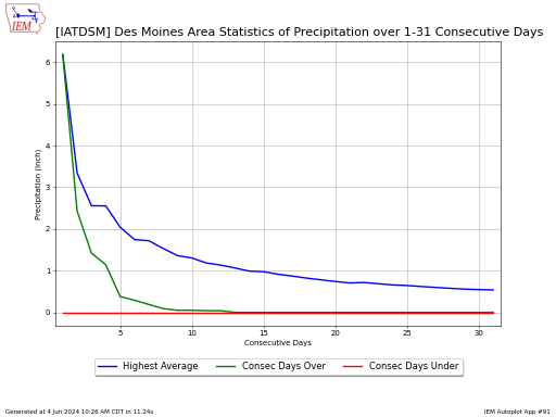
This plot produces statistics on min, max, and average values of a variable over a window of days. The labels get a bit confusing, but we are looking for previous
#66. Consecutive Days Frequency by DOY for High/Low/Precip Above/Below Threshold
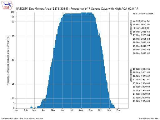
This chart presents the daily frequency of the given date having the prescribed number of previous days above or below some provided treshold. Autoplot 216 provides actual streaks and
#216. Consecutive Days by Year with Daily Summary Variable Above/Below Threshold
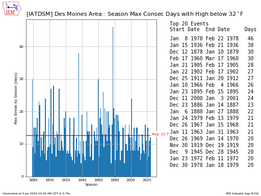
This chart presents the longest daily streaks of having some threshold meet. This tool presents a number of variables that may not be observed by your station or network. If
#9. Cooling/Growing/Heating/Stress Degree Day Daily Values and Climatology
This chart produces the daily climatology of Degree Days for a location of your choice. Please note that Feb 29 is not considered for this analysis.
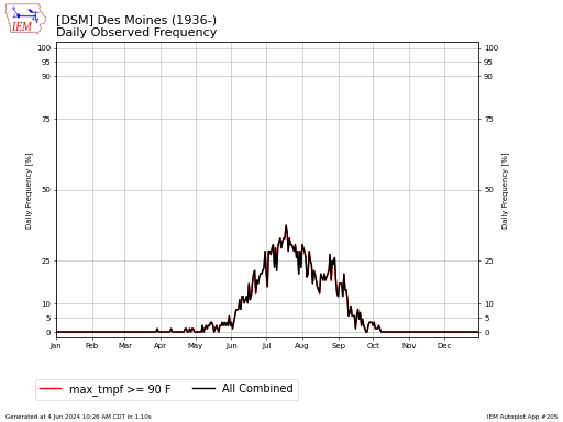
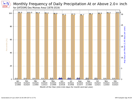
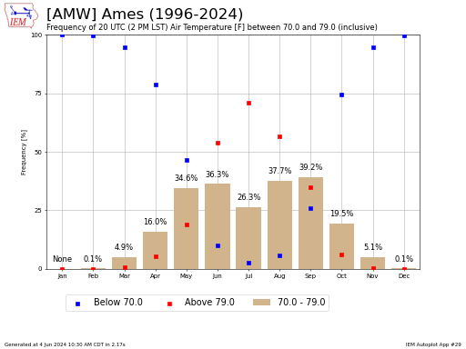
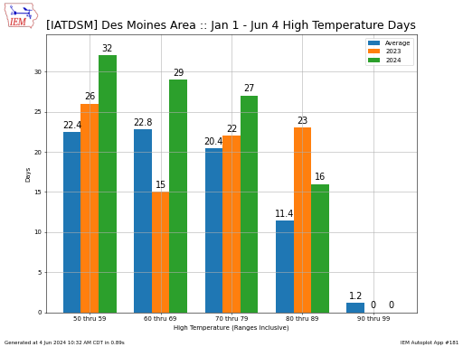
#49. Daily/Multi-Day Frequency of Some Threshold/Range (snow, precip, temps)
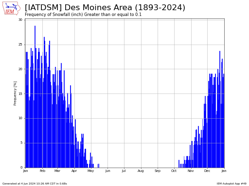
This plot presents the observed frequency of some daily event happening. Leap day (Feb 29th) is excluded from the analysis. If you download the data from this application, a placeholder
#113. Daily Climatology
Presents the simple daily climatology as computed by period of record data. If you select a start date that is later than the end date, the plot will wrap over
#176. Daily/Monthly/Yearly Records Beat Margin
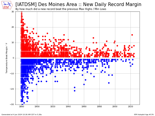
This chart shows the margin by which a new daily high and low temperatures record beat the previously set record. Ties are not presented on this plot.
#5. Daily Records for each month of year
This plot displays the dates with the monthly record of your choice displayed. In the case of ties, only the most recent occurence is shown.
#31. Extreme Jumps or Dips in High/Low Temperature over X days
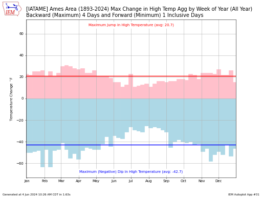
This chart attempts to assess by now much the high temperature can change between two or three periods of time. These periods are defined by the consecutive number of days
#147. Frequency of One Station Warmer/Wetter than Another
This plot presents the daily frequency of the first station having a higher value than the second station.
#205. Frequency of Daily Summary Variables for Automated Stations
The IEM computes daily summaries of ASOS station data based on available station summaries and computed summaries based on available hourly data. This chart presents the frequency combination of one
#252. Frequency of Daily Variable Above/Below Threshold over period of days (map)
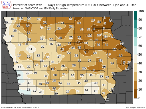
This autoplot generates a map of the frequency of having at least one day at-or-above or below a given threshold between an inclusive period of days. If you set the
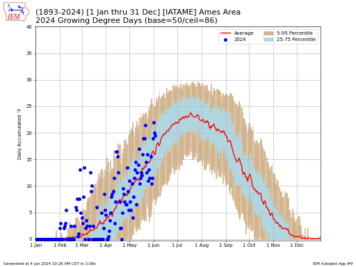
#7. Growing Degree Day Periods for One Year by Planting Date
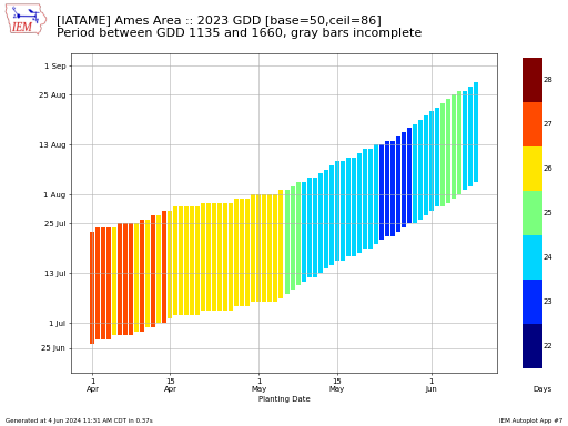
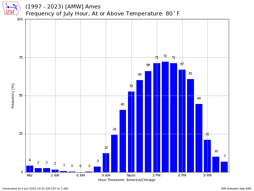
This plot presents the period over which growing degree days were accumulated between the two thresholds provided by the user. The colors represent the number of days for the period
#240. Growing Degree Day Obs + Near Term Forecast
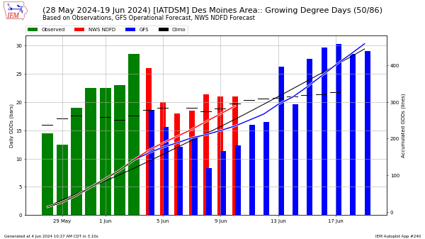
This autoplot combines growing degree day observations along with a near term forecast from the deterministic GFS and NWS NDFD models. The primary source of observations for this plot is
#204. Heatmap of Daily / Trailing Daily Temperature / Precip
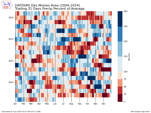
This app generates a heatmap-like presentation of daily climate data of your choice. In the case of 'Trailing XX Days', you will want to set a trailing number of days
#225. Heatmap of Distribution of Trailing Departures
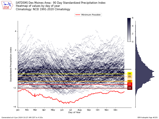
Departure from climatology metrics have an annual signal that is a function of the climatology. This plot shows the distribution of departure values. SPI is the standardized precipitation index. This
#61. High/Low Temp above/below avg OR dry streaks by NWS CLI Sites
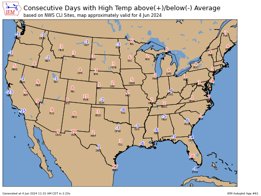
This plot presents the current streak of days with a high or low temperature above or at-below the daily average temperature. You can also plot the number of days since
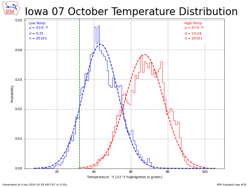
#19. Histogram (weathergami) of Daily High/Low Temps + Ranges
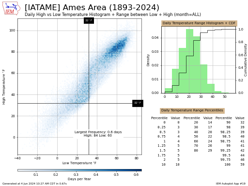
This chart displays a histogram of daily high and low temperatures for a station of your choice. If you optionally choose to overlay a given year's data and select winter,
#35. Histogram of X Hour Temp/RH/Dew/Pressure Changes
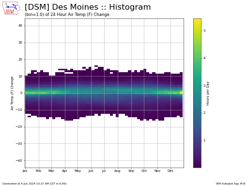
This plot presents a histogram of the change in some observed variable over a given number of hours. The histogram is constructed by computing the 99.9th percentile of the absolute
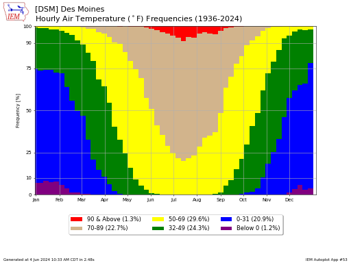
#60. Hourly Variable Frequencies/Min/Max by Week of Year
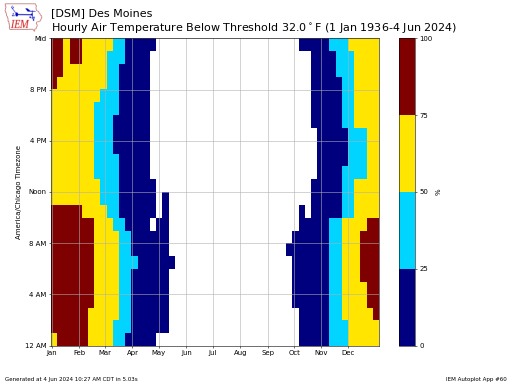
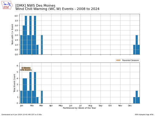
This plot presents hourly variable metrics from automated stations. Values are partitioned by week of the year to smooth out some of the day to day variation. Updated 28 Jun
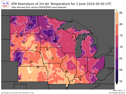
#86. IEMRE Daily Reanalysis Plots
This map presents a daily IEM ReAnalysis variable of your choice. The concept of a day within this dataset is a period between 6 UTC to 6 UTC, which
#249. IEMRE Hourly Reanalysis Plots
This map presents an hourly IEM ReAnalysis variable of your choice. Autoplot 86 is the daily variant of this plot.
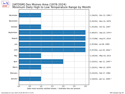
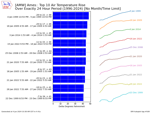
#139. Largest / Smallest Local Calendar Day Temperature Differences
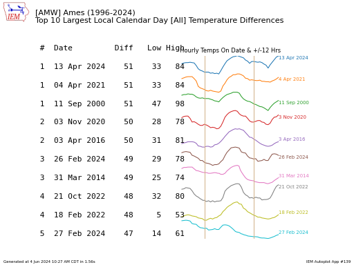
This table presents the 10 largest or smallest differences between the lowest and highest air temperature for a local calendar day. Some stations have auxillary products that provide 'daily' values
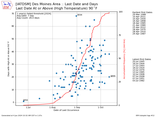
#168. Latest Date of Year for High Temperature
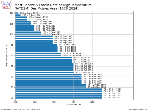
This chart presents the last date of fall or first date of spring that a given temperature threshold was last or first reached. Note that leap day creates some ambiguity
#229. Lightning Stroke Density Maps
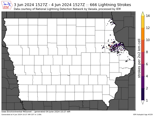
This data is courtesy of Vaisala NLDN. The IEM processes a data stream by NLDN to construct this heatmap. The stroke density is computed over a two by two
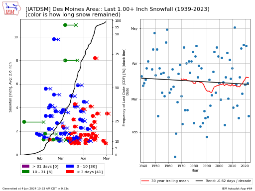
#207. Local Storm Report + COOP Snowfall Analysis Maps
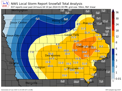
Generates an analysis map of snowfall or freezing rain data based on NWS Local Storm Reports, NWS COOP Data, and CoCoRaHS. This autoplot presents a number of tunables including:
#206. Map of Daily Automated Station Summaries
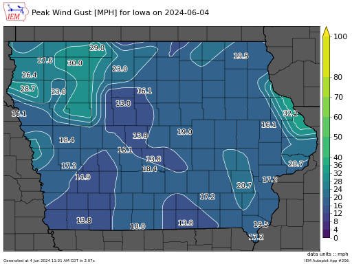
Generates analysis maps of ASOS station data for a given date.
#97. Map of Departures/Stats over One Period of Days
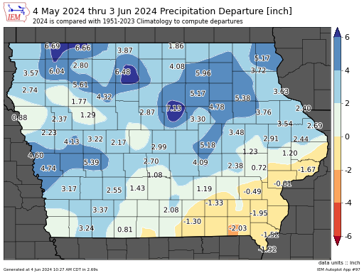
This application plots an analysis of station data for a period of your choice. Spatially aggregated values like those for climate districts and statewide averages are not included. The IEM
#34. Max Stretch of Days with High/Low Above/Below Threshold or Climatology
This plot displays the maximum number of consec days above or below some threshold for high or low temperature.
#26. Min Daily Low after 1 July / Max Daily High for year
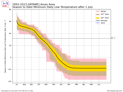
This plot presents the climatology and actual year's progression of warmest to date or coldest to date temperature. The simple average is presented along with the percentile intervals. When plotting
#126. Mixing Ratio / Vapor Pressure Deficit Climatology and Yearly Timeseries Plot
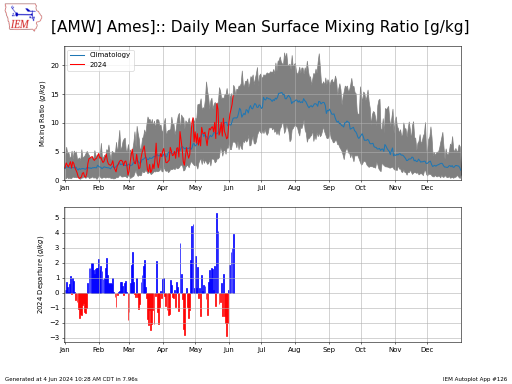
This plot presents one of two metrics indicating daily humidity levels as reported by a surface weather station. The first being mixing ratio, which is a measure of the amount
#84. MRMS / PRISM / Stage IV / IFC / IEM Reanalysis Estimated Precip (multiday summaries/departures)
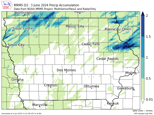
This application generates maps of precipitation daily or multi-day totals. There are currently three backend data sources made available to this plotting application: IEM Reanalysis A crude
#185. Number of Days to Accumulate an Amount of Precip (MRMS)
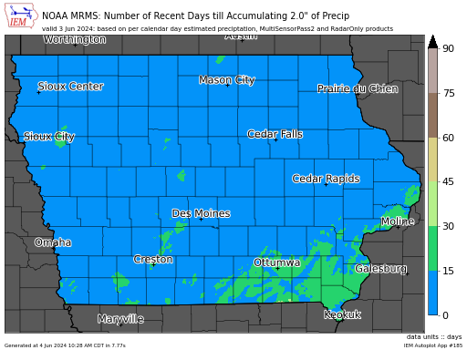
This application will make a map with the number of days it takes to accumulate a given amount of precipitation. This is based on progressing daily back in time for
#164. Percentage of NWS CLI Sites Reporting Daily Above/Below Temps or Precip/Snow
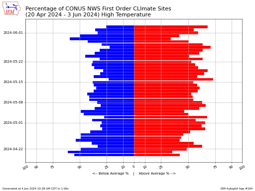
This chart presents a simple accounting of the percentage of first order NWS climate sites that are either above or below average or reporting precipitation / snow each day. Note
#22. Percentage of Years within Temperature Range from Averages
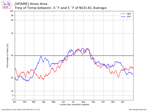
This plot displays the frequency of a daily high or low temperature being within a certain bounds of the long term NCEI climatology for the location.
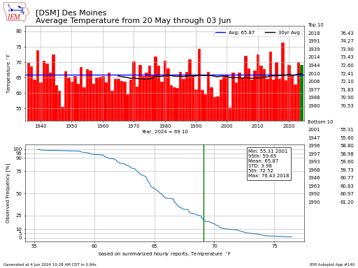
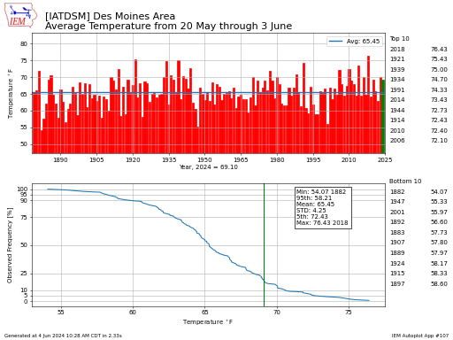
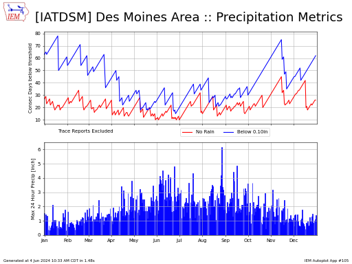
#83. Period Averages or Totals of X days around a given day of the year
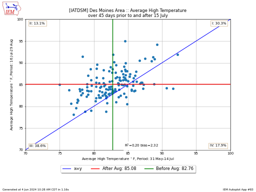
This plot compares a period of days prior to a specified date to the same number of days after a date. The specified date is not used in either statistical
#140. Period Statistics of Temp/Precip/Wind for a date period each year [ASOS/Automated Stations]
This plot presents statistics for a period of days each year provided your start date and number of days after that date. If your period crosses a year bounds, the
#107. Period Statistics of Temp/Precip for a date period each year [COOP/Climate Sites]
This plot presents aggregate statistics by year for a date period of your choice. You can either set an explicit date period or make the end date based on the
#182. Precip (MRMS) Coverage Efficiency by State
This application attempts to assess the effectiveness of a calendar day's rainfall based on where the rain fell in relation to a previous period of days departure from climatology. So
#110. Precip Frequency Bins by Climate Week (climodat)
This plot presents the weekly percentage of precipitation events within a given rainfall bin.
#241. Real-Time Mesoscale Analysis (RTMA) Max/Min Air Temperature
NCEP's Real-Time Mesoscale Analysis (RTMA) provides a fine scale hourly or in the case of the RTMA Rapid-Update (RTMA-RU), 15 minute interval analysis of a number of atmospheric variables. The
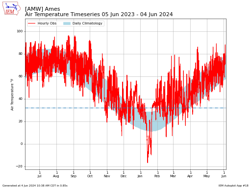
#43. Recent (Past 2-3 Days) Timeseries (Meteogram)
This plot presents a time series of observations. Please note the colors and axes labels used to denote which variable is which in the combination plots.
#157. Relative Humidity, Feels Like, Dew Point Climatology by Day of Year
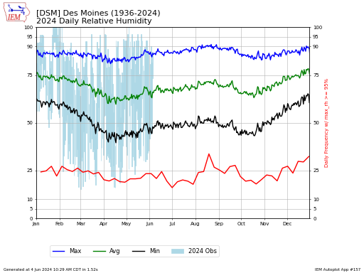
Based on available hourly or better observations, the IEM computes local calendar day statistics for variables like relative humidity, dew point, and feels like (read: windchill or heat index) temperature.
#62. Snow Depth
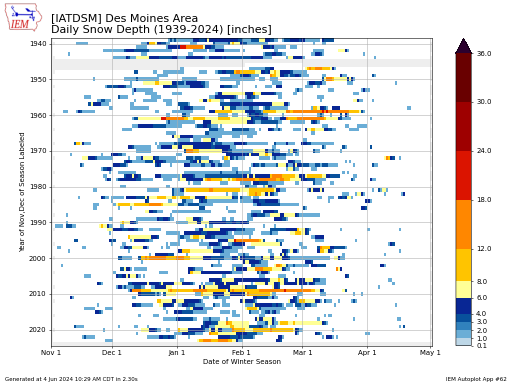
This chart presents the daily snow depth reports as a image. Each box represents an individual day's report with the color denoting the amount. Values in light gray are missing
#199. ISU Soil Moisture Network Daily Plots
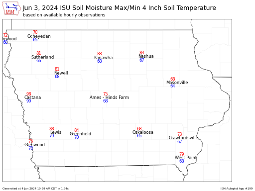
This application generates maps of daily ISU Soil Moisture Network Data.
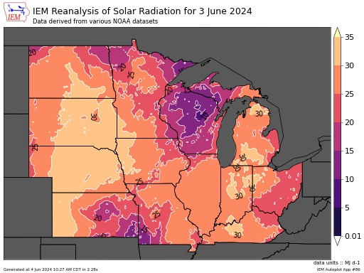
#38. Solar Radiation Estimates ERA5Land, HRRR, MERRAv2, NARR
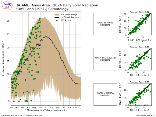
This plot presents daily estimates of solar radiation for a given year for the 'climodat' stations tracked by the IEM. These stations only report temperature, precipitation, and snowfall, but many
#25. Spread of Daily High and Low Temperatures
This plot displays the distribution of observed daily high and low temperatures for a given day and given state or station. The dataset is fit with a simple normal distribution
#137. Start Date of Spring/Fall with Statistics
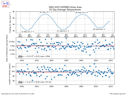
This plot displays some metrics about the start date and duration of the spring or fall season. The definition of the season being the period between the coldest 91 day
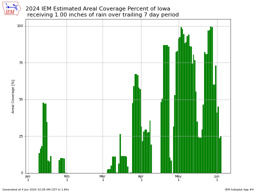
#4. State Areal Coverage of Precip Intensity over X Days
Using the gridded IEM ReAnalysis of daily precipitation. This chart presents the areal coverage of some trailing number of days precipitation for a state of your choice. This application does
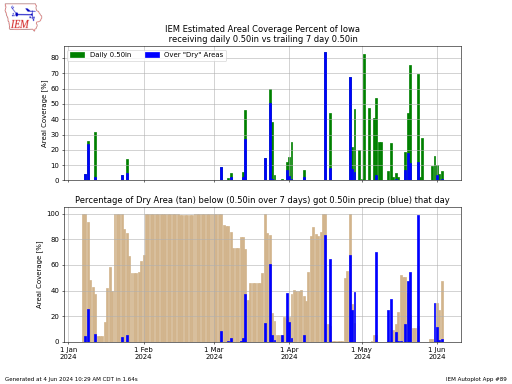
#89. State Areal Coverage/Efficiency of Precip
This is a complex plot to describe! For each 24 hour period (roughly ending 7 AM), the IEM computes a gridded precipitation estimate. This chart displays the daily coverage of
#81. Standard Deviation of Daily Temperatures
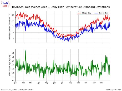
This chart presents two measures of temperature variability. The first is the standard deviation of the period of record for a given day of the year. The second is the
#28. Trailing Number of Days Precip Total Rank
This plot presents trailing day precipitation metrics. Each point on the x-axis represents a period from that date to the right-most date on the plot. There are five options for
#228. Trailing Standardized Precip (SPI) + Drought Monitor
This visualization mashes up the US Drought Monitor and three trailing day standardized precipitation index of your choice within a map presentation for a single state. SPI is computed by
#142. Trailing X Number of Days Temp/Precip Departures
This plot presents the trailing X number of days temperature or precipitation departure from long term average. You can express this departure either in Absolute Departure or as a Standard
#132. Top 10 Precip/Temperature Values by Month/Season
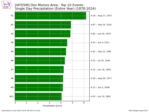
This plot displays the top ten events for a given site and period of your choice. Here is a description of the labels shown in the 'Which Metric to Summarize'
#190. Year of Daily High/Low Temperature Record
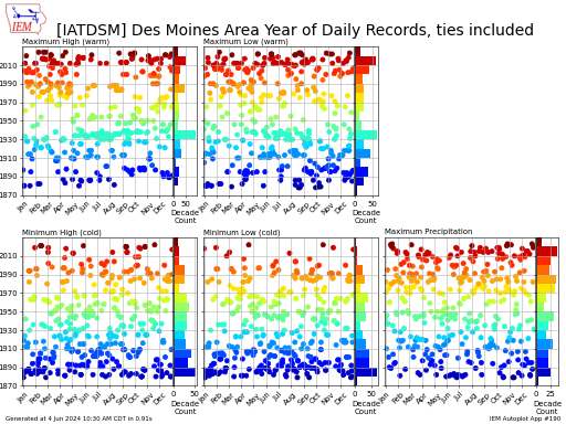
This chart presents the year that the present day climatology record resides.
Monthly
#130. Average High/Low Temperature with/without Snowcover
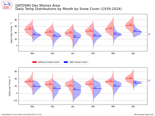
This chart presents violin plots of the distribution of daily high and low temperatures on dates with and without snow cover by month. A given month is plotted when at
#125. Climatological Maps of Period Averages
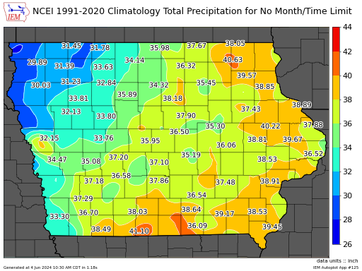
This application produces map analysis of climatological averages. The IEM maintains a number of different climatologies based on period of record and source. If you pick the NCEI Climatology, only
#1. Comparison of Multi-Month Totals/Averages
This app allows the arbitrary comparison of months against other months. When the period of months wraps around a new year, the app attempts to keep this situation straight with
#55. Daily Climatology Comparison
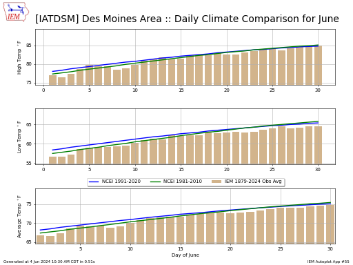
This plot displays a comparison of various daily temperature climatologies. The National Center for Environmental Information (NCEI) releases a 30 year climatology every ten years. This data is smoothed to
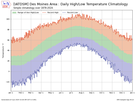
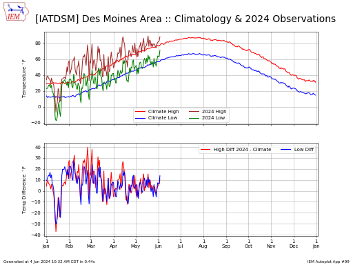
#17. Daily High/Low Temps or Precip with Climatology
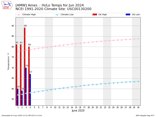
Daily plot of observed high and low temperatures or precipitation along with the daily climatology for the nearest (sometimes same) location. The vertical highlighted stripes on the plot are just
#129. Daily Observation Percentiles/Frequencies by Month
This chart plots the monthly percentiles that a given daily value has. For example, where would a daily 2 inch precipitation rank for each month of the year. Having a
#15. Daily Temperature Change Frequencies by Month
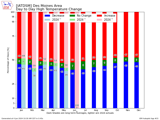
This plot displays the directional frequency of day to day changes in high or low temperature summarized by month.
#98. Day of Month Frequency of meeting temp/precip threshold
This plot produces the daily frequency of a given criterion being meet for a station and month of your choice. The number labeled above each bar is the actual number
#65. Day of the Month with the coldest/warmest temperature
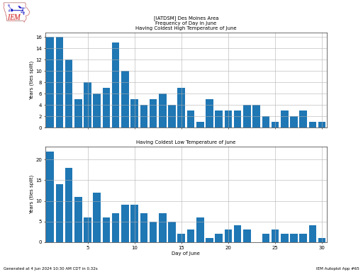
This plot displays the frequency of a given day in the month having the coldest high or low temperature of that month for a year.
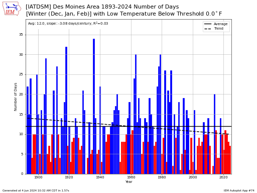
#161. Days per month/season above/below some threshold
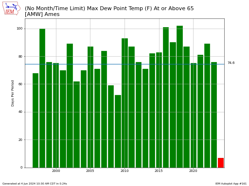
This application plots the number of days for a given month or period of months that a given variable was above or below some threshold.
#29. Frequency of Hourly Variable within Range by Month
This plot presents the frequency of a given hourly variable being between two inclusive thresholds. The hour is specified in UTC (Coordinated Universal Time) and observations are rounded forward in
#116. Cooling/Heating Degree Days monthly totals
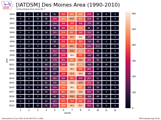
This chart presents monthly cooling degree days or heating degree days for a 20 year period of your choice. The 20 year limit is for plot usability only, the data
#42. Consecutive Hours / Streaks Above/Below Threshold
Based on hourly or better METAR reports, this plot displays the longest periods above or below a given temperature threshold. There are plenty of caveats to this plot, including missing
#154. Hourly Temperature Averages by Month
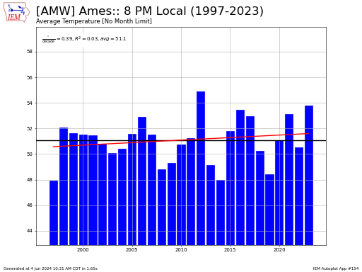
This chart presents an average hourly value for a given month or season over the years covering the period of record for the site. For the year to plot, at
#85. Hourly Frequencies / Last Occurence by Month
Based on IEM archives of METAR reports, this application produces the hourly frequency of a temperature at or above or below a temperature thresold. This application tries to only consider
#20. Hours of Precip by Month
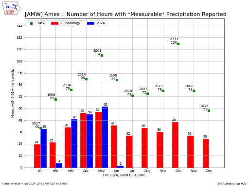
This chart displays the number of hourly observations each month that reported measurable precipitation. Sites are able to report trace amounts, but those reports are not considered in hopes of
#177. ISU Soil Moisture Network Timeseries Plots
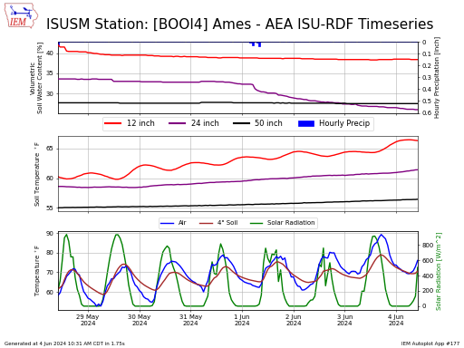
This application generates time series charts using data from the ISU Soil Moisture Network.
#115. Monthly Heatmap of Summary Totals
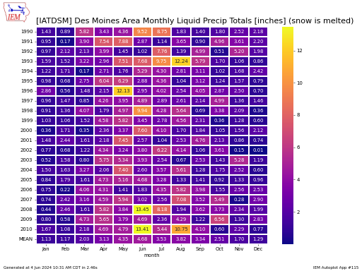
This reports presents simple monthy and yearly summary statistics. The WYEAR column denotes the 'Water Year' total, which is defined for the period between 1 Oct and 30 Sep. For
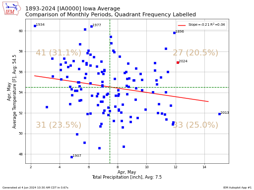
#2. Month Precip vs Month Growing Degree Day Departures
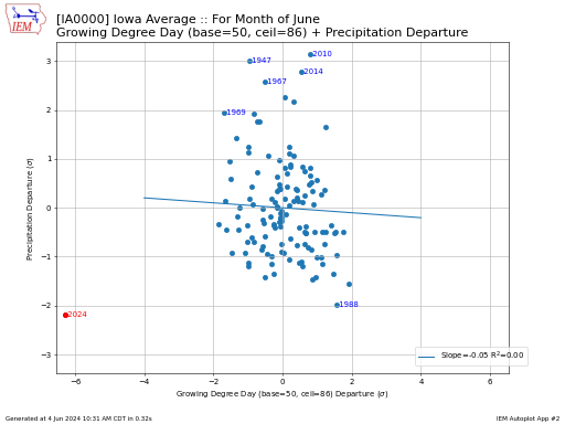
This plot compares the growing degree day vs precipitation departure for a given month and station. The departure is expressed in units of standard deviation. So a value of one
#223. Monthly/Seasonal Partition of Temperature/Precip Reports
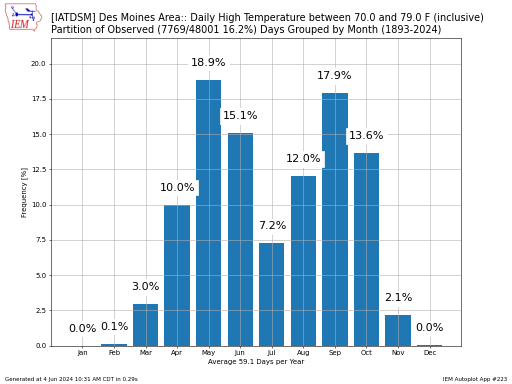
This chart presents the monthly/seasonal partition of how a daily observed climate variable is observed. Rewording, what percentage of a given year's daily reports at the given threshold range occur
#57. Monthly Precip/Temperature Records or Climatology
This plot displays the monthly records or climatology for a station of your choice. The current month for the current day is not considered for the analysis, except for total
#95. Monthly Precip/Temperature with El Nino SOI Index Relationship
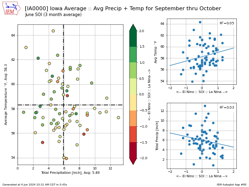
This chart displays the combination of average temperature and total precipitation for one or more months of your choice. The dots are colorized based on the Southern Oscillation Index (SOI)
#24. Monthly Precip/Temperature Climate District / Statewide Ranks/Aridity
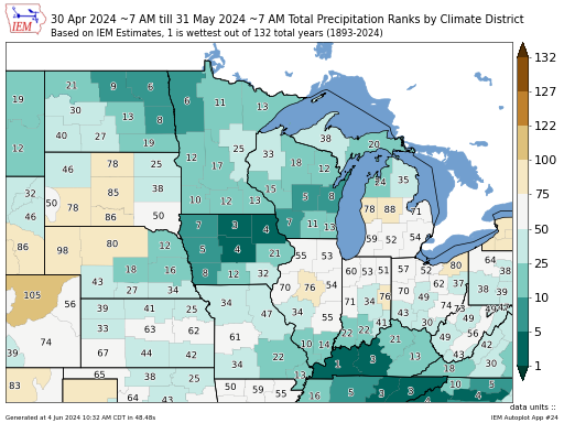
The map presents IEM computed climate district or statewide values for a metric of your choice. This map can be generated for a given month and year or period of
#3. Monthly/Yearly Precip/Temperature Statistics by Year
This plot displays a single month's worth of data over all of the years in the period of record. In most cases, you can access the raw data for these
#6. Monthly Precip/Temperature Distributions
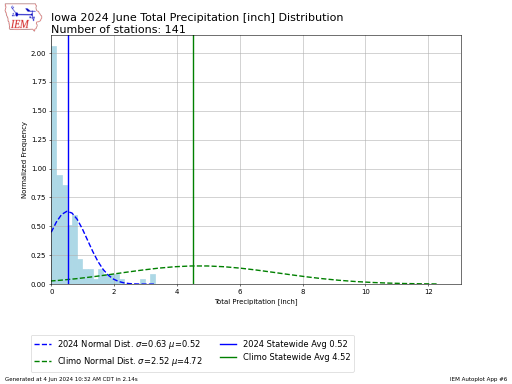
This application plots out the distribution of some monthly metric for single month for all tracked sites within one state. The plot presents the distribution and normalized frequency for a
#8. Monthly Precip Reliability
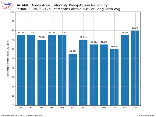
This plot presents the frequency of having a month's preciptation at or above some threshold. This threshold is compared against the long term climatology for the site and month. This
#23. Monthly Station Departures + El Nino 3.4 Index Time Series
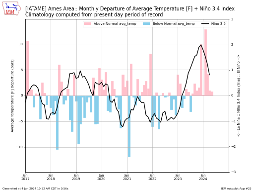
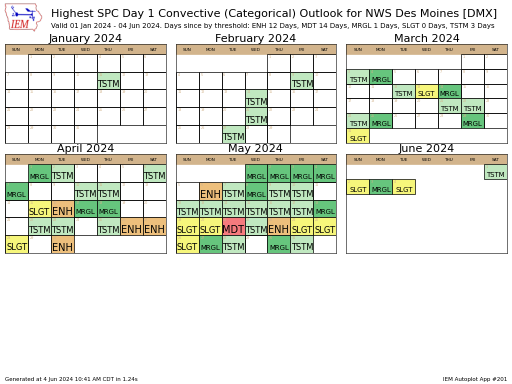
This plot presents the combination of monthly temperature or precipitation departures and El Nino index values.
#36. Month warmer/wetter than other Month for Year
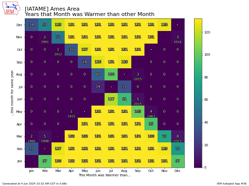
This plot summarizes the frequency of one month being warmer/wetter than another month for that calendar year.
#58. One Day's Precip Greater than X percentage of Monthly Total
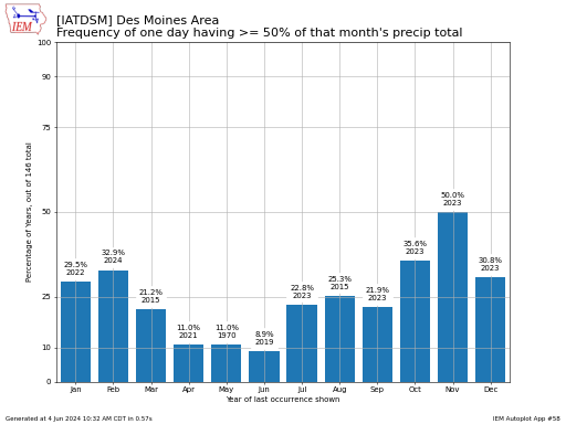
Displays the number of times that a single day's precipitation was greater than some portion of the monthly total. The default settings provide the frequency of getting half of the
#41. Quantile / Quantile Plot of Daily Temperatures for Two Months/Periods
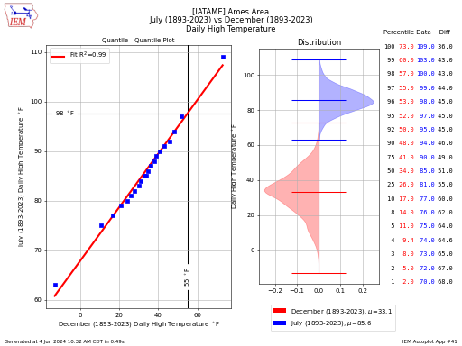
This plot compares the distribution of daily temperatures for two months or periods for a single station of your choice. The left hand plot depicts a quantile - quantile plot,
#47. Snowfall vs Precip Total for a Month
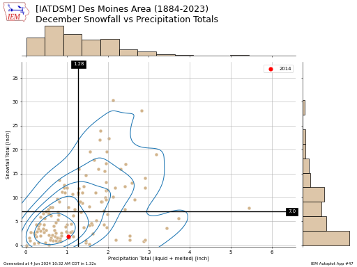
This chart displays the combination of liquid precipitation with snowfall totals for a given month. The liquid totals include the melted snow. So this plot does not show the combination
#39. Scenarios for this month besting some previous month
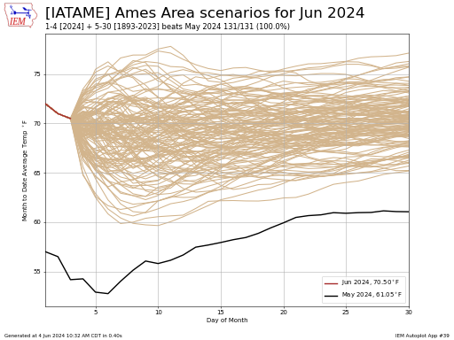
This plot compares the month to date average temperature of this month against any previous month of your choice. The plot then contains this month's to date average temperature along
#71. Wind Speed and Wind Direction Daily Averages for Month
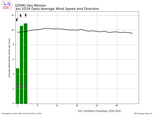
This plot displays daily average wind speeds for a given year and month of your choice. These values are computed by the IEM using available observations. Some observation sites explicitly
#138. Wind Speed and Wind Direction Monthly Climatology
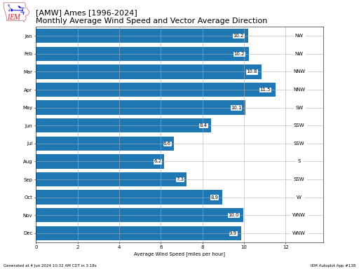
This graph presents monthly average wind speed values along with vector-averaged average wind direction.
#173. Wind Speed Hourly Climatology by Month or Period
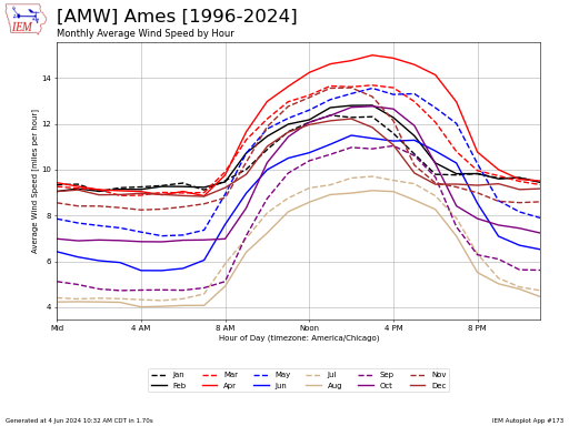
This chart presents the hourly average wind speeds by month of the year or by custom periods. The hours presented are valid in the local time zone of the reporting
Yearly
#135. Accumulated Days with High/Low Above/Below Threshold
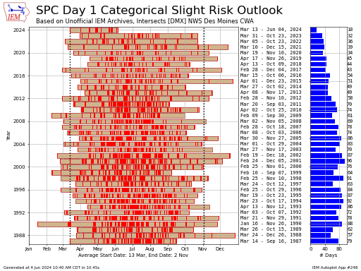
This plot displays the accumulated number of days that the high or low temperature was above or below some threshold. This uses somewhat sloppy day-of-year logic that does not necessarily
#246. Accumulated GDD/Precip Threshold Frequency by Day of Year
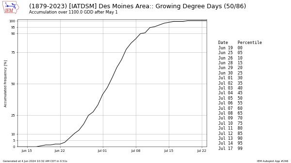
This autoplot generates a probability of a specified accumulation threshold being reached by the given calendar date. This is based on period of record observations, so it is an observed
#76. Dew Point / Vapor Pressure Deficit / RH Distributions by Year or Season
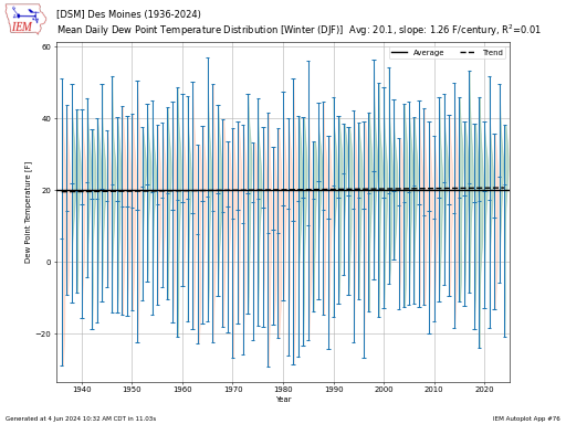
Simple plot of yearly average dew points by year, season, or month. This calculation was done by computing the mixing ratio, then averaging the mixing ratios by year, and then
#125. Climatological Maps of Annual/Monthly Averages
This application produces map analysis of climatological averages. The IEM maintains a number of different climatologies based on period of record and source. If you pick the NCEI Climatology, only
#151. Difference between two periods or single period of years [map]
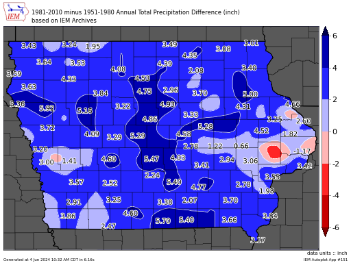
This autoplot can either produce a plot of averages for a given period or annual over a period of years; or a difference between a second set of years.
#187. Compare one station yearly summary vs entire state
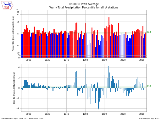
This chart presents the rank a station's yearly summary value has against an unweighted population of available observations in the state. The green line is a simple average of the
#244. Compare NCEI Climdiv to IEM Climodat Statewide Values
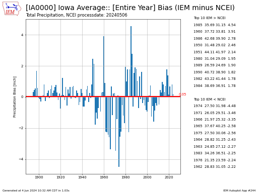
The IEM attempts to create areal averaged climate values akin to what NCEI has with its "Climdiv" dataset. This autoplot creates comparisons between the two. Variances shown are problems with
#128. Comparison of Yearly Summaries between two stations
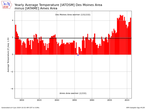
This chart compares yearly summaries between two long term climate sites. Only years with similiar observation counts are used in this data presentation.
#99. Daily High + Low Temperatures with Departures
This plot produces a time series difference between daily high and low temperatures against climatology. Climatology is based on the current official NCEI 1991-2020 dataset to compute the daily average
#12. Days per year and first/latest date above/below given threshold
This plot presents the yearly first or last date of a given high or low temperature along with the number of days that year above/below the threshold along with the
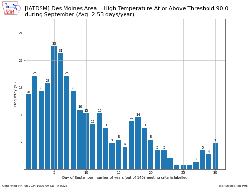
#184. Days per year with High Temperature above temperature thresholds
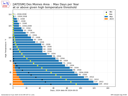
This plot shows the number of days with a high temperature at or above a given threshold. You can optionally generate this plot for the year to date period. The
#74. Days per year by season or year with temperature above/below threshold
The number of days for a given season that are either above or below some temperature threshold.
#181. Days per year with temp/precip/snowfall within ranges
This application plots frequencies of a variable of your choice for five bins of your choice. These five bins represent inclusive ranges and may overlap, if so desired. The range
#13. End/Start Date of Summer (warmest 91 day period) per Year
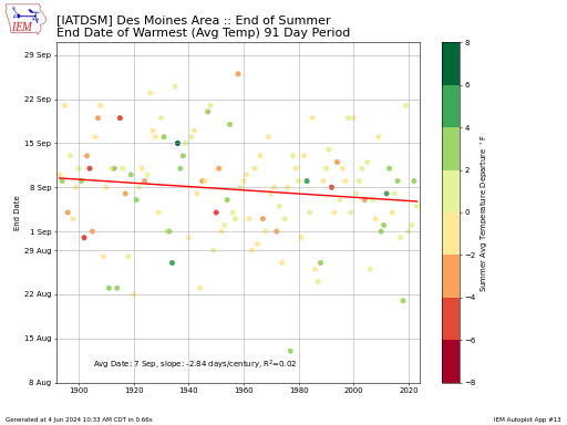
This chart presents the start or end date of the warmest 91 day period each year.
#27. First Fall Temp Below Threshold (First Freeze/Frost)
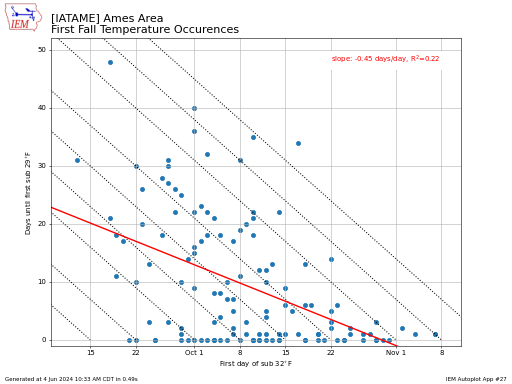
This chart presents the date of the first fall (date after 1 July) temperature below threshold 1 and then the number of days after that date until threshold 2 was
#165. First / Last Date of Air/Soil Temperature Threshold [map]
This app generates a map showing either an explicit year's first or last date or the given percentile (observed frequency) date over all available years of a given temperature threshold.
#119. Frequency of First/Last Fall High/Low Temp by Day of Year
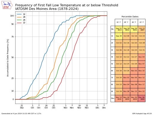
This chart presents the accumulated frequency of a temperature threshold being the first time observed or last time observed during the fall season. There is a complexitiy to the last
#120. Frequency of Last Spring High/Low Temperature by Day of Year
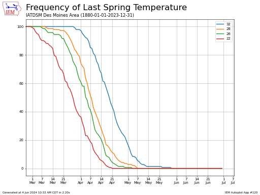
This chart presents the accumulated frequency of having the last spring temperature at or below a given threshold. Autoplot 119 is closely related to this autoplot and presents the
#189. General yearly totals with trend line fitted
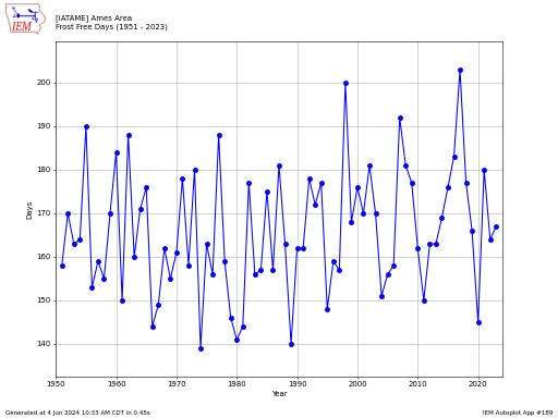
Create plots of yearly totals and optionally fit a linear trendline. Here is a brief description of some of the available metrics. Frost Free Days: Number of days each
#179. Growing Degree Day Scenarios For This Year
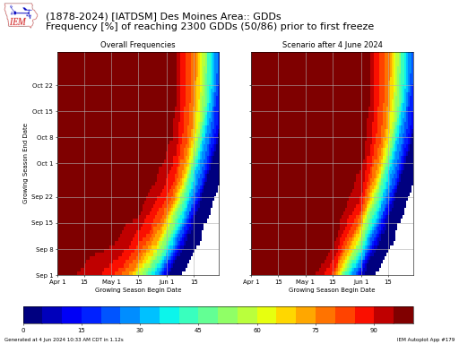
This application creates two 2-D histograms of GDD accumulation frequencies. These frequencies are based on historical data for the specificed site and base the end of each year's growing season
#152. Growing Season Differences Map between Two Periods
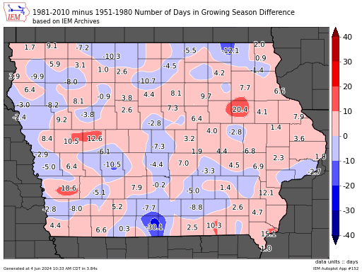
This map produces an analysis of change in the number of days for the growing season. This is defined by the period between the last spring low temperature below 32
#148. Holiday or Same Day Daily Weather Observations each year
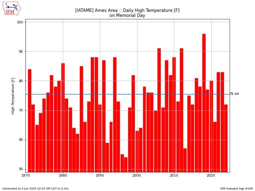
This plot presents a daily observation for a site and year on a given date / holiday date each year. A large caveat to this chart is that much of
#53. Hourly Frequency of Variable within Certain Ranges
Based on hourly observations, this plot displays the frequency of a given variable falling within a set of thresholds. The thresholds are defined by the user and must be in
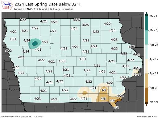
#10. Last Spring and First Fall Date above/below given threshold
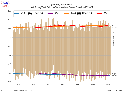
This plot presents the period between the first or last date for spring and fall season that the temperature was above or below some threshold. The year is split into
#64. Last or First Snowfall of Each Winter Season
This chart displays either the first or last date of the winter season with a snowfall of a given intensity. The snowfall and snow depth data is not of great
#33. Maximum Low Temperature Drop
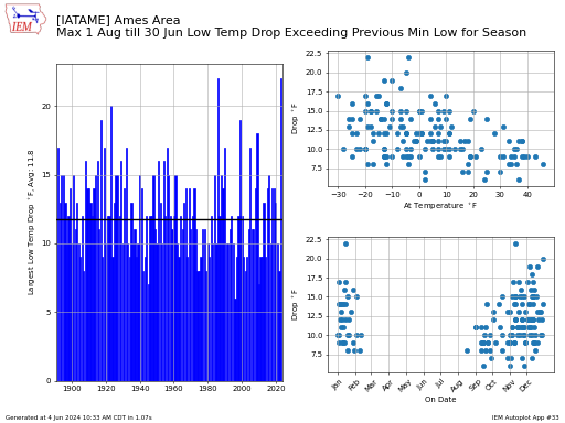
This plot presents the largest drop in low temperature during a period between 1 July and 30 June of the next year, but not including the July data of that
#188. Max/Min High/Low after first temperature exceedence of season
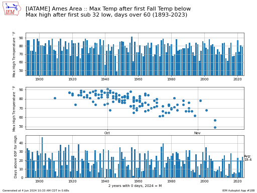
This plot presents the yearly minimum temperature after the first spring temperature above a given value or the maximum temperature after the first fall temperature below a given value. The
#105. Maximum Period between Precip Amounts
This plot presents three precipitation metrics for a site of your choice. The upper plot displays the maximum period of days in between precip events of either greater than 0.01"
#46. Minimum Wind Chill / Max Heat Index Temperature
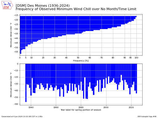
This chart presents the frequency of observed minimum wind chill or maximum heat index over the period of record for the observation site. Please note that this application requires the
#30. Monthly Temperature Range
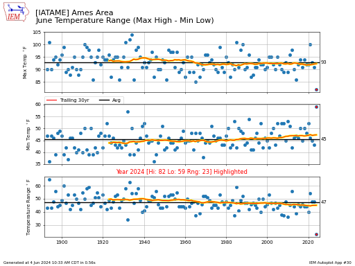
This chart presents the range between the warmest high temperature and the coldest low temperature for a given month for each year. The bottom panel displays the range between those
#44. NWS Office Accumulated SVR+TOR Warnings
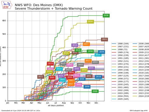
This plot displays an accumulated total of office issued watch, warning, advisories. These totals are not official and based on IEM processing of NWS text warning data. The totals are
#69. Percentage of Days each Year Above/Below Average
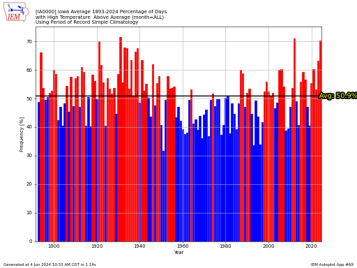
The frequency of days per year that the temperature was above/below average. Data is shown for the current year as well, so you should consider the representativity of that value
#77. Period between Last and First High Temperature for Year
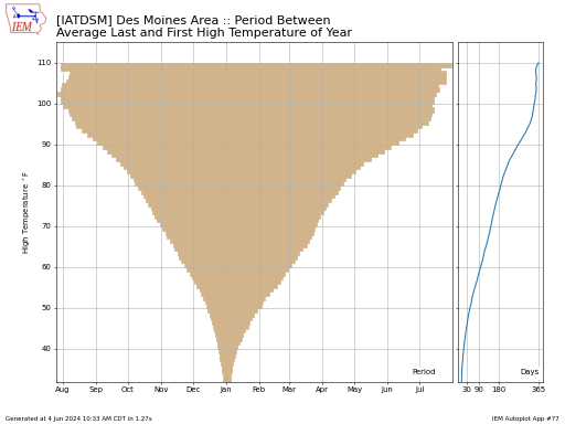
For each year, the average first and last date of a given temperature is computed. The values are then averaged and plotted to represent the period between these occurences and
#134. Period each year that was warmest/coldest/wettest/driest
This plot displays the period of consecutive days each year with the extreme criterion meet. In the case of a tie, the first period of the season is used for

#63. Records Set by Year (Max High / Min Low / Max Precip)
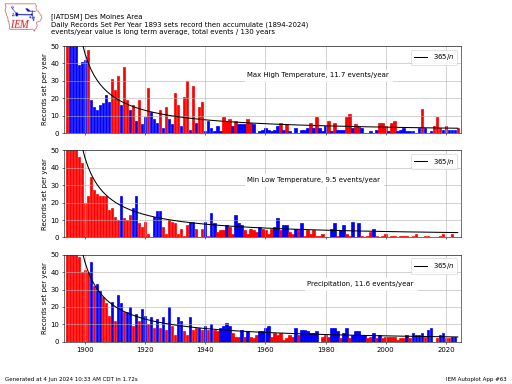
This chart plots the number of daily maximum high temperatures, minimum low temperatures and precipitation records set by year. Ties are not included. The algorithm sets the records based on
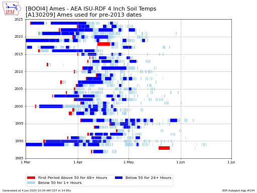
#144. Soil Temperature Periods Above/Below Threshold in Spring
This plot uses hourly 4 inch depth soil temperature observations from the ISU Soil Moisture Network. It first plots the first period each year that the soil temperature was at
#145. Soil Temperature / Moisture Daily Time Series by Year
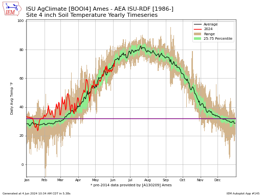
This chart presents daily timeseries of soil temperature or moisture. The dataset contains merged information from the legacy Iowa State Ag Climate Network and present-day Iowa State Soil Moisture Network.
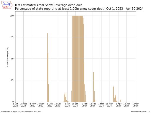
#175. Snow Coverage Percentage for State For One Winter
This chart displays estimated areal coverage of snow cover for a single state. This estimate is based on a 0.125x0.125 degree analysis of NWS COOP observations. The date shown would
#133. Snowfall Season Totals Split by Date within Season
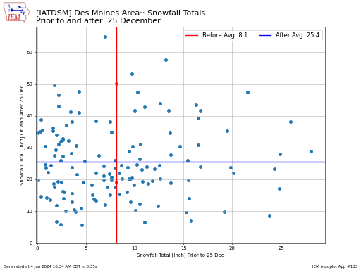
This plot displays the total reported snowfall for a period prior to a given date and then after the date for the winter season. When you select a date to
#103. Step Ups in High Temp / Step Downs in Low Temp by Year
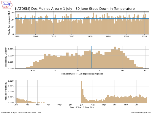
This plot analyzes the number of steps down in low temperature during the fall season and the number of steps up in high temperature during the spring season. These steps
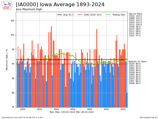
#100. Temperature / Precip Statistics by Year
This plot displays a metric for each year. In most cases, you can access the raw data for these plots here.
#136. Time per Winter Season below Wind Chill Threshold
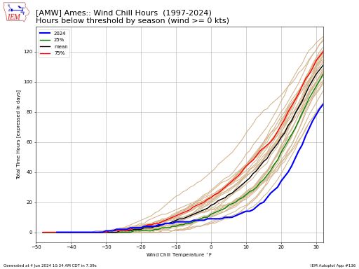
This plot displays the number of accumulated hours below a given wind chill temperature threshold by season. The labeled season shown is for the year of January. So the season
#104. Trailing X day temp/precip departures (weather cycling)
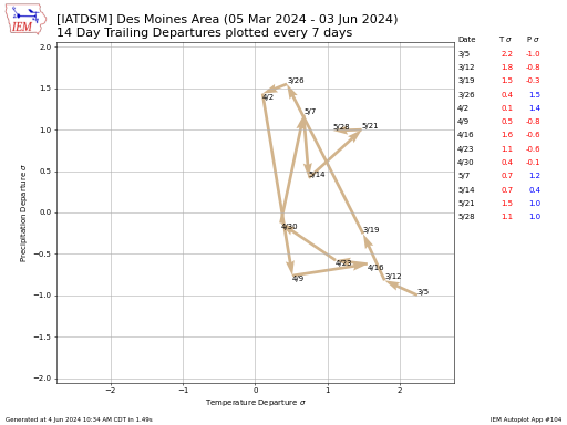
This plot presents the time series of trailing X number of day departures evaluated every Y days forward in time. The departures are expressed in terms of standard deviation (sigma)
#14. Yearly Precip Contributions by Daily Totals
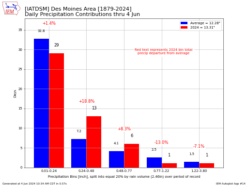
Using long term data, five precipitation bins are constructed such that each bin contributes 20% to the annual precipitation total. Using these 5 bins, an individual year's worth of data
Hydrology / Drought Monitor Plots
#160. River Gauge Obs and Forecasts from HML Products
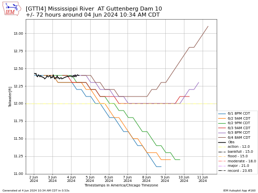
This page presents a sphagetti plot of river stage and forecasts. The plot is roughly centered on the date of your choice with the plot showing any forecasts made three
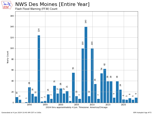
#178. NWS RFC Flash Flood Guidance Plots
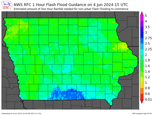
This application plots Flash Flood Guidance for a time of your choice. The time is used to query a 24 hour trailing window to find the most recent FFG issuance.
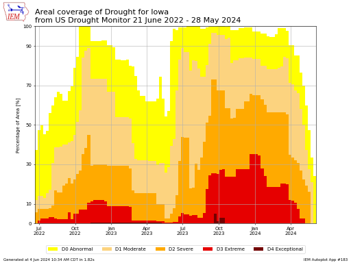
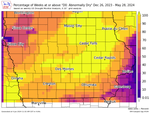
#183. US Drought Monitor Areal Coverage by State
This plot presents a time series of areal coverage of United States Drought Monitor for a given state of your choice. This plot uses a JSON data service provided by
#186. US Drought Monitor Change in Areal Coverage by State
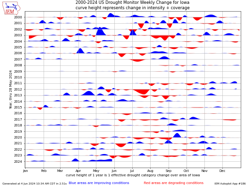
This plot shows the weekly change in drought monitor intensity expressed in terms of category change over the area of the selected state. For example, an arrow of length one
#194. US Drought Monitor Time Duration over Period Maps
This application generates a heatmap of the frequency of a given drought classification. The classification is the minimal threshold, so if a location is in D3 classification drought, it would
#193. US Drought Monitor + Weather Prediction Center (WPC) Forecast Rain (QPF)
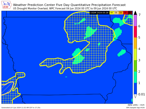
Generates a map of WPC Quantitative Precipitation Forecast (QPF) and most recent US Drought Monitor to the date choosen to plot the WPC forecast
#231. Weekly Statewide SPI Changes and Drought Classification
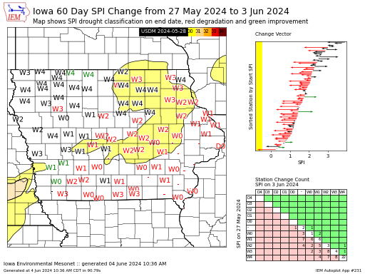
This autoplot produces an infographic for a given state with some diagnostics on the weekly change in Standardized Precipitation Index (SPI) over a given day interval. The purpose is to
METAR ASOS Special Plots
#78. Average Dew Point/RH% by Air Temperature by Month or Season or Year
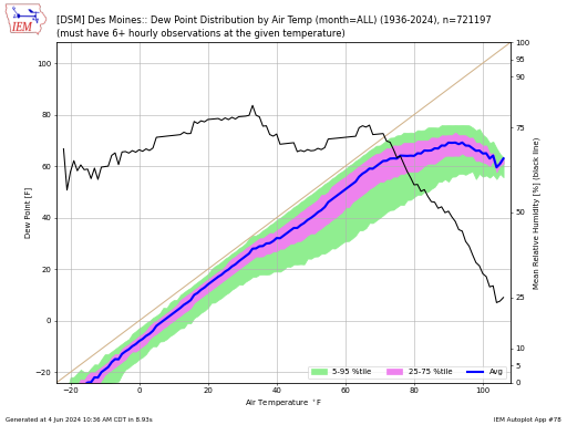
This plot displays the average dew point at a given air temperature along with the envelope between the 5th and 95th percentile. The average dew point is computed by taking
#40. Cloud Amount and Level Timeseries / Visibility for One Month
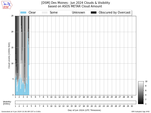
This chart is an attempted illustration of the amount of cloudiness that existed at a METAR site for a given month. The chart combines reports of cloud amount and level
#88. Cloudiness Impact on Hourly Temperatures
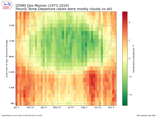
This plot attempts to show the impact of cloudiness on temperatures. The plot shows a simple difference between the average temperature during cloudy/mostly cloudy conditions and the average temperature by
#214. Combos of Hourly Observations Var Vs Var
This plot generates a comparison between two hourly ASOS observation values. The interactive chart version and raw data download also presents the most recent UTC timestamp for that given combination.
#59. Daily u and vs Wind Component Climatologies
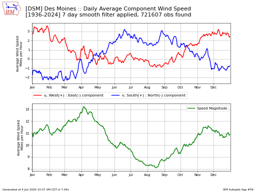
This plot presents a climatology of wind observations. The top panel presents the u (east/west) and v (north/south) components. The bottom panel is the simple average of the wind speed
#79. Dew Point Distribution by Wind Direction by Month or Season or Year
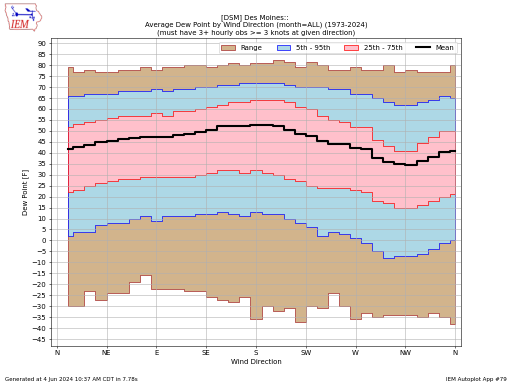
This plot displays the average dew point at a given wind direction. The average dew point is computed by taking the observations of mixing ratio, averaging those, and then back
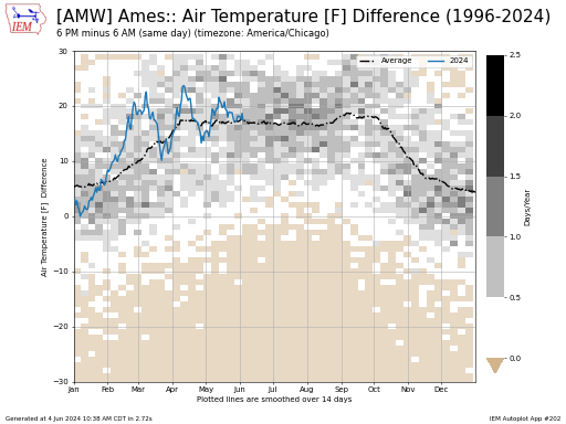
#54. Difference between morning low or afternoon high temperature between two sites
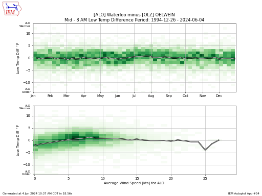
This application plots the difference in morning low or afternoon high temperature between two sites of your choice. The morning is defined as the period between midnight and 8 AM
#250. Difference between two ASOS/METAR stations for a given hourly variable
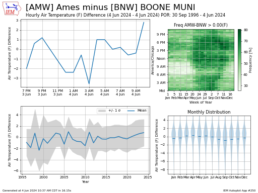
This autoplot presents some metrics when comparing a single variable between two airport weather stations. The time zone of the first station is used for the various subplots. The top
#167. Flight / Aviation Condition (VFR, MVFR, IFR, LIFR) hourly for one month
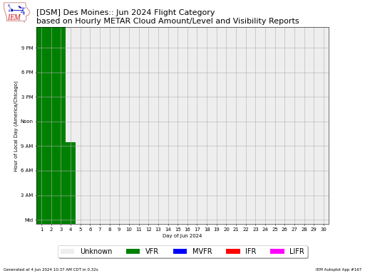
This chart summarizes Flight Category by hour and day of a given month. In the case of multiple observations for a given hour, the worst category is plotted.
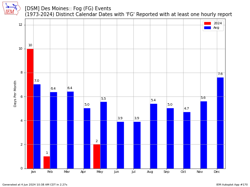
#87. Frequency of METAR Code (Thunder, etc) by week or day by hour
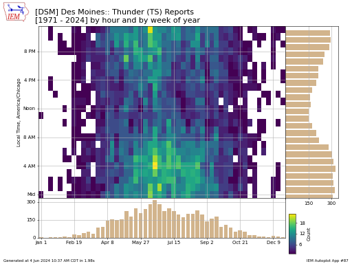
Frequency plot partitioned by hour and day or week of the year for a given METAR code to appear in the present weather. If your favorite METAR code is not
#131. Frequency of Overcast Clouds / Clear Skies by Air Temperature by month/season
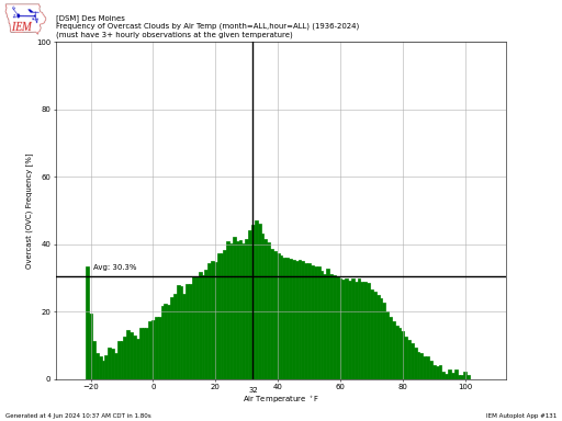
This plot displays the frequency of having overcast conditions reported by air temperature. More specifically, this script looks for the report of 'OVC' within the METAR sky conditions. Many caveats
#93. Heat Index / Temperature / Dew Point / Wind Chill Hourly Histogram
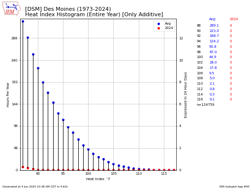
Caution: This plot takes a bit of time to generate. This plot displays a histogram of hourly observations. Only the routine hourly observations are considered, so specials or multiple observations

#153. Hourly Extremes by Month/Season/Day Period/Year
This table presents the extreme hourly value of some variable of your choice based on available observations maintained by the IEM. Sadly, this app will likely point out some bad
#159. Hourly Frequency / Histogram by year and by hour of day
Based on available hourly observation reports by METAR stations, this application presents the frequency of number of hours for a given month or season at a given threshold. If you
#106. Hourly temp distributions on days exceeding temperature
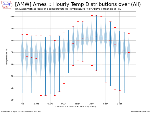
This plot displays hourly temperature distributions on dates having at least one hourly observation meeting the given requirement. The distributions are presented as "violins" with the width of the violin
#202. Hourly variable comparison between two hours on one day
This application presents daily comparisons of an automation station's hourly data. You pick two hours of your choice and the application will compute the difference between the two. The hours
#169. Largest Rise/Drop in Temp/Dew Point/Pressure over X Hours
This chart presents the largest change in some observed variable over a given number of hours. This is based on available reports. There are two options for how to compute
#18. Long term observation time series
This chart displays a simple time series of an observed variable for a location of your choice. For sites in the US, the daily high and low temperature climatology is
#45. Monthly Frequency of Overcast Conditions
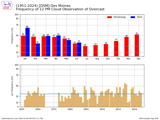
Computes the frequency of having a day within a month with an overcast sky reported at a given time of the day. There are a number of caveats to this
#170. Monthly Frequency of Present Weather Code in METAR Report
This chart totals the number of distinct calendar days or hours per month that a given present weather condition is reported within the METAR data feed. The calendar day is
#67. Monthly Frequency of Wind Speeds by Air Temperature
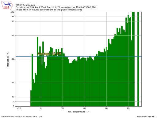
This plot displays the frequency of having a reported wind speed be above a given threshold by reported temperature and by month.
#37. MOS Forecast Ranges + ASOS Observations
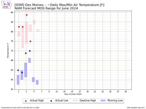
This chart displays the combination of Model Output Statistics (MOS) forecasts and actual observations by the automated station the MOS forecast is for. The case of ~Daily Max/Min Air Temperature
#211. One Minute Interval Plots
This application generates charts of 1 minute interval ASOS data, where available. It presently lists all ASOS sites without limiting them to which the IEM has data for, sorry. You
#222. One Minute Precip During Severe Weather
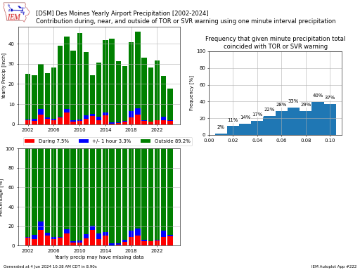
Using available one minute precipitation data from an ASOS, this data is merged with an archive of polygon based warnings. Precipitation totals are then computed during the warnings that spatially
#162. Overcast Sky Condition 2D Histogram (Level by Week)
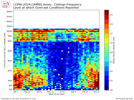
This plot presents a 2-D histogram of overcast conditions reported by the automated sensor. Please note that the yaxis uses an irregular spacing.
#213. Percentiles of Hourly ASOS Data by Day, Week, Month, or Year
This application generates percentiles based on available data from the selected station. These types of applications are good at identifying bad data :(. The date you select is used to
#146. Temperature Frequency by Week During Precip
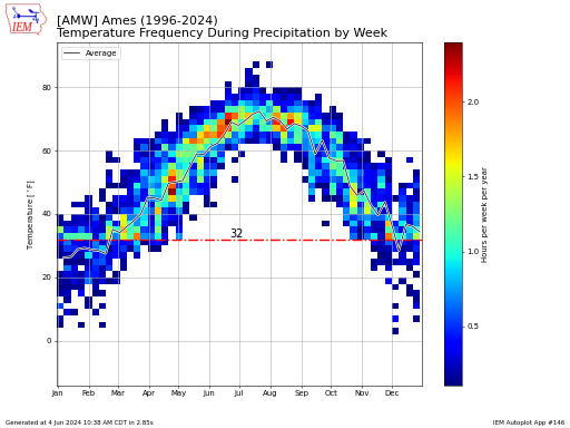
This chart displays the frequency of having measurable precipitation reported by an ASOS site and the air temperature that was reported at the same time. This chart makes an assumption
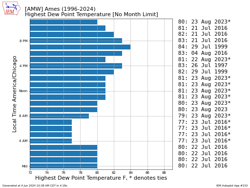
#155. Top 10 / Most Recent Hourly Reports from ASOS Stations
Based on available hourly observation reports by METAR stations, this application presents the top 10 events for a given metric of your choice. Please note that this application often reveals
#16. Wind Rose when specified criterion is meet
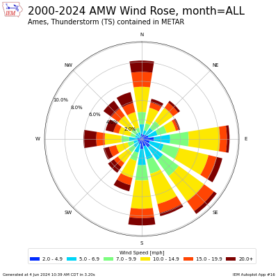
This application generates a wind rose for a given criterion being meet. A wind rose plot is a convenient way of summarizing wind speed and direction. You can select a
NASS Quickstats (USDA Crop Statistics)
#238. NASS County Yield Maps
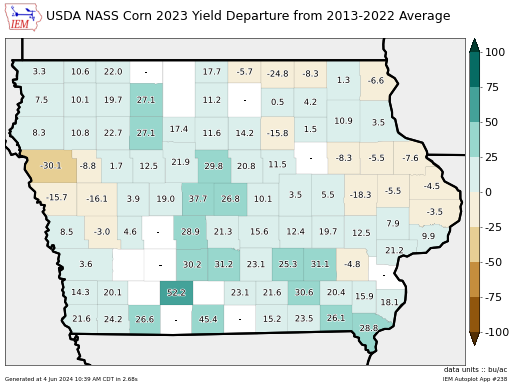
This app generates maps of yearly USDA NASS county yield estimates. It is a bit of a work in progress yet, but will be added to as interest is shown!
#239. NASS County Yields + Weather Station Summaries
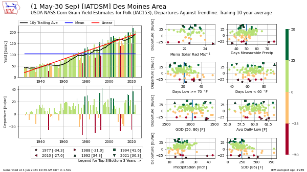
This autoplot combines the USDA NASS county yield estimates with summarized weather variables from a single weather station. The county that the weather station resides in is used for the
#156. NASS Crop Condition by Year for Six States
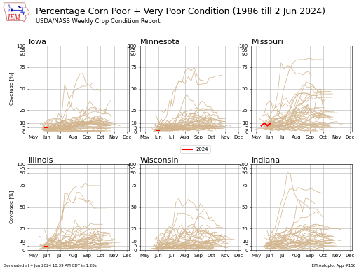
This chart presents crop condition reports from USDA/NASS.
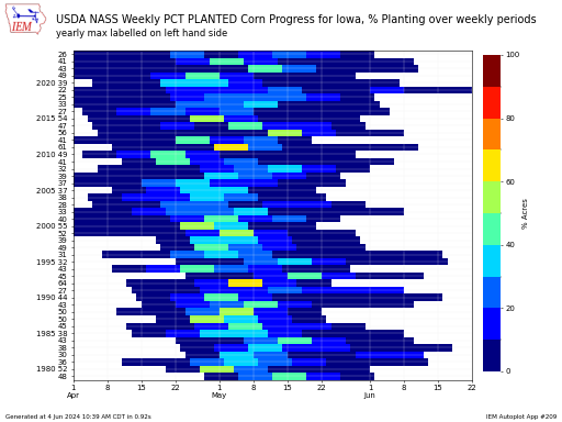
#127. NASS Crop Progress by Year
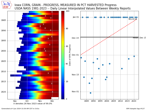
This chart presents the crop progress by year. Since the NASS data is weekly, a linear interpolation is performed to estimate the daily values. The chart presents a yearly trendline
#197. NASS Crop Progress State Average Map

This generates a map showing USDA NASS weekly statistics. The date you select is rectified back to the latest available date. Historical data is linearly interpolated so that departures can
#209. NASS Crop Progress Weekly Change
This plot presents the weekly change in a given USDA NASS Crop Progress report variable. The units of the change are expressed as percentage points and not a true percentage.
NWS Warning Plots
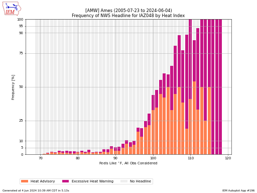
#196. ASOS/METAR Heat Index / Wind Chill Frequencies by NWS Alert Headline
This plot presents a frequency of having either a heat index or wind chill advisory/warning active for a given computed feels like temperature. The major caveat with this plot is
#232. ASOS/METAR Time Series during NWS Alert Headline (Blizzard / Fire / Wind / Heat / Wind Chill)
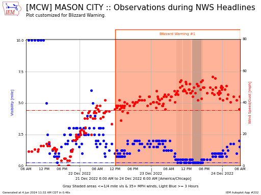
This app plots ASOS/METAR data during a period of your choice and overlays NWS Watch, Warning, and Advisory data. The choice of NWS Headline type will limit which potential headlines
#191. Calendar Plot of Watch/Warn/Adv Daily Counts
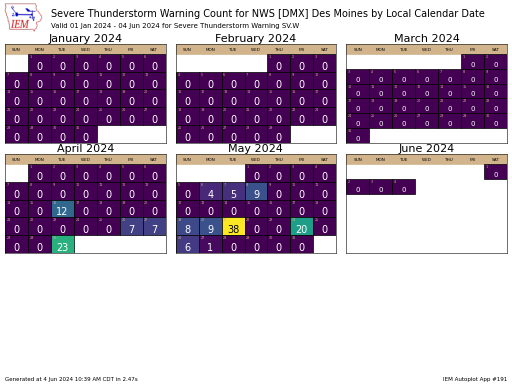
This application presents a calendar of daily counts of the number of watch, warning, advisories issued by day. This accounting is based on the initial issuance date of a given
#253. NWS Damage Assessment Toolkit (DAT) Tornado Tracks + Lead Time
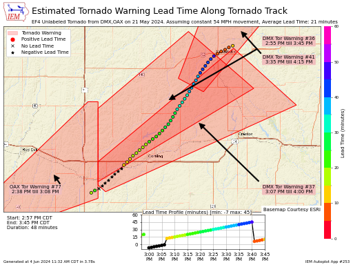
This autoplot combines NWS Damage Assessment Toolkit (DAT) tornado tracks (lines) with Tornado Warning (polygons) to provide along track estimates of lead time. This is all unofficial, of
#92. Days since Last Watch/Warning/Advisory by WFO
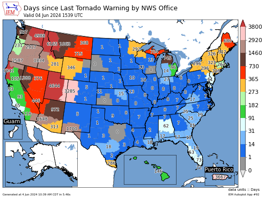
This map depicts the number of days since a Weather Forecast Office has issued a given VTEC product. You can set the plot to a retroactive date, which computes the
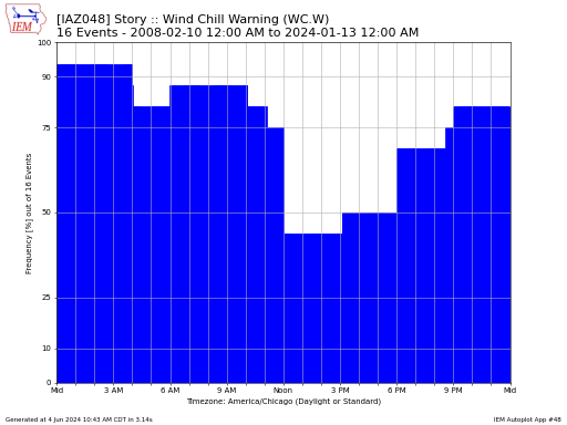
#72. Frequency of Watch/Warning/Advisories by Time of Day
This chart presents a histogram of the Watch, Warning, Advisory valid time. This is the time period between the issuance and final expiration time of a given event. An individual
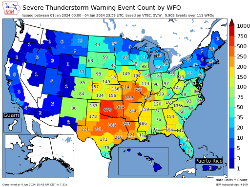
#50. Frequency of Hail/Wind Tags used in Severe TStorm Warnings
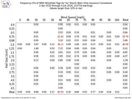
This app produces a table of frequencies of wind and hail tags used in NWS Severe Thunderstorm Warnings. You have the choice to only plot the issuance or use a
#52. Gantt Chart of Watch/Warning/Advisories by WFO or UGC
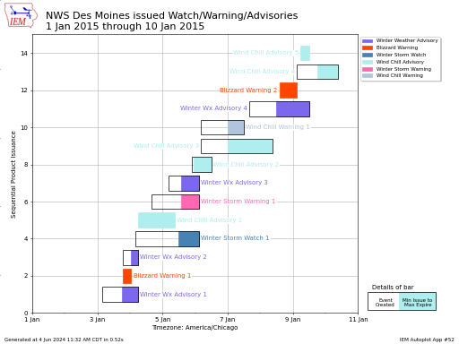
Gantt chart of watch, warning, and advisories (WaWa) issued by an NWS Forecast Office for a start date and number of days of your choice. The width of the bar
#245. Local Storm Reports by Month/Year + Top 10 Daily
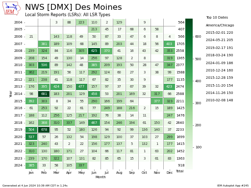
This chart presents the total number of Local Storm Reports disseminated by the NWS by month and year. Autoplot 171 produces a similar plot, but contains totals of Watch,
#234. Local Storm Reports Calendar Counts
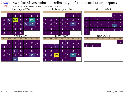
This autoplot generates a calendar showing calendar day Local Storm Report totals by NWS Weather Forecast Office (WFO) or State. The calendar date is based on the local timezone of
#163. Local Storm Reports Issued by WFO/State [map]
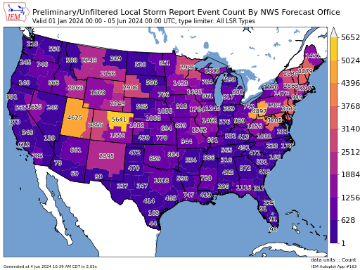
This application generates a map displaying the number of LSRs issued between a period of your choice. These are the preliminary reports and not official totals of events. For plots
#102. Local Storm Report Source Type Ranks by Year
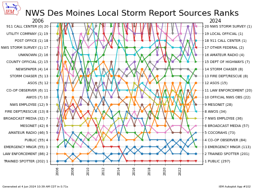
The National Weather Service issues Local Storm Reports (LSRs) with a label associated with each report indicating the source of the report. This plot summarizes the number of reports received
#237. Map of WFO/CWSU Miscellaneous Event Counts (SPS/CWA)
This autoplot is a bit of a catch-all for mapping event counts at a WFO or CWSU map unit. These are events that do not have VTEC.
#44. NWS Office Accumulated Watch/Warning/Advisories by Year
This plot displays an accumulated total of office issued watch, warning, advisories. These totals are not official and based on IEM processing of NWS text warning data. The totals are
#68. Number of Distinct Phenomena/Significance VTEC per Year
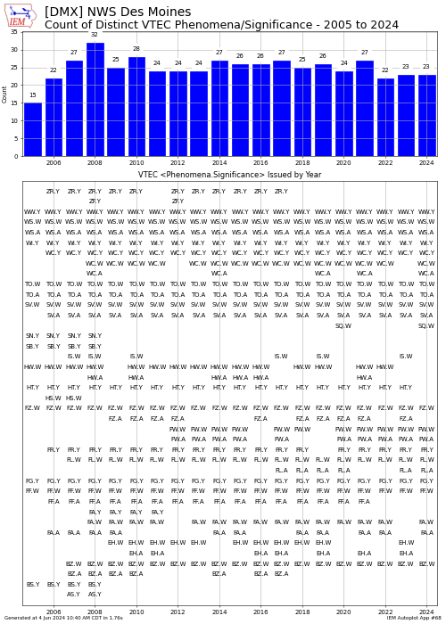
This chart shows the number of VTEC phenomena and significance combinations issued by a NWS Forecast Office for a given year. Please note that not all current-day VTEC products were
#73. Number of Watch/Warning/Advisories Issued per Year
This chart displays the number of products issued by a NWS Office or state by year for a given watch, warning, or advisory of your choice. These numbers are based
#171. Number of Watch/Warning/Advisories Issued per Year per Month + Top 10 Daily
This chart displays the monthly number of distinct NWS Office issued watch / warning / advisory product. For example, a single watch for a dozen counties would only count 1
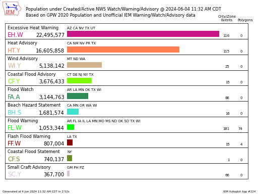
#247. NWS Watch Warning Advisory (WaWa) Map + Population Stats
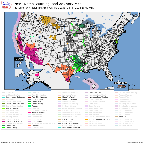
This autoplot generates a map of active NWS Watch, Warnings, and Advisories active at the given timestamp. Footnote on "Active" WaWA: A more complex than it should be nuance to
#251. NWS Warning Load Time Series
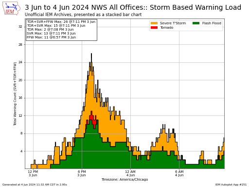
The purpose of this autoplot is to generate a time series of NWS warning load with time for short fuse warnings.
#70. Period between First and Last VTEC Product Each Year
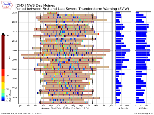
This chart attempts to display the period between the first and last VTEC enabled watch, warning or advisory issuance by year. For some long term products, like Flood Warnings, this
#248. Period between First and Last SPC/WPC Outlook each Year
This chart displays the period each year between the first and last SPC/WPC outlook type for a given NWS forecast office, state or county. The dates presented are the commonly
#224. Population/Area under NWS Watch/Warning/Advisory at Time
This autoplot attempts to estimate the number of people or area in the US under a given NWS Watch/Warning/Advisory (WaWA). Double-accounting is somewhat a problem here in the case of
#203. Storm Based Warning Polygon Visual Summary
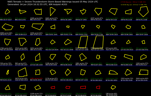
This application generates a visual summary of polygons issued for a given UTC date. Due to the plot's oblong nature, there is no present way to control the plot's resolution.
#195. Storm Motion distribution based on NWS Warnings
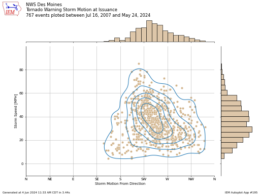
Some of the warnings that the National Weather Service issues includes a storm motion vector. This application plots the speed vs direction of the vector and includes a kernel density
#201. SPC Convective/Fire Wx or WPC Excessive Rainfall Outlook Calendar
This application presents a calendar of Storm Prediction Center or Weather Prediction Center outlooks by state, WFO, or county. The GIS spatial operation done is a simple touches. So an
#258. SPC Convective/Fire Wx or WPC Excessive Rainfall Outlook Progression for Lat/Lon

This tool generates an info-graphic with the progression of outlooks for a given point and date. This plot utilizes the outlook progression web service.
#230. SPC Convective/Fire Wx or WPC Excessive Rainfall Last Event Infographic
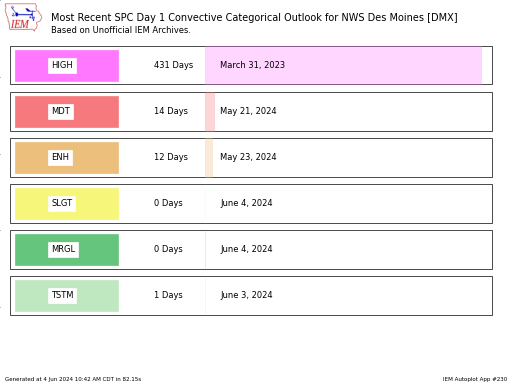
This application presents an infographic showing the most recent date of a given SPC outlook threshold as per IEM unofficial archives. Note that the probability data can get a little
#200. SPC + WPC Outlook Heatmap
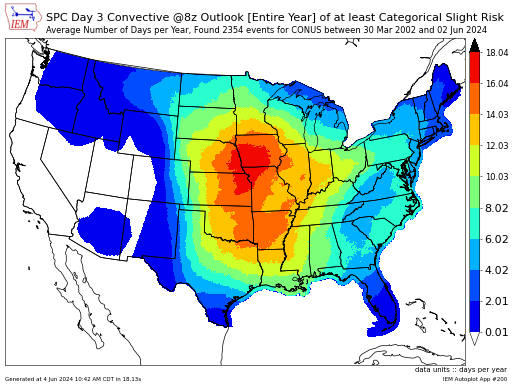
This application generates heatmaps of Storm Prediction Center convective outlooks. Major Caveat: Due to how the IEM stores the outlook geometries, the values presented here are for an outlook level
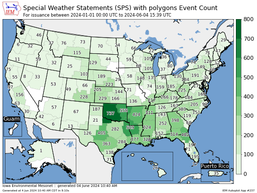
#143. Special Weather Statements (SPS) Polygon Count by Year by Month
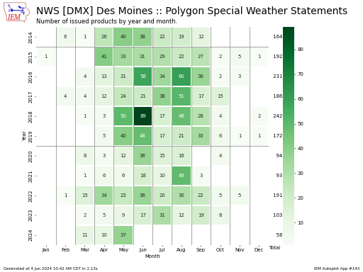
The NWS issues Special Weather Statements (SPS) products that often cover events that are just below severe limits and/or not covered by other headline products. Sometimes these SPS products have
#233. Special Weather Statements (SPS) Polygon Calendar of Daily Counts
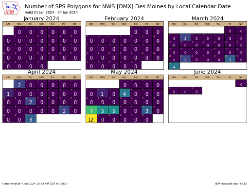
This calendar presents the number of Special Weather Statements that contain polygons issued per day. Autoplot 143 presents this same data, but as yearly and monthly totals.
#166. Storm Prediction Center (SPC) Watches per Year for a State
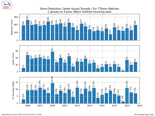
This plot presents a summary of the number of year to date watches issued by the Storm Prediction Center and the percentage of those watches that at least touched the
#210. Text Product Frequency Maps
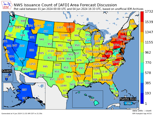
This application generates a map of the per WFO office usage of a given text product identifier based on unofficial IEM archives of NWS Text Product data. The three character
#235. Text Product Issuance Counts by Month + Year
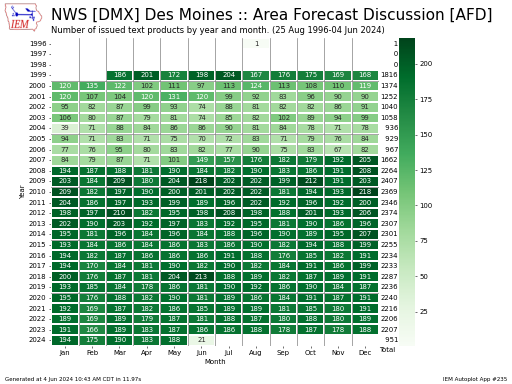
This autoplot presents the total number of text products issued by UTC month and year. Autoplot 210 presents a map of issuance counts for all Weather Forecast Offices.
#48. Time of Day Frequency for Given Warning / UGC
For a given watch/warning/advisory type and forecast zone, what is the frequency by time of day that the product was valid. The total number of events for the county/zone is
#80. Time Duration of a Watch/Warning/Advisory for a UGC/WFO
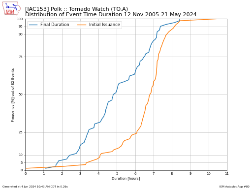
This plot presents the accumulated frequency of duration for a given NWS VTEC Watch, Warning, Advisory product. The complication with this tool is that some alerts are issued for zones
#243. Top 10 VTEC Event Days/Multi-Day by Year/Month
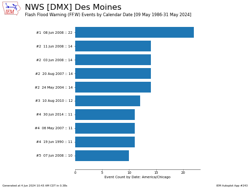
This autoplot prints out the top 10 dates for number of VTEC events issued. Note that a warning covering multiple counties would only count as 1 in this summary. You
#101. Top 25 Most Frequent VTEC Products by Office/NWS
This chart displays the relative frequency of VTEC products. This is computed by taking the unique combination of events and UGC county/zones. Restating and for example, a single Severe Thunderstorm
#259. UGC Geometry Change Diagnostic

This tool generates a diagnostic plot of how a given NWS UGC geometry has changed over time. The NWS updates their UGC databases about every year and some IEM processing
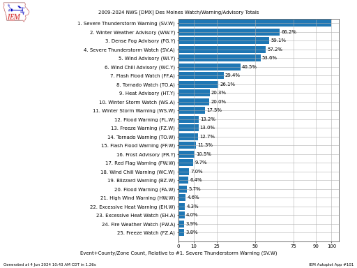
#56. Weekly/Daily/Monthly Frequency of a Watch/Warning/Advisory
This chart shows the time partitioned frequency of having at least one watch/warning/advisory (WWA) issued by the Weather Forecast Office (top plot) and the overall number of WWA issued events
#109. WFO / State VTEC Event Counts/Time Coverage Percent/Num Days for a Given Period (map)
This application generates per WFO or state maps of VTEC event counts. The current three available metrics are: Event Count: The number of distinct VTEC events. A distinct
#208. WFO VTEC Single Event Map Plot (map)
This application generates a map showing the coverage of a given VTEC alert. The tricky part here is how time is handled for events whereby zones/counties can be added /
#90. UGC or Polygon SBW Statistics for Watch/Warning/Advisory by state/wfo
This application has a considerable and likely confusing amount of configuration options. The biggest source of the confusion is the interplay between the statistic chosen and the dates/times provided. This
Tall Towers Plots
#158. Tall Towers - 1 Second Interval Time Series
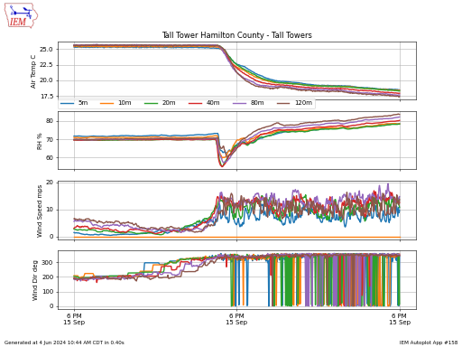
This plot presents one second data from the Iowa Atmospheric Observatory Tall-Towers sites overseen by Dr Gene Takle. The plot limits the number of times plotted to approximately 1,000 so
Upper Air / RAOB Sounding Plots
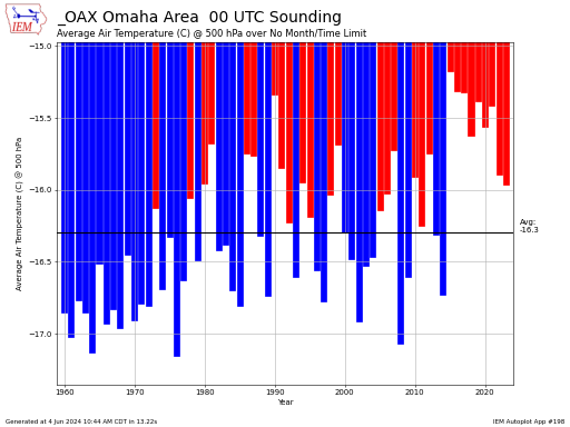
#198. Monthly Max/Min/Avgs for Sounding Parameter or Variable at Given Level
This plot presents a simple average of a given sounding variable of your choice. If the selected month period crosses a calendar year, the year shown is for the January
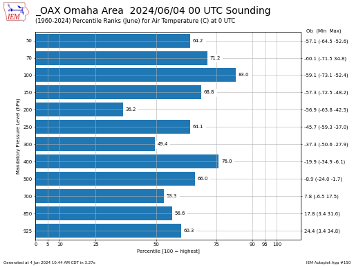
#150. Single Sounding Mandatory Level Percentile Ranks
This plot presents percentiles of observations from a given sounding profile against the long term record for the site. These percentiles are computed against all other soundings for the valid
#212. Sounding Parameter / Variable Yearly Timeseries
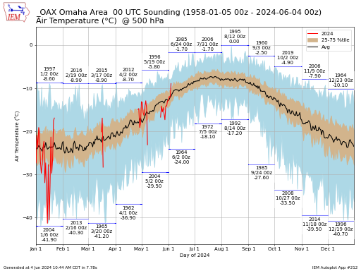
This plot presents the daily climatology range of a sounding variable along with a given year's values. The Storm Prediction Center website has a very similiar tool that
Miscellaneous
#226. Center Weather Advisory (CWA) Map
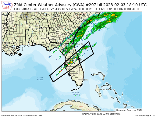
This plot is not meant for interactive use, but a backend for CWA plots.
#257. HRRR Comprehensive Climate Index (CCI)

This tool plots the Comprehensive Climate Index (CCI) based on HRRR model data.
#221. HRRR Time-Lagged Ensemble Reflectivity Plot
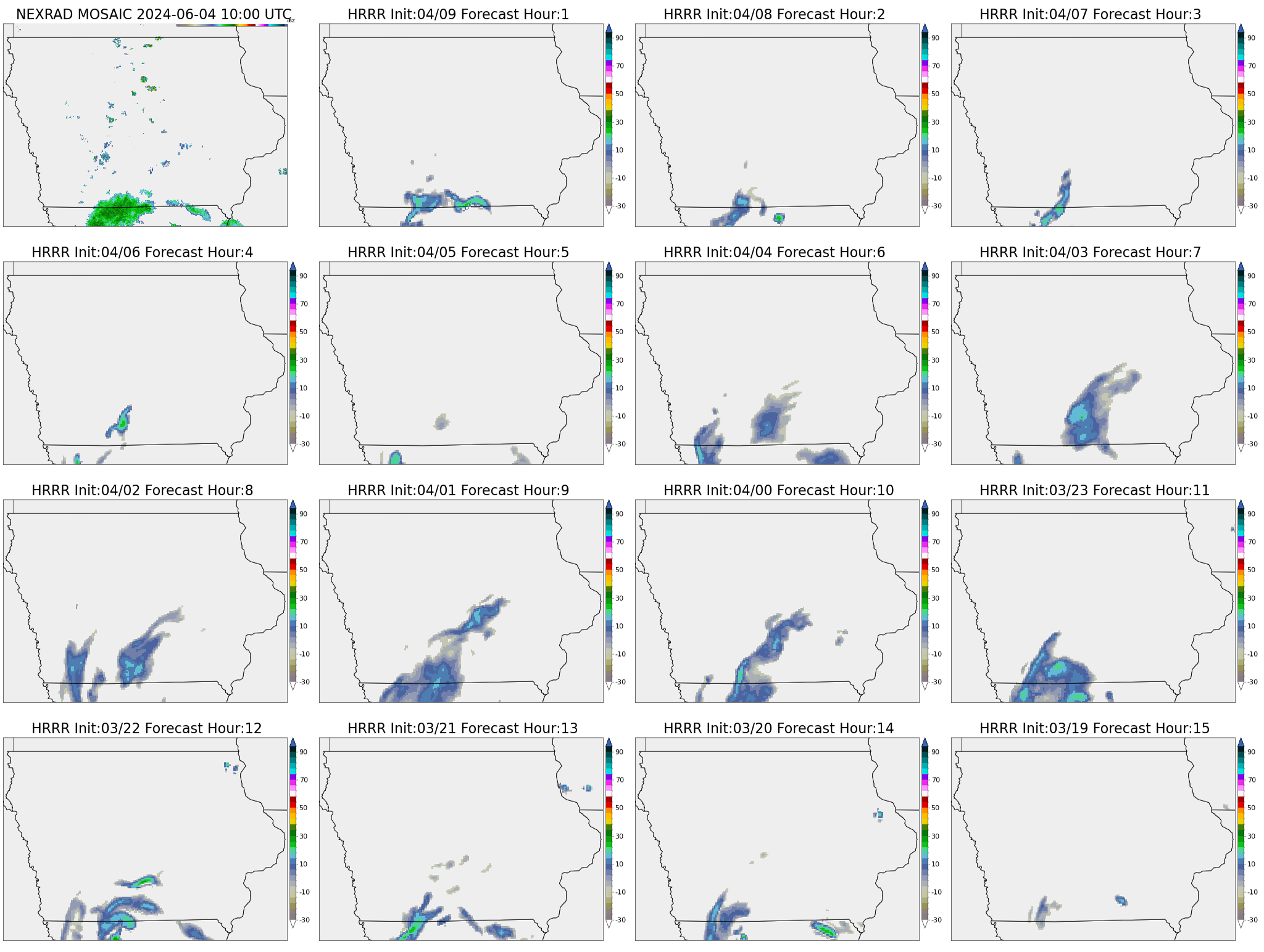
The NCEP deterministic HRRR model forecast produces a post processed field that is meant to resemble RADAR reflectivity. The lowest 1km HRRR product is plotted along with the IEM mosaic
#242. Local Storm Report (LSR) Simple Map
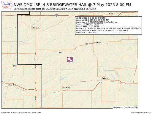
Presently, this autoplot is a backend for generating Local Storm Report social media graphics. You have to know the associated NWS text product id for it to be of any
#254. NEXRAD Level III Latency over NOAAPort

Map of NEXRAD Level III Latencies over NOAAPort or Realtime-ness. This autoplot has two modes of operation attempting to address two distinct data availability questions. Realtime-ness: This is a
#227. NWEM / NWS Non-VTEC Products containing a polygon
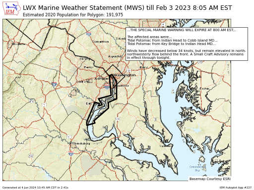
This plot is not meant for interactive use, but a backend for NWEM plots.
#236. PIREP Daily Counts by ARTCC / Alaska Zone
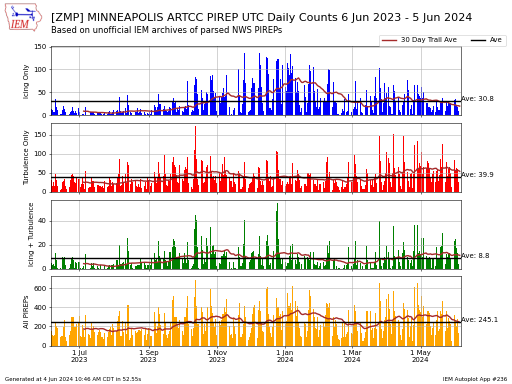
This autoplot presents a time series of UTC daily PIREP totals by ARTCC or Alaska Zone. The chart presents daily totals for PIREPs that contain icing (/IC), turbulence (/TB), icing
#220. SPC Convective / Fire Weather Outlook Graphics
This app generates infographics for the Storm Prediction Center or Weather Prediction Center outlooks. The trick here is how the valid time works. The app will first attempt to match
#217. SPS Special Weather Statement Maps
This plot is not meant for interactive use, but a backend for SPS plots. A more approachable frontend is to visit the NWS Text by WFO page and click
#219. Terminal Aerodome Forecast (TAF) Infographic
This app generates infographics for Terminal Aerodome Forecasts (TAF). You need not provide an exact valid timestamp for the TAF issuance, the app will search backwards in time up to