Automated Data Plotter
This application dynamically generates many types of graphs derived from various IEM data sources. Feel free to use these generated graphics in whatever way you wish.
1 Select a Chart Type
2 Configure Chart Options
Plot Description:
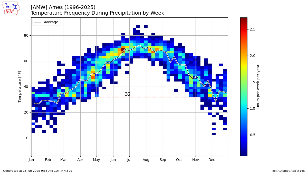
This chart displays the frequency of having measurable precipitation reported by an ASOS site and the air temperature that was reported at the same time. This chart makes an assumption about the two values being coincident, whereas in actuality they may not have been.3 Generated Chart
Based on recent timings, plot generation averages 8 seconds. Please wait while your chart is being generated...
If you notice plotting issues with the image above, please
contact us
and provide the URL address currently shown by your web browser.
IEM Daily Features using this plot
The IEM Daily Features found on this website often utilize plots found on this application. Here is a listing of features referencing this plot type.
- 30 Oct 2025: Chillier Precipitation
- 08 Mar 2024: Chilly Rainfall
- 11 Feb 2022: Mid-February Rain
- 24 Apr 2020: Warm Rain
- 15 Aug 2018: Play in the Rain
- 02 May 2016: Temps when Precipitating