Automated Data Plotter
This application dynamically generates many types of graphs derived from various IEM data sources. Feel free to use these generated graphics in whatever way you wish.
1 Select a Chart Type
2 Configure Chart Options
Plot Description:
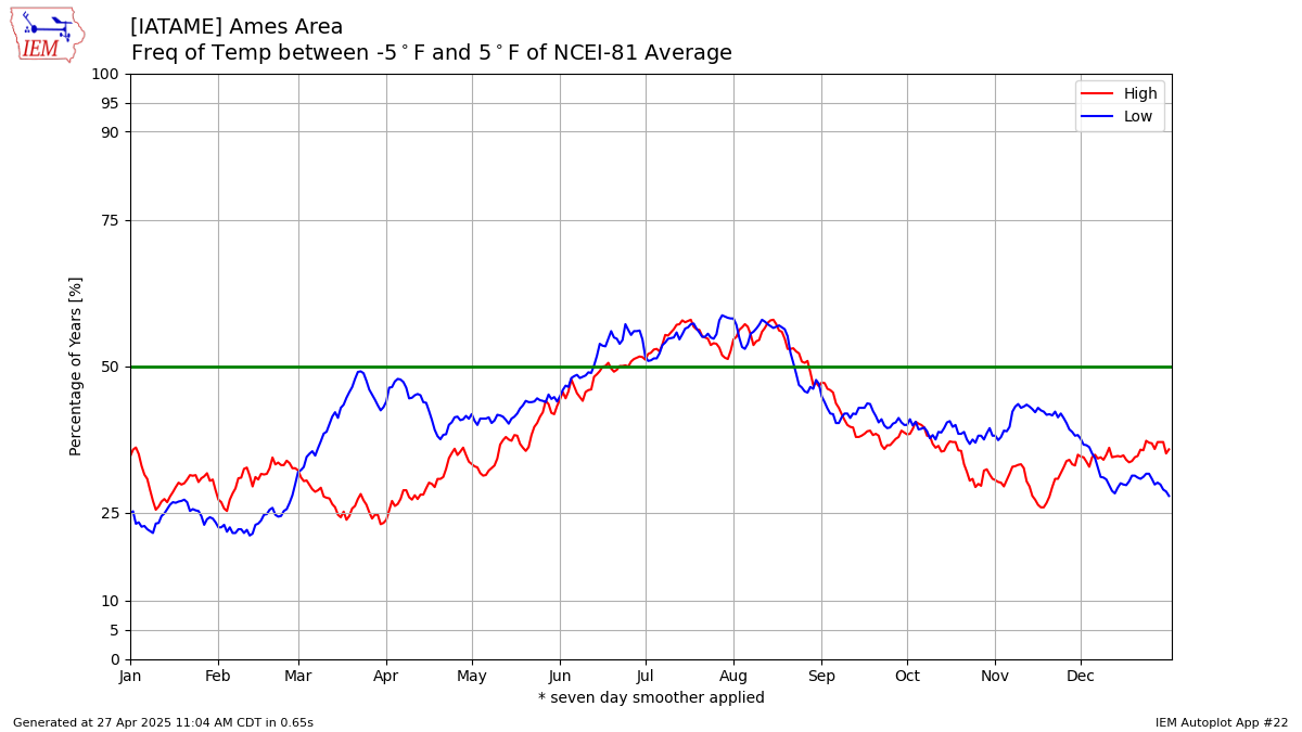
This plot displays the frequency of a daily high or low temperature being within a certain bounds of the long term NCEI climatology for the location.3 Generated Chart
Based on recent timings, plot generation averages 2 seconds. Please wait while your chart is being generated...
If you notice plotting issues with the image above, please
contact us
and provide the URL address currently shown by your web browser.
IEM Daily Features using this plot
The IEM Daily Features found on this website often utilize plots found on this application. Here is a listing of features referencing this plot type.
- 18 Nov 2025: Within 20 Degrees
- 21 Mar 2024: High/Low Frequency Difference
- 21 Mar 2022: Great First Day of Spring
- 14 Jul 2020: +3 Degrees and Warmer
- 10 Dec 2018: Within Five Degrees
- 05 May 2017: Within Two Degrees
- 24 Jun 2015: Close to Average
- 30 Sep 2014: Close to Average is Uncommon