Automated Data Plotter
This application dynamically generates many types of graphs derived from various IEM data sources. Feel free to use these generated graphics in whatever way you wish.
1 Select a Chart Type
2 Configure Chart Options
Plot Description:
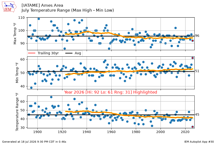
This chart presents the range between the warmest high temperature and the coldest low temperature for a given month for each year. The bottom panel displays the range between those two values. The black lines represent the simple averages of the data.3 Generated Chart
Based on recent timings, plot generation averages 2 seconds. Please wait while your chart is being generated...
If you notice plotting issues with the image above, please
contact us
and provide the URL address currently shown by your web browser.
IEM Daily Features using this plot
The IEM Daily Features found on this website often utilize plots found on this application. Here is a listing of features referencing this plot type.
- 04 Feb 2026: January Temp Range
- 17 Jan 2025: January Temperature Range
- 20 Apr 2023: An Average April
- 01 Jul 2021: Large June Range
- 09 Jul 2020: Tight July Range so Far
- 27 May 2020: May Temp Range
- 13 Nov 2018: November Ranges
- 03 Jan 2018: About the Decreasing Range
- 01 Nov 2017: October Range
- 17 Aug 2017: Muted August Range
- 13 Oct 2015: Room to the Downside
- 23 Jul 2015: July Ranges
- 22 Oct 2014: October Ranges