Automated Data Plotter
This application dynamically generates many types of graphs derived from various IEM data sources. Feel free to use these generated graphics in whatever way you wish.
1 Select a Chart Type
2 Configure Chart Options
Plot Description:
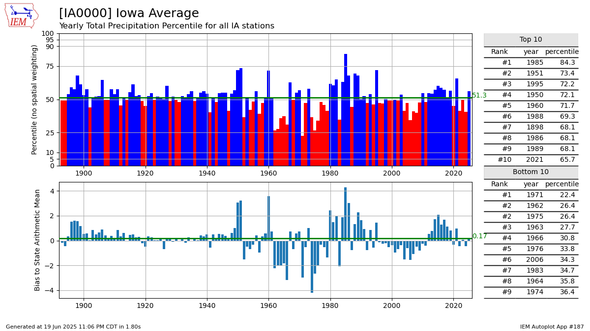
This chart presents the rank a station's yearly summary value has against an unweighted population of available observations in the state. The green line is a simple average of the plot.3 Generated Chart
Based on recent timings, plot generation averages 3 seconds. Please wait while your chart is being generated...
If you notice plotting issues with the image above, please
contact us
and provide the URL address currently shown by your web browser.
IEM Daily Features using this plot
The IEM Daily Features found on this website often utilize plots found on this application. Here is a listing of features referencing this plot type.
- 08 Jul 2026: Des Moines Heat Island
- 21 Jun 2024: Des Moines on Low End
- 28 Jul 2022: Sioux City vs Iowa
- 21 Dec 2020: Spencer vs Iowa
- 05 Apr 2019: Ames representing Iowa