Automated Data Plotter
This application dynamically generates many types of graphs derived from various IEM data sources. Feel free to use these generated graphics in whatever way you wish.
1 Select a Chart Type
2 Configure Chart Options
Plot Description:
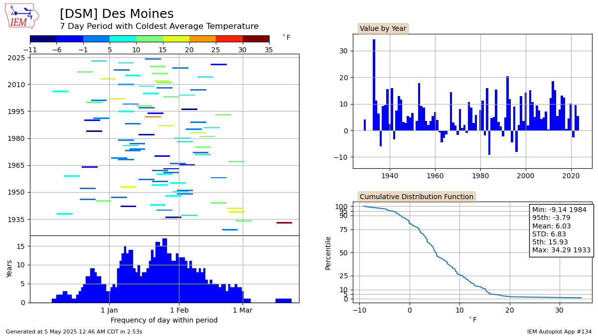
This plot displays the period of consecutive days each year with the extreme criterion meet. In the case of a tie, the first period of the season is used for the analysis. If you select any of the warmest options, the year must have at least 200 days of data.The dew point and feels like option only works for ASOS networks and does a simple arthimetic mean of dew point temperatures.
Note that the coldest and warmest feels like temperature values are averages of the daily minimum or maximum values, not an average of an average feels like temperature. This is why we can't have nice things.
3 Generated Chart
Based on recent timings, plot generation averages 3 seconds. Please wait while your chart is being generated...
IEM Daily Features using this plot
The IEM Daily Features found on this website often utilize plots found on this application. Here is a listing of features referencing this plot type.
- 12 Feb 2026: Coldest Seven Days
- 15 Sep 2025: Warmest Two Days
- 21 Oct 2024: Driest 45 Days
- 29 Aug 2024: Warmest Four Day Stretch
- 25 Sep 2023: Wettest Day in September
- 28 Jul 2023: Miserable 3 Day Stretch
- 04 Nov 2022: Max Rainfall in November
- 03 Aug 2022: Peak Dew Point
- 25 Oct 2021: Wettest Day
- 27 Jul 2021: Warmest Seven Days
- 18 Feb 2021: Coldest Ten Days
- 12 Sep 2020: Wettest Seven Day Period
- 25 Aug 2020: Warmest Five Days
- 25 Jul 2019: Warmer than last week?
- 08 Jan 2018: Coldest Eight Days for Lows
- 26 Sep 2017: Latest Warmest Stretch of the Year
- 20 Dec 2016: Coldest Low of Winter
- 19 Jul 2016: Warmest Three Day Period
- 07 Jan 2016: Coldest 7 Days
- 28 Jun 2011: Warmer weather to come?