Automated Data Plotter
This application dynamically generates many types of graphs derived from various IEM data sources. Feel free to use these generated graphics in whatever way you wish.
1 Select a Chart Type
2 Configure Chart Options
Plot Description:
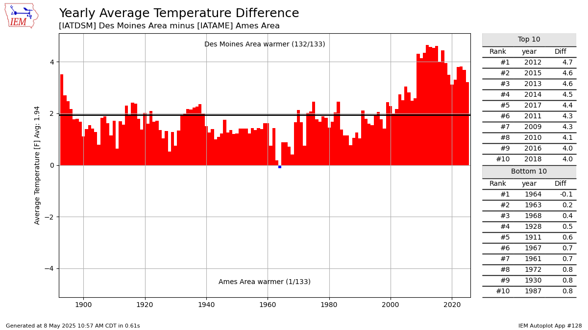
This chart compares yearly summaries between two long term climate sites. Only years with similiar observation counts are used in this data presentation.3 Generated Chart
Based on recent timings, plot generation averages 2 seconds. Please wait while your chart is being generated...
If you notice plotting issues with the image above, please
contact us
and provide the URL address currently shown by your web browser.
IEM Daily Features using this plot
The IEM Daily Features found on this website often utilize plots found on this application. Here is a listing of features referencing this plot type.
- 03 Jun 2026: Cedar Rapids vs Ames
- 09 Sep 2024: Algona vs Iowa
- 25 Nov 2022: Ames vs Sioux City
- 12 Mar 2021: Des Moines v Sioux City
- 26 Jun 2019: Comparing Corners of the State
- 06 Oct 2017: Ames vs Des Moines
- 10 Nov 2015: Des Moines vs Ames