Automated Data Plotter
This application dynamically generates many types of graphs derived from various IEM data sources. Feel free to use these generated graphics in whatever way you wish.
1 Select a Chart Type
2 Configure Chart Options
Plot Description:
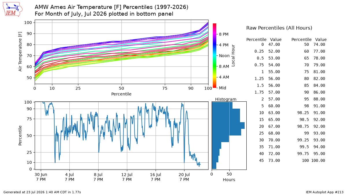
This application generates percentiles based on available data from the selected station. These types of applications are good at identifying bad data :(. The date you select is used to generate the bottom panel of explicit percentiles for the period of interest. The week is computed for the ISO-8601 week.If you generate this plot with the "year" option selected, you may get an unexpected result. The percentiles are computed over the entire year which means that about everything during the summer is near the top and everything during winter is near the bottom. More understandable results are found with shorter time windows of time to compute the percentiles.
3 Generated Chart
Based on recent timings, plot generation averages 9 seconds. Please wait while your chart is being generated...
IEM Daily Features using this plot
The IEM Daily Features found on this website often utilize plots found on this application. Here is a listing of features referencing this plot type.
- 15 May 2025: May Temp Percentiles
- 30 Sep 2024: Sept Temperature Percentiles
- 19 Jul 2024: Low July Dew Points
- 18 Aug 2022: August Dew Point Percentiles
- 17 Feb 2022: February Percentiles
- 11 Oct 2021: October Dew Point Percentiles
- 23 Jun 2021: June Extremes
- 05 Apr 2021: Remarkable First Four Days
- 28 Aug 2020: August Temp Percentiles