Automated Data Plotter
This application dynamically generates many types of graphs derived from various IEM data sources. Feel free to use these generated graphics in whatever way you wish.
1 Select a Chart Type
2 Configure Chart Options
Plot Description:
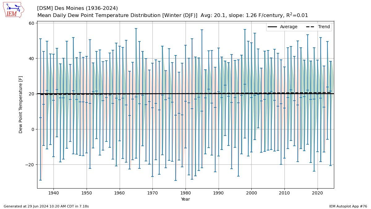
Simple plot of yearly average dew points by year, season, or month. This calculation was done by computing the mixing ratio, then averaging the mixing ratios by year, and then converting that average to a dew point. This was done due to the non-linear nature of dew point when expressed in units of temperature. If you plot the 'winter' season, the year shown is of the Jan/Feb portion of the season. If you plot the 'Water Year', the year shown is the September 30th of the period.You can optionally restrict the local hours of the day to consider for the plot. These hours are expressed as a range of hours using a 24 hour clock. For example, '8-16' would indicate a period between 8 AM and 4 PM inclusive. If you want to plot one hour, just set the start and end hour to the same value.
3 Generated Chart
Based on recent timings, plot generation averages 16 seconds. Please wait while your chart is being generated...
IEM Daily Features using this plot
The IEM Daily Features found on this website often utilize plots found on this application. Here is a listing of features referencing this plot type.
- 27 May 2025: Spring Season Average RH
- 01 Jun 2023: May Max VPD Averages
- 14 Jul 2021: July Dew Point Distributions
- 03 Jun 2021: Spring Season Dew Points
- 13 Aug 2019: Summer Dew Point Trend
- 15 May 2018: Lowest Average April Dew Point
- 01 Sep 2016: Humid Summer
- 25 May 2016: Low May Dew Points
- 04 Jun 2015: Spring Dew Points
- 04 Aug 2009: July Dew Points