Automated Data Plotter
This application dynamically generates many types of graphs derived from various IEM data sources. Feel free to use these generated graphics in whatever way you wish.
1 Select a Chart Type
2 Configure Chart Options
Plot Description:
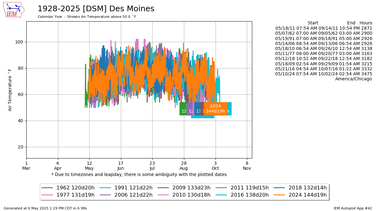
Based on hourly or better METAR reports, this plot displays the longest periods above or below a given temperature threshold. There are plenty of caveats to this plot, including missing data periods and data during the 1960s that only has reports every three hours. This plot also stops any computed streak when it encounters a data gap greater than three hours.You can additionally set a secondary threshold which then makes this autoplot compute streaks within a range of values.
Updated 16 Jan 2024: The option to control the minimum number of hours was removed. This option did not add much value as folks generally wish to see the top 10 longest streaks.
3 Generated Chart
Based on recent timings, plot generation averages 17 seconds. Please wait while your chart is being generated...
IEM Daily Features using this plot
The IEM Daily Features found on this website often utilize plots found on this application. Here is a listing of features referencing this plot type.
- 25 Sep 2025: September streaks above 57°F
- 17 Jan 2024: Lamoni at or below zero
- 29 Jun 2023: Summer Visibility Streaks
- 11 Nov 2022: November Streaks Below 40
- 17 Feb 2021: Cedar Rapids 100+ hours below 0
- 28 Oct 2020: Mason City below 40
- 26 Sep 2019: Sultry September Streaks
- 22 Feb 2019: Estherville Freezing Streak
- 31 Jul 2018: Streaks below 80 in July
- 04 Jan 2018: Almost 72 Hours Straight below 0
- 27 Jan 2017: Nine straight in January
- 22 Sep 2016: Sept 70+ Dew Point Streak
- 16 Dec 2015: Streak above Freezing in December
- 07 Sep 2015: Streak above 70 in September
- 17 Dec 2014: Above 50 in December
- 20 Nov 2014: November Frozen Streaks