Automated Data Plotter
This application dynamically generates many types of graphs derived from various IEM data sources. Feel free to use these generated graphics in whatever way you wish.
1 Select a Chart Type
2 Configure Chart Options
Plot Description:
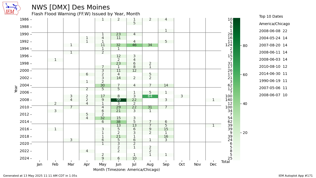
This chart displays the monthly number of distinct NWS Office issued watch / warning / advisory product. For example, a single watch for a dozen counties would only count 1 in this chart. These values are based on unofficial archives maintained by the IEM.The chart summarizes by the month of issuance, so long fuse products like Flood Warnings that cover multiple months in time would only appear once for the month of issuance.
If you select the state wide or FEMA option, the totaling is a bit different. A single watch issued by multiple WFOs would potentially count as more than one event in this listing. Sorry, tough issue to get around. In the case of warnings and advisories, the totals should be good.
Autoplot 243 allows for more direct plotting of daily record totals. Autoplot 245 produces a similar plot to this one, but with Local Storm Report (LSR) totals. Autoplot 109 produces maps in a similiar manner to this plot.
3 Generated Chart
Based on recent timings, plot generation averages 3 seconds. Please wait while your chart is being generated...
IEM Daily Features using this plot
The IEM Daily Features found on this website often utilize plots found on this application. Here is a listing of features referencing this plot type.
- 29 May 2025: 1 May Tornado Warning
- 15 Aug 2024: Severe Warnings for Omaha
- 29 Apr 2024: Record Warning Count
- 17 Jan 2023: Tornado Warnings in January
- 15 Dec 2022: Another wild December
- 23 Dec 2021: December Tornado Warnings
- 13 Oct 2021: Monthly Warning Counts
- 23 Apr 2021: Quiet April
- 14 Aug 2019: Monthly Dense Fog Advisories
- 27 Dec 2018: December SVR Warnings
- 22 Oct 2018: October Tornado Warnings
- 01 Mar 2017: February Tornado Warnings
- 29 Nov 2016: November Tornado Warnings Again