Automated Data Plotter
This application dynamically generates many types of graphs derived from various IEM data sources. Feel free to use these generated graphics in whatever way you wish.
1 Select a Chart Type
2 Configure Chart Options
Plot Description:
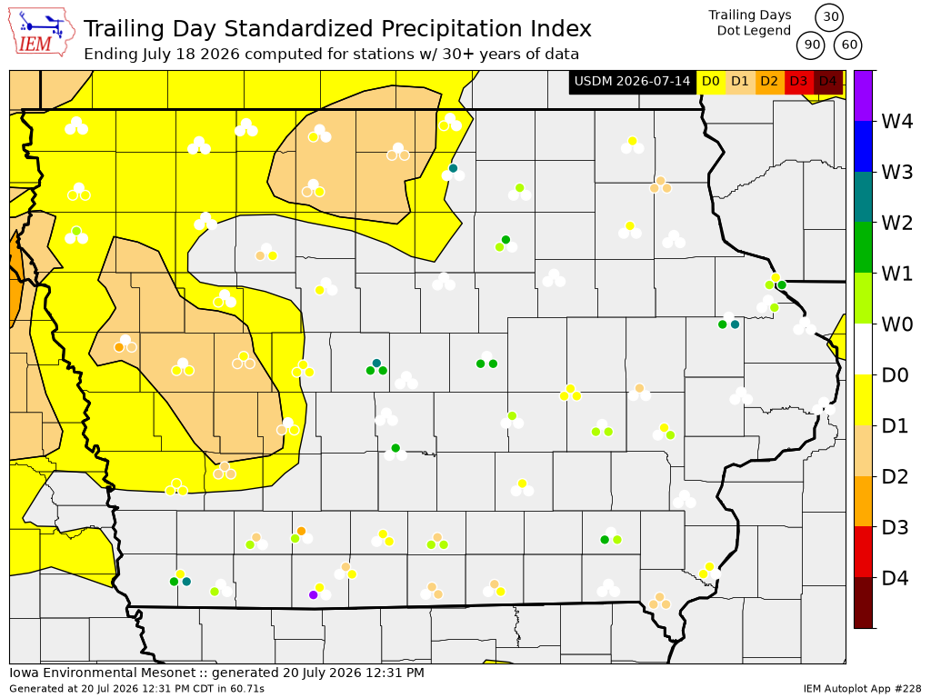
This visualization mashes up the US Drought Monitor and three trailing day standardized precipitation index of your choice within a map presentation for a single state. SPI is computed by the simple formula of(accum - climatology) / standard deviation.
This autoplot is extremely slow to generate due to the on-the-fly calculation of standard deviation. As such, an optimization is done to sub-sample from available stations since the resulting map can only display a certain number of data points legibly. This means that the dataset you download from this page does not contain all available stations for a given state :/
3 Generated Chart
Based on recent timings, plot generation averages 66 seconds. Please wait while your chart is being generated...
IEM Daily Features using this plot
The IEM Daily Features found on this website often utilize plots found on this application. Here is a listing of features referencing this plot type.
- 18 Feb 2026: 30/90/120 Day SPIs
- 09 May 2024: Driest areas need more rain
- 26 Aug 2022: Different Droughts
- 17 Jun 2022: Drought Dots