Automated Data Plotter
This application dynamically generates many types of graphs derived from various IEM data sources. Feel free to use these generated graphics in whatever way you wish.
1 Select a Chart Type
2 Configure Chart Options
Plot Description:
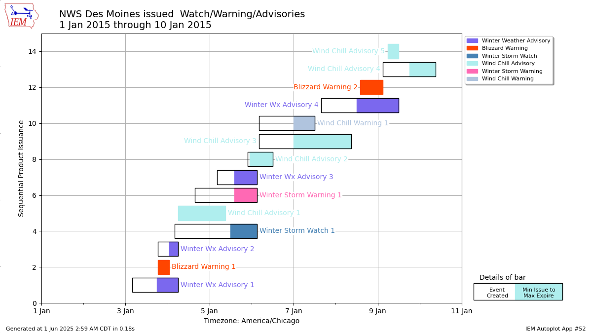
Gantt chart of watch, warning, and advisories (WaWa) issued by an NWS Forecast Office for a start date and number of days of your choice.The width of the bar is the duration of the event and is a bit difficult to explain for some WaWa types. The color shaded area represents the maximum period at least one county/zone was included in the event. The hallow area represents the period between when the NWS created the event to when it first hit its issuance time. This is a quirk of how VTEC works with things like winter storm watches going "into effect" at some time in the future. When there is no hallow area, these are events that went into effect immediately at issuance. For example, Severe Thunderstorm Warnings are all this way.
3 Generated Chart
Based on recent timings, plot generation averages 2 seconds. Please wait while your chart is being generated...
IEM Daily Features using this plot
The IEM Daily Features found on this website often utilize plots found on this application. Here is a listing of features referencing this plot type.
- 24 Nov 2025: Quiet November So Far
- 22 Jan 2024: Busy Two Weeks
- 13 Dec 2022: Week of Headlines
- 11 Feb 2021: Active Winter Weather
- 01 Dec 2019: Eventful Thanksgiving Week
- 27 Oct 2017: The Gamut of Products
- 27 Dec 2016: Active Four Days
- 17 Feb 2016: Active Two Weeks
- 09 Jan 2015: Busy Week
- 24 Jan 2014: January Headlines