Automated Data Plotter
This application dynamically generates many types of graphs derived from various IEM data sources. Feel free to use these generated graphics in whatever way you wish.
1 Select a Chart Type
2 Configure Chart Options
Plot Description:
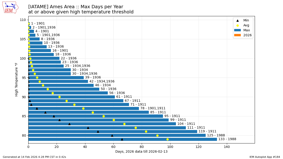
This plot shows the number of days with a high temperature at or above a given threshold. You can optionally generate this plot for the year to date period. The present year is not used for the computation of the average nor minimum value.3 Generated Chart
Based on recent timings, plot generation averages 2 seconds. Please wait while your chart is being generated...
If you notice plotting issues with the image above, please
contact us
and provide the URL address currently shown by your web browser.
IEM Daily Features using this plot
The IEM Daily Features found on this website often utilize plots found on this application. Here is a listing of features referencing this plot type.
- 05 Jan 2026: 2025 High Temp Days
- 07 May 2024: Above average counts
- 29 Apr 2022: Warm Days Count
- 08 Oct 2020: Most Days above High Temp Threshold
- 18 Apr 2019: Few Warm Days
- 19 Sep 2017: Many warm, few very hot days
- 13 Dec 2012: 2012: rewriting the record book
- 24 Oct 2012: Plenty of days over 63 to 83
- 26 Sep 2012: Most 80+ degree days
- 12 Sep 2012: Days above X