Past IEM Features tagged: climate
Upcoming Climate Normals Update
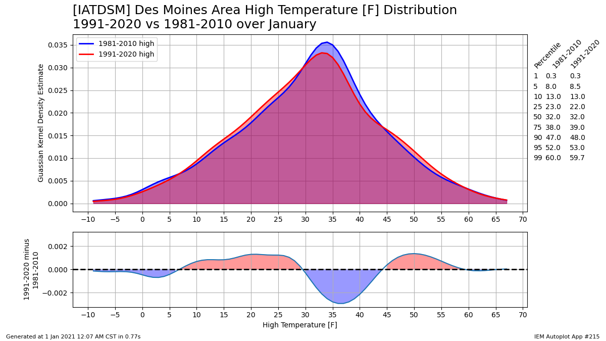
01 Jan 2021 05:35 AMThe year 2021 is mercifully here and one of the things climate folks are looking forward to this year is an updated climate normals dataset covering the 1991 to 2020 period, which will become the new official climatology. This standard 30 year climate period is updated every 10 years by the National Centers for Environmental Information (NCEI, formerly NCDC). This updated period will replace our current reference climate normals covering the 1981 to 2010 period. The featured chart presents a glimpse into what has changed over these two periods with the frequency distribution of daily high temperatures for Des Moines plotted for the month of January. The plot effectively becomes a comparison between the 2010s and 1980s, since the other two decades are constant for the plot. The bottom panel attempts to tease out the differences between the two distributions. So this plot shows a shifting of some days in the 30s to colder levels in the 20s and warmer into the 40s.
Voting:
Good: 6
Bad: 0
Tags: climate
Upcoming September Slide
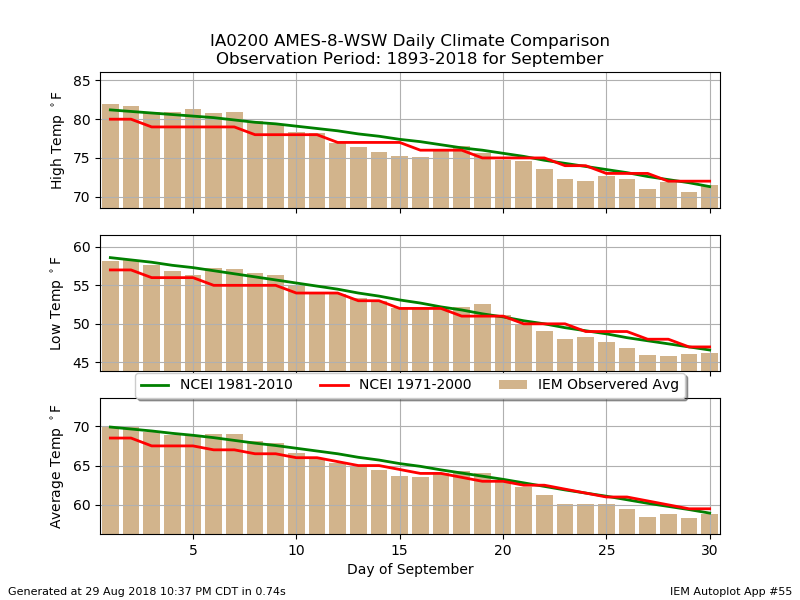
30 Aug 2018 05:33 AMAfter a sticky and stormy Tuesday, the weather felt amazing on Wednesday with sunshine, low humidity, and low 70s temperatures. It certainly felt like fall and a reminder that September is only two days away. The featured chart looks at the daily temperature climatology for Ames for September. Three different climatologies are shown as NCEI updates their standard climate period every ten years and the IEM generates a simple arithmetic average for each calendar date over the period of record. Regardless of the metric, the temperatures clearly slide downward for the month. We loose about 10 degrees of temperature from the start to the end of the month.
Voting:
Good: 7
Bad: 1
Tags: climate

Largest Month to Month Change
06 Jun 2018 05:35 AMYesterday's feature looked into the month to month change between April and May showing the exception departure it was from the climatology. For some locations, it was more than just exceptional but the largest on record. The featured map displays the largest *positive* month to month change in average temperature. The values plotted in red indicate that this year's change between April and May was the largest on record. These areas were likely helped to achieve the record by having substantial snow cover in April depressing temperatures for the month and allowing for a larger contrast into May.
Voting:
Good: 11
Bad: 3
Tags: climate

Rare Recent Record Low
05 Jan 2018 05:34 AMDes Moines started off the new year by establishing a new daily record minimum low temperature of -19 degrees. This broke the previous record of -18 set way back in 1887! The featured chart looks at the year that the present day daily record is either set or currently tied. The four sections present the year of the daily record and a simple decade frequency. For the current decade, setting record cold lows and cold highs have been rare. This decade has the lowest totals for both values. There are a number of interesting features of the chart including how the 1930s stand out for record warm highs and lows.
Voting:
Good: 12
Bad: 1
Abstain: 1
Tags: climate
Largest Yearly Totals
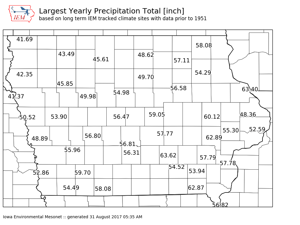
31 Aug 2017 05:40 AMTo finish off the series looking at Iowa precipitation climatology, the featured map presents the largest calendar year precipitation totals for long term climate sites tracked by the IEM in the state. As with the previous maps, there are storm totals from Harvey in Texas that are larger than even the largest yearly total in Iowa. This map does show a rather large northwest to southeast gradient in the state. Tomorrow's daily feature will look into why just a large gradient exists.
Voting:
Good: 10
Bad: 0
Tags: climate

Largest Monthly Totals
30 Aug 2017 05:34 AMAs with yesterday's featured map showing 24 hour precipitation maximums for Iowa, today's map shows maximum one month accumulations. Again, these totals pale in comparison with what was dumped over SE Texas from Harvey. Some reports in the area are in the 30 to 50 inch range, which are double of our wettest month in Iowa.
Voting:
Good: 14
Bad: 0
Tags: climate
Max 24 Hour Precipitation
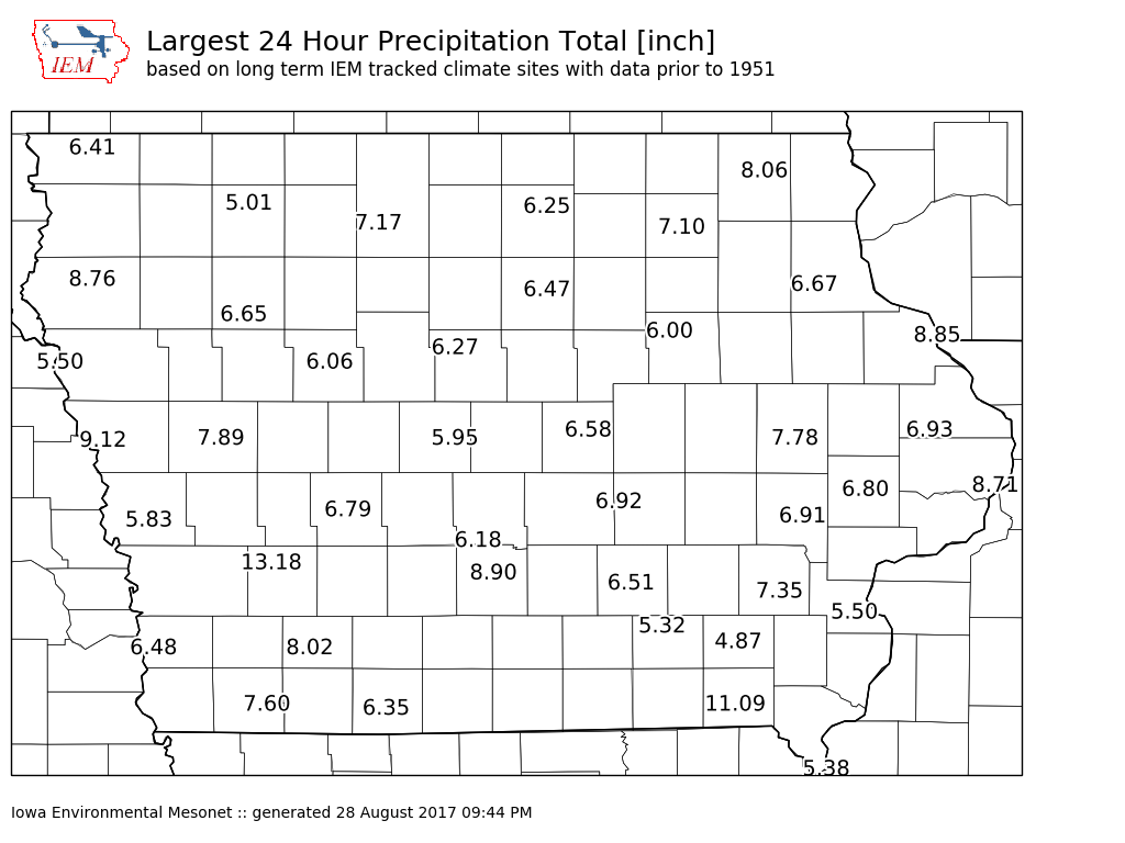
29 Aug 2017 05:34 AMThe hard to fathom amounts of accumulated precipitation continued overnight for SE Texas from Tropical Storm Harvey. Many locations in the Houston area have reported 24 hour totals well above 10 and even 15 inches. Putting aside that some of these same locations have reported such amounts for multiple days in a row, has Iowa ever seen anything close to those amounts? The featured map presents 24 hour max accumulations for long term climate sites that the IEM tracks. Almost all locations on the map have seen maximum amounts well below even 10 inches. The 13.18 report was from Atlantic back in June 1998. How can such a large difference exist between here and Texas? Iowa does not see slow moving tropical systems with a direct and immediate fetch of extremely moist air from the Gulf of Mexico. Our heavy rain makers tend to be progressive (they move along), don't last long enough to pile up 10+ inches of rain (sources of rich moisture are transient), and not as efficient of rain producers as tropical storm systems (cloud ice and hail reduce rainfall rates).
Voting:
Good: 12
Bad: 0
Tags: climate

September Slide
16 Sep 2015 05:40 AMThe featured chart displays three daily climatology datasets. Every ten years, the National Center for Environmental Information (formerly NCDC) produces a 30 year climatology. Those values for 1971-2000 and 1981-2010 are shown on the chart along with the raw daily averages based on the period of record computed by the IEM. On an individual day there are differences in these three datasets, so which one is right? The answer is they all are! The NCEI climatologies are smoothed to remove day to day variability that results from a 30 year sample size.
Voting:
Good: 15
Bad: 11
Abstain: 5
Tags: climate

Time of Observation Bias
10 Aug 2015 05:45 AMThe long term climate record is mostly daily observations that do not represent calendar day summaries, but values representing 24 hour periods ending sometime during the mid morning or mid afternoon. While this time may not seem significant, there are very important climate implications. The featured chart displays the result of computing 24 hour summaries based on the hourly Des Moines temperature reports. If the values computed when the 24 hour period is split at midnight (actual calendar day summaries) is considered the 'truth', the bias can then be computed for the other 23 possible hours of the day that the temperature record can be split over. The result of this plot is known as a time of observation bias, with the largest biases for high temperature appearing in the mid afternoon. How can this be? Consider a hypothetical Sunday with each hourly temperature of 95 degrees, then the following day has each hourly temperature of 75 degrees. If you compute the 24 hour totals at midnight, the high on Sunday is 95 and on Monday is 75. But if you take the observation at 4 PM, the high reported on Sunday would again be 95 and the value reported at 4 PM on Monday would also be 95! The 24 hour period ending at 4 PM on Monday would contain those 8 hours of 95 degree reports from Sunday evening, thus the high is 95!
Voting:
Good: 15
Bad: 6
Abstain: 6
Tags: climate bias
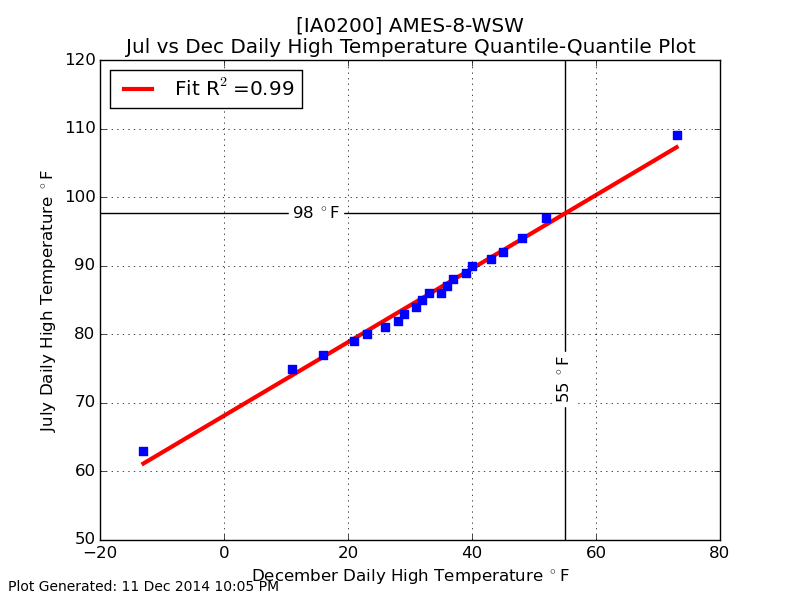
55 is like 98
12 Dec 2014 05:43 AMThe forecast continues to hold out hope for 50s this weekend. How exceptional is this warm of a high temperature in December? The featured chart is called a quantile quantile plot, which compares identical quantiles for two populations. In this case, the daily highs for July and December are compared for Ames. Each dot represents the same quantile for each populations and the red line is a least squares fit for dots. The correlation coefficient is nearly one, which indicates that the two populations have a very similarly shaped distribution. So for comparison, having a high temperature of 55 in December is like having a high temperature of 98 in July.
Voting:
Good: 30
Bad: 24
Abstain: 17
Tags: qq climate
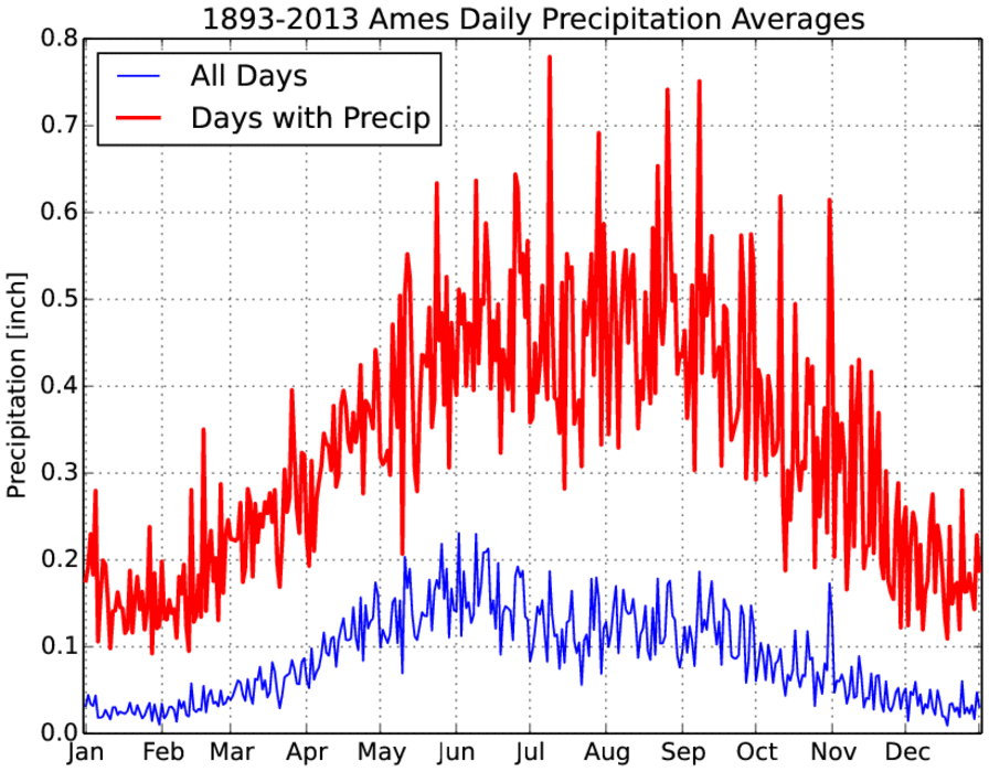
Daily Precipitation
11 Jun 2014 05:55 AMThe featured chart presents the daily climatology of precipitation for Ames using period of record data. The blue line represents the simple daily average of precipitation using all days and the red line is the simple average over only the days on which precipitation was reported. These two lines answer the question what is the average daily precipitation and what is the average daily precipitation when it actually precipitates that day. While the blue line peaks in early June, the red line plateaus through the summer. The nature of the summer time thunderstorms is rather consistent over the summer months, but their frequency decreases as the summer passes. So the blue line peaks during the peak in thunderstorm activity, while the red line decreases once we are out of summer and into September.
Voting:
Good: 11
Bad: 4
Tags: climate precip
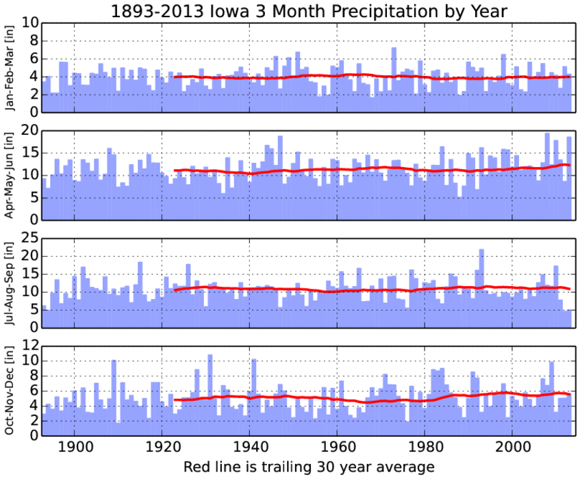
Seasonal Precipitation
24 Apr 2014 05:37 AMNeeded rainfall is currently falling over Iowa. This rainfall is needed due to the deficits that built up during the later part of the growing season in 2013. The featured chart presents the seasonal precipitation totals by year and a simple trailing 30 year moving average plotted as well. The recent few years have seen very dry conditions for the Jul-Aug-Sep period, but they have been compensated by wet springs. The complications with a wet spring are delays and difficulties with planting the agricultural crops.
Voting:
Good: 19
Bad: 4
Abstain: 4
Tags: precip climate
High + Low Percentiles
28 Jul 2013 07:46 AMThe low temperature dipped to 51 degrees for Des Moines on Sunday morning, which set a record low temperature. How common is this cold of a temperature in July? The featured chart presents a means by which low temperature frequencies can be compared to high temperature frequencies by equating their respective percentiles. A line is shown for each month of the year. So for July, the 51 degree low temperature compares with a high temperature around 104. Restating, Des Moines has about the same number of days at or below 51 degrees for a low temperature as it does for having a high temperature at or above 104. So you could say the weather this morning is as common as a high of 104!
Voting:
Good: 118
Bad: 13
Tags: qq climate highs lows

Above Freezing Precipitation
08 Feb 2013 05:37 AMMost of the precipitation that fell on Thursday over Iowa was at temperatures above freezing. Is that rare for the first week of February? The featured chart presents the weekly frequency of hourly precipitation reports from the Des Moines Airport with air temperatures at or above 32°F. A caveat is that frozen precipitation can hit the ground with temperatures slightly above freezing. For the first week of February, the frequency is about 25%. The chances of these mostly rain events dramatically increases by the end of this month with above freezing events becoming the most common in March.
Voting:
Good: 87
Bad: 11
Tags: climate precip
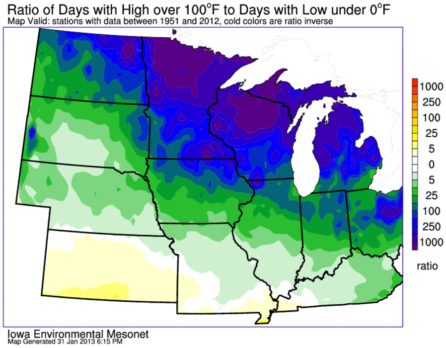
Cold Bias
01 Feb 2013 05:44 AMMost of the state is below zero this Friday morning. The featured chart presents an analysis of the ratio of days above 100 degrees to days below 0 degrees Fahrenheit. Locations with more days below zero have the ratio flipped to keep all values positive. Locations in white are the closest to having equal days above 100 and below 0. Nearly all of the Midwestern US has many more days below zero and there is a large gradient over Iowa. Southwestern Iowa has roughly 10 times as many days below zero than above 100, while Northeastern Iowa is around 100 times as many days! The moral of the story is that the number of days below zero dwarfs the number of days above 100 for most of the region.
Voting:
Good: 49
Bad: 12
Tags: climate 100
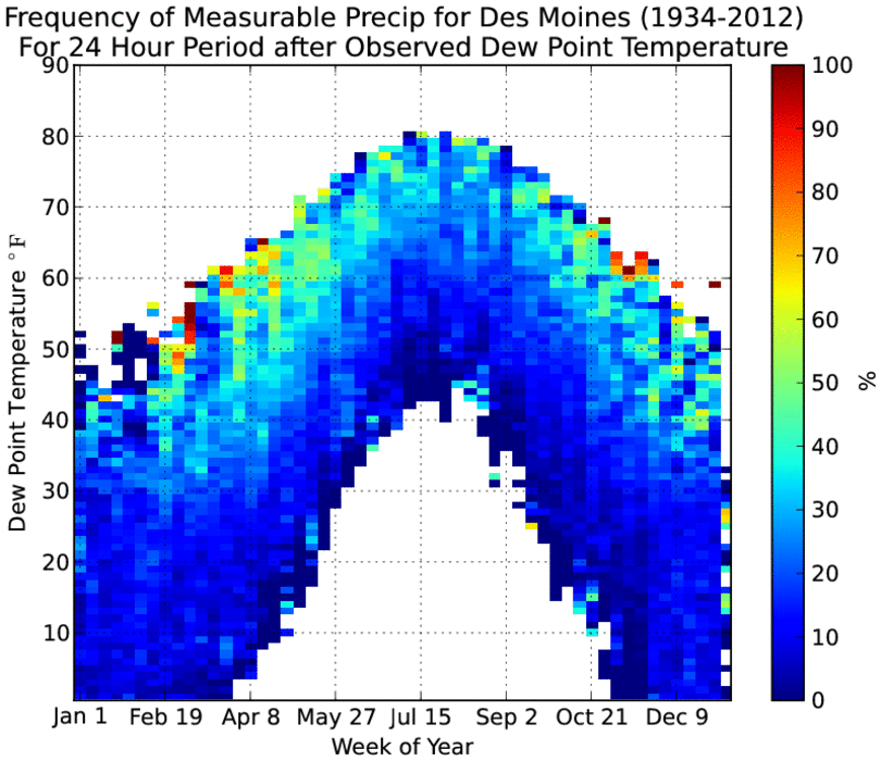
Dew Points then Precipitation
25 Oct 2012 05:00 AMThe very muggy air that has visited Iowa for the past fews days is almost swept clean from the state with the passage of a strong front this morning. It took a bit for showers and thunderstorms to get going Wednesday evening, but the rains did come after sunset. The featured chart looks at the frequency of getting measurable precip for a 24 hour period after a given dew point observation by week of the year. The general pattern is with increased dew points for a given week, the chances of precip increase as well. The highest frequencies are for the spring and fall periods at relatively high dew points for that time of year. These higher dew points are often associated with storm systems that draw moist air from the gulf region northwarn and eventually lead to precipitation, like what is happening today.
Voting:
Good: 27
Bad: 3
Tags: precip dewpoint climate
Proxy for statewide precipitation
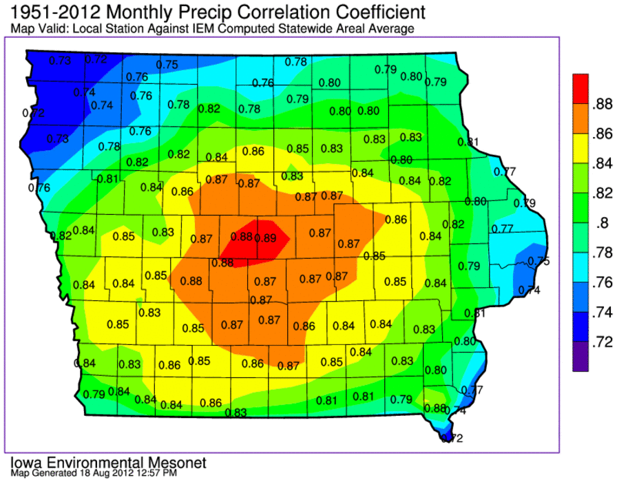
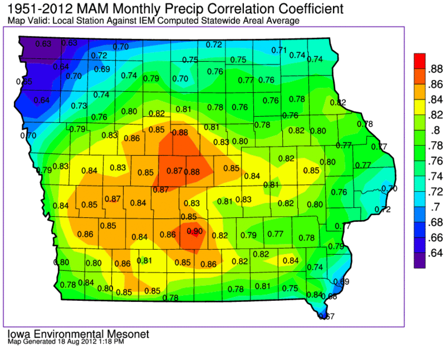
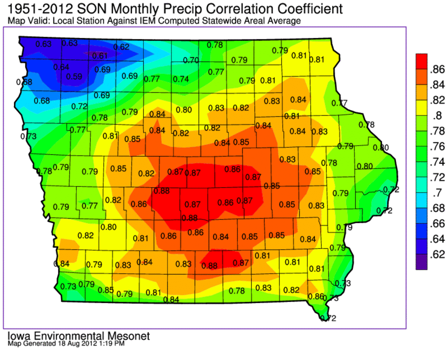
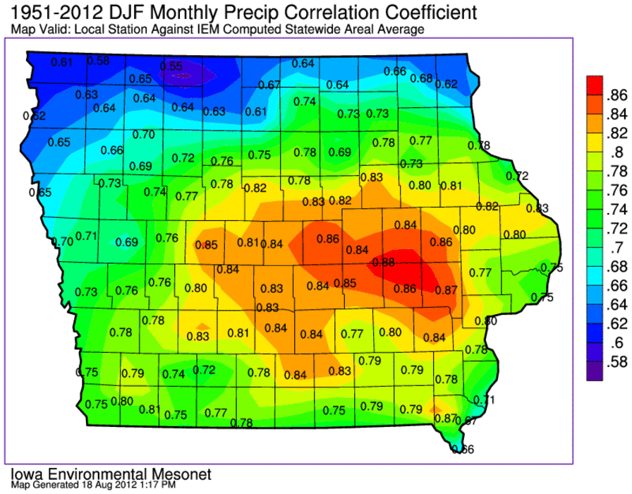
18 Aug 2012 01:10 PMSince we like to identify ourselves by the state we live in, climate parameters are often provided on a state by state basis. Given that precipitation varies on very fine spatial and temporal scales, how representative are statewide values for a location in Iowa? The featured map presents a simple analysis of the correlation coefficient between the monthly statewide precipitation value and the local site's monthly total. One could think of this map as which location in the state has monthly precipitation that most resembles the statewide areal average. Intuitively (since we are a land locked state), the middle of the state is the most representative. Northwestern and extreme southeastern Iowa show up with the lowest values as they both lie at the extremes of the annual precipitation for the state. Ames shows up with the highest value, so those of us at Iowa State are the most representative of Iowa! :)
Here is the same plot split by seasons: spring, summer, fall, winter
Voting:
Good: 72
Bad: 29
Tags: climate

Do we need severe weather?
06 Jun 2012 05:46 AMThe proverb "you have to take the good with the bad" may apply to rainfall that comes along with thunderstorms in Iowa producing severe weather. How much do these severe thunderstorms contribute to Iowa's total rainfall? The featured chart presents the contribution of yearly rainfall totals for Des Moines during time periods under which the airport was under either a severe thunderstorm or tornado warning, the period including the hour before and after severe weather, and the rest of the year. The +/- hour period does not include the warning period or any other warnings that may have been active at the time. This chart is based on the one minute interval precipitation observations. Based on this data, these thunderstorms generally bring around 10% of the yearly total of precipitation. The severe thunderstorm contribution so far for 2012 is much higher due to an intense storm back on 14 April and the limited data so far this year.
Voting:
Good: 36
Bad: 14
Tags: precip climate
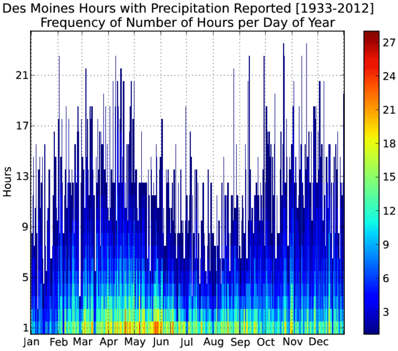
Length of Rain
01 Jun 2012 05:47 AMThe last day of May saw a remarkably cool and drizzly day. The Des Moines ASOS weather sensor reported measurable precipitation for 15 of the 24 hours during the day. The featured chart presents the frequency of hourly reports of precipitation per day of the year based on hourly reports back to 1933. There is a clear signal in this chart showing maximums in precipitation duration in mid spring and late fall. These are common times for large storm systems that could produce precipitation over longer time periods than summer when our weather is dominated by smaller scale storm systems and individual thunderstorms. One caveat to this plot is that our summertime storm systems frequent the state in the late evening into the next morning, so their time totals would be split over two days moreso than other times of the year.
Voting:
Good: 61
Bad: 16
Tags: precip climate

Importance of May
29 May 2012 05:37 AMWith May now winding to a close, it appears this month will come in well below average for most of the state. May is an important month to the yearly contribution of precipitation as shown by the featured chart. The chart shows the frequency of having a month with the same direction of departure as the year long total. For example, having this May be below average precipitation along with having the year of 2012 be below average precipitation. Interestingly, May has the largest frequencies in both directions. Precipitation in May can help "set the table" for the rest of the summer, as a wet May leads to wetter soils and more precipitation chances for the summer. A dry May can have the opposite effect. Most concerning is that this chart would indicate a 75% chance of having below average precipitation for 2012.
Voting:
Good: 33
Bad: 7
Tags: may climate precip
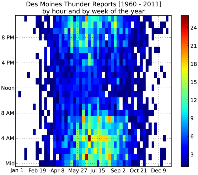
Thunder Climatology
19 Apr 2012 05:57 AMNow that we are in a stormy springtime pattern, most people know that night time is best time for thunder storms in Iowa. Of course, this is also the time when most of us are trying to sleep! The featured chart presents the climatology of thunderstorm reports from the Des Moines Airport partitioned by hour of the day and week of the year. The highest frequencies are clearly during the night time hours in the spring and summer seasons. Prior to about mid April, there does not appear to be much of a night time signal with all hours of the day having about the same frequencies.
Voting:
Good: 29
Bad: 4
Tags: lightning climate
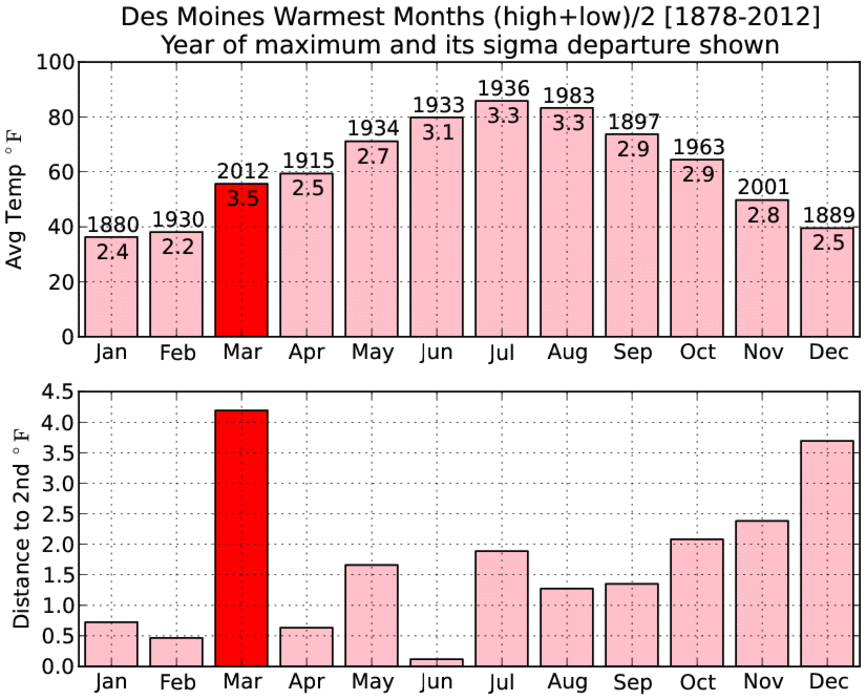
Relatively warmest month on record
01 Apr 2012 08:25 PMOur recently finished month of March has rewritten the record books in the Upper Midwest and in some respects, was relatively warmer than the iconic months during the dust bowl era! The featured chart presents the monthly record temperatures for Des Moines. The top chart presents the record temperature along with the year it occurred and the sigma departure the value was from current day average. The bottom chart presents the amount the current record is warmer than the second warmest month on record. The value of 3.5 sigma is shown for March 2012, which is larger than any of the other months. The sigma value represents how far the observation is away from the mean distribution of climatology. It provides a simple, but not complete, means to compare different months of the year. Regardless of that comparison, the bottom chart shows another exceptional aspect by besting the previous record by over four degrees! In this regard, this month is the most exceptionally warmest as well! Amazing to think about what we just experienced in the context of climatology for Iowa!
Voting:
Good: 30
Bad: 9
Tags: march month climate

Annual cycles
22 Dec 2011 05:57 AMThe day with the least amount of daylight is also the start of the winter season. This at first may seem counter-intuitive as the sun is the energy source for heating the ground which then heats the air. We have about another month yet to go before we see the coldest average air temperatures as shown by the featured chart presenting the daily climatologies of air and soil temperatures along with daylight length. You can see that none of these curves exactly line up with their maximums and minimums shifted in time slightly.
Voting:
Good: 24
Bad: 5
Tags: daily climate soil daylight
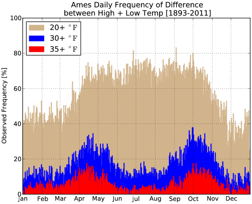
Big Warmup for late November
01 Dec 2011 05:58 AMTemperatures yesterday warmed 37 degrees for Ames after a chilly start in the low teens. Having this large of a daily warm up is somewhat rare for this time of year as shown by the featured chart. The chart presents the frequency of 20+, 30+, and 35+ degree differences between the daily low and high temperature. The spring and fall seasons show up clearly in this chart along with a general annual signal of the 20 degree line. The dip in frequencies for the largest differences in the summer is due to shorter nighttime periods (less time to cool off) and abundance of water vapor to help moderate any temperature moves.
Voting:
Good: 16
Bad: 3
Tags: climate highs
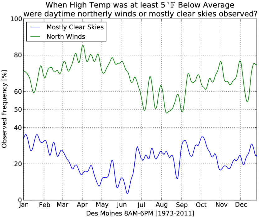
Cool days and clear skies
08 Sep 2011 05:50 AMThe weather these past few days has been remarkable for cool high temperatures along with mostly clear skies overhead. The featured chart attempts to look at the relationship of having cool days along with mostly clear skies or northerly winds. While the determination of these two criteria was somewhat arbitrary, the signal appears to be reasonable. Having northerly winds is common for these cool days, but least important during the summer time when the air to our north may not be that cold. Clear skies are the least common during May and June, when are surface heating rates are the largest.
Voting:
Good: 8
Bad: 5
Tags: climate clouds highs
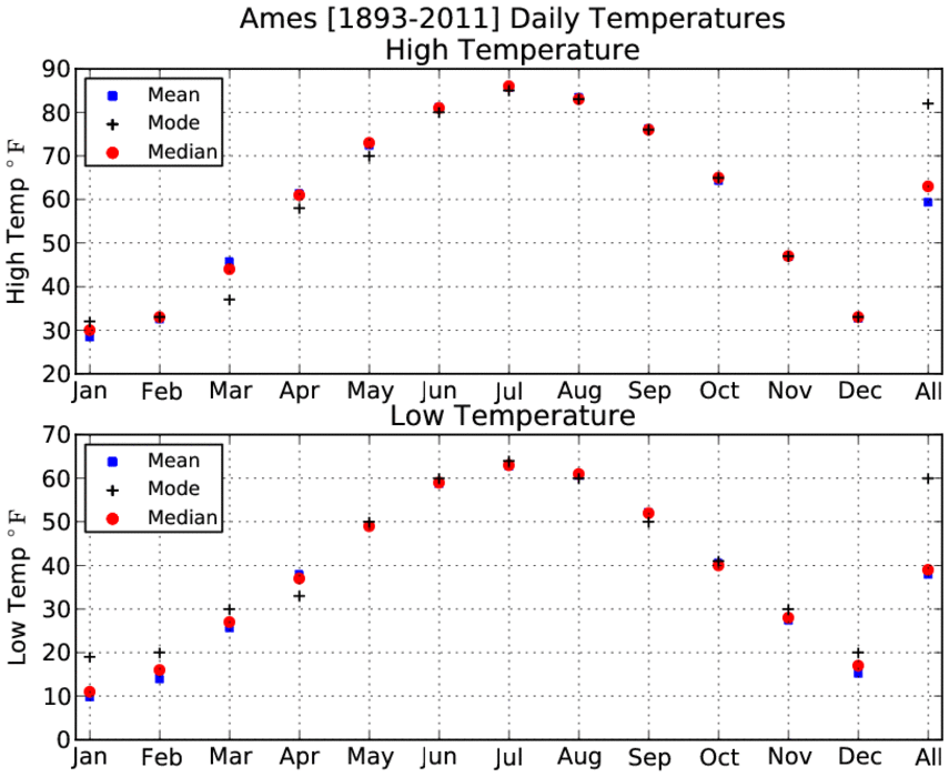
Mean, Median, and Mode
22 Aug 2011 06:03 AMToday is the first day of school for many, so the featured chart presents a refresher of something you should learned in middle school math. There are many ways to statistically represent a distribution of values. Three of those ways are the mean, the median, and the mode. The featured chart presents these three values for all daily temperatures on a monthly and annual basis. In general, these three values are close to each other except during the winter and springtime. The last value is for the entire year and there is a large difference between the mode and median/mean. Our summertime can be very persistent thanks to high humidities holding temperatures around 60 over night and in the low eighties during the day. This is about what our weather has been like for the past week and will be like for most of the coming week.
Voting:
Good: 15
Bad: 2
Tags: stats climate

Warmer weather to come?
28 Jun 2011 05:54 AMThe featured chart presents the frequency of a given day being one of the seven warmest for the year. July is clearly the winner with most days having an one in ten chance of being one of the seven warmest for the year. The red bars indicate the warmest seven days so far this year and given that these days fall outside of the higher probabilities, perhaps we can expect warm days ahead in July with highs well into the 90s? The forecast has highs above 90 on Thursday and Friday.
Voting:
Good: 13
Bad: 2
Tags: highs climate
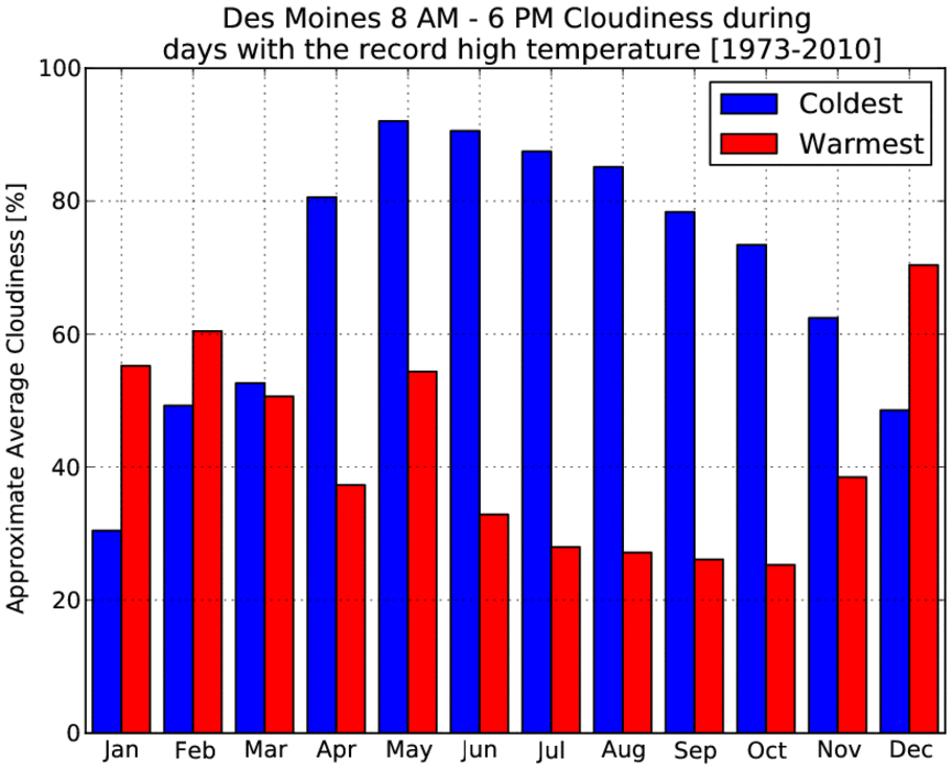
June Highs and Clouds
23 Jun 2011 05:55 AMHigh temperatures on Wednesday struggled in the 60s and were only a few degrees warmer than the coldest high temperatures on record for the date. This was thanks to a thick cloud cover and cold air brought in from our north. The featured chart looks at a measure of the amount of cloud cover on days were the high temperature was at record minimums and maximums. It makes intuitive sense that the coldest days are typically more cloudy during the spring, summer, and fall months as the sun is effective at warming the ground thanks to its high declination. Clouds are less important in the winter months as temperatures are dominated by organized air masses and the sun is less effective. For the warmest temperatures, having more sunny conditions are the most important in October it appears. Outside of a blip for warmest days in May, the plot has two clear annual signals!
Voting:
Good: 14
Bad: 5
Tags: highs climate clouds

Biggest Changes
21 Feb 2011 09:38 PMRecently, Bartlesville Oklahoma went from a low temperature of -28 F on the 10th of February to a high temperature of 82 F on the 17th. This is a remarkable 110 degree change on the seventh day. Can any site in Iowa compete with this? The featured chart presents an IEM computation of historical climate data in Iowa and the largest value is 106 degree change on the 9th day. This happened during a remarkable period in February 1930 for Webster City after a low temperature of -34 was followed by highs in the 60s and then 72 on the 24th. Please note that the number for the 0th day is simply the difference between the high and low temperature (Tripoli 18 Jan 1996).
Voting:
Good: 13
Bad: 3
Tags: climate high low extreme
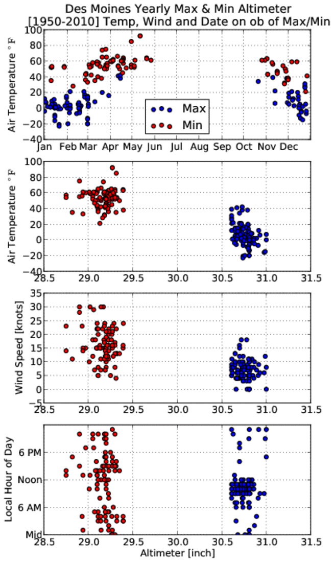
All about pressure
09 Feb 2011 03:33 AMVery cold air has settled into the state thanks to a robust area of high pressure. The altimeter reading (a measure of pressure) yesterday morning was a few hundredths of an inch below the highest value reported so far this year. The featured chart presents the yearly events of when the highest and lowest altimeter readings were observed. The first chart compares the air temperature against the day of the year for the observation. The highest pressure events are associated with colder temperatures than low pressure events as confirmed by the second chart. Low pressure events tend to be with dynamic storm systems (upward motion) that are windier than high pressure events (downward motion). The last chart shows the time of day that each event type occurs. High pressure events mostly occur during the morning hours when the atmosphere is still cooling, while low pressure events happen about any time of day.
Voting:
Good: 22
Bad: 6
Tags: climate pressure
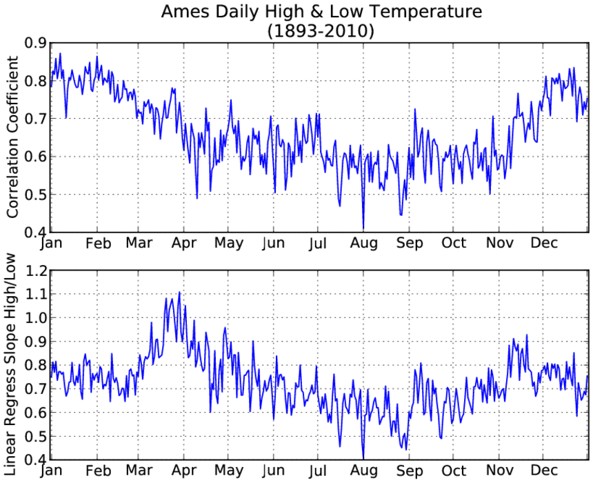
Daily High & Low Correlation
05 Feb 2011 05:46 AMThe featured chart presents the daily computed correlation between the high and low temperature. Higher values imply a closer relationship between changes in highs and lows. For example, a cold low temperature would typically imply a cold high temperature for that day. There is a clear annual signal shown, but the question is what causes it... One reason may be that the increase in moisture and warming soil temperatures cause overnight lows to moderate and not vary as much. Another potential explanation is that air masses dominate in the winter season and perhaps that causes highs and lows to be more regular. What do you think? Feel free to comment on this via facebook!
Voting:
Good: 20
Bad: 7
Tags: climate high low
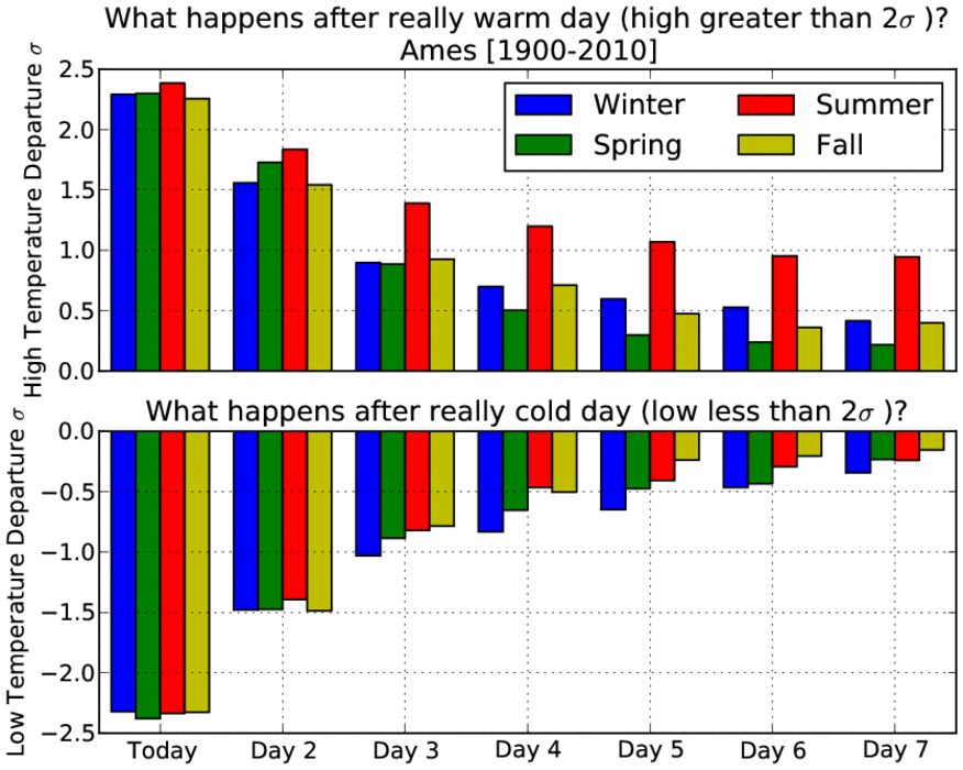
How fleeting are hot or cold days?
07 Jan 2011 05:56 AMThe featured chart presents the average temperature departure from average after a day that has either a high temperature two standard deviations (two sigma) warmer than average or a low temperature two sigma colder than average. You could think of this plot as examining how persistent really warm or cold days are. The plot is divided up by seasons showing how warm temperatures in the summer time tend to stick around longer than in the other seasons. Warm weather in the winter time is not as fleeting as one might have expected. Cold weather tends to stick around slightly more in the winter time than other seasons. Very cold air is set to arrive this weekend and stick around for most of next week.
Voting:
Good: 20
Bad: 7
Tags: climate high low extreme
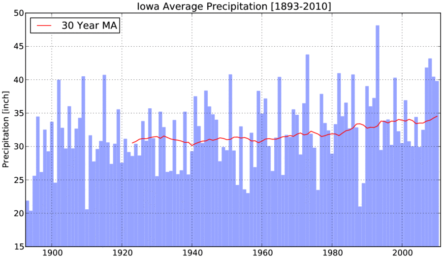
Another wet year
05 Jan 2011 05:46 AMBased on some preliminary data and IEM estimates, 2010 will go down as the four year in a row wetter than a recent trend of 30 years of Iowa data. The featured chart presents the yearly areal averaged precipitation along with a trailing 30 year moving average. The flood year of 1993 and drought year of 1988 stick out in this chart. The trend line has increased in this chart by roughly 4 inches in the past 50 years (~12%).
Voting:
Good: 20
Bad: 5
Tags: climate precip

Cold November Rains
30 Nov 2010 05:47 AMA passing storm system brought rains to primarily eastern Iowa on Monday and with temperatures only in the 40s, it was certainly a cold rain. The featured chart presents the temperature at which the Des Moines ASOS sensor reported an hourly precipitation greater than 5 hundredths of an inch (think of it as the temperature during which the precip fell). The top plot shows that during the summer time, these rain events rarely occur below 60 degrees whereas in late November they occur at 55 degrees and less. Getting stuck outside during a rain is certainly more pleasant in July! The bottom plot shows a comparison between the temperature and reported one hour precipitation total. The bottom plot shows an interesting feature whereby nearly all the heavy one hour events occur at temperatures above 60 degrees. Surface temperatures can be thought of as a proxy to the amount of water capable of being held in a column of atmosphere. To get heavy precipitation rates, one needs a warm column capable of holding more water vapour to yield precipitation.
Voting:
Good: 31
Bad: 5
Tags: climate precip

First Flakes of Fall
28 Oct 2010 05:52 AMThe first snow flakes of the season where reported yesterday afternoon over extreme northwest Iowa thanks to our large storm system to the north. The featured chart presents the first fall occurence of snow as reported by the sensors at the larger Iowa airports and the human COOP observers. The average first occurence is around the first of November, so yesterday's snow is nothing exceptional. The winds are finally expected to die down some this evening with the coldest night of the season on the way for tonight.
Voting:
Good: 44
Bad: 4
Tags: climate snow 2010

Changes in time
19 Oct 2010 05:52 AMA final feature on the diurnal temperature cycle. This plot presents a crude analysis of when the low and high temperature occurs each day based on minute interval data. Some adjustment was done to the plot to remove cases of having the low or high temperature set at midnight. The plot nicely shows the annual cycle of when the low temperature occurs, which is typically just before sunrise. The high temperature is more constant and typically occurs around 4 PM CDT (or 3 PM during the winter time). Many people think the highest temperature occurs at noon when the sun is the most direct (highest in the sky), but since the net downward radiation is still positive well into the afternoon, we continue to warm.
Voting:
Good: 22
Bad: 3
Tags: climate temp
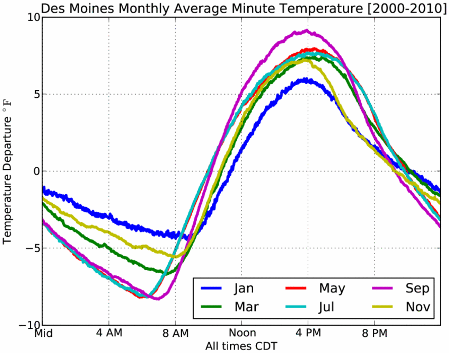
Monthly patterns
18 Oct 2010 05:47 AMContinuing along looking at the diurnal cycle of temperatures, the featured graph presents the monthly average for six months out of the year. The weakest signal is shown in January and the strongest in September. It is interesting to contrast the patterns as September has the most rapid warming, but also the most rapid cooling. This is a result of still having significant sunshine, but also dry air allowing the rapid changes. It is curious to note how similiar July and May are. This analysis is based on minute interval data dating back to only 2000.
Voting:
Good: 22
Bad: 1
Tags: climate temp

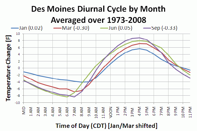
Daily Temperature Cycle
16 Oct 2010 06:25 AMThe featured chart presents the average daily diurnal temperature cycle. The values are the departure from the daily mean temperature. The chart nicely depicts the profile of when the warmest and coolest temperatures are each day. The magnitude of the values during the winter season are less due to the decreased power of the sun and dominance of warm and cold air advection not forced by the sun. This time of year and April see the strongest diurnal signal thanks to decreased amounts of water vapor in the air (warms and cools more quickly).
Voting:
Good: 36
Bad: 9
Tags: climate temp
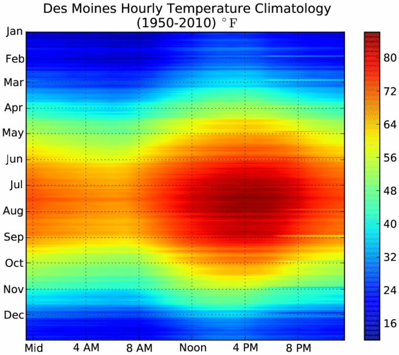
Hourly Temps
15 Oct 2010 05:55 AMThe colorful feature image presents the hourly temperature climatology by hour and day of the year for Des Moines based on 60 years of data. The plot shows our warmest time of the year during the mid afternoon in July and our coldest time of the year during the early morning hours in January. For mid October, you can see our warm afternoon temperatures are fleeting with cooler weather increasing with each passing day. Our actual weather looks to continue the pleasant weather streak with highs in the 60s and low 70s.
Voting:
Good: 35
Bad: 9
Tags: climate temp
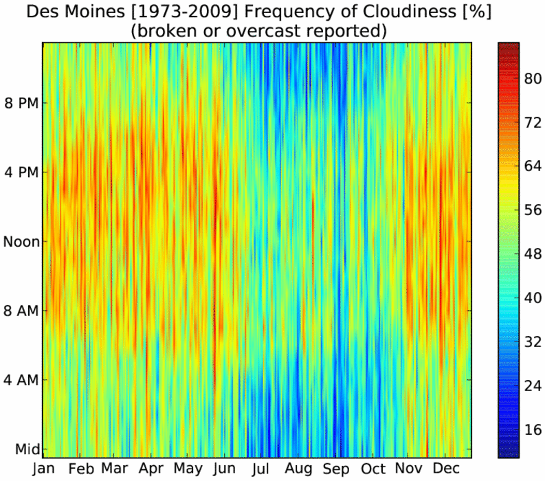
Frequency of clouds
01 Oct 2010 05:47 AMThe featured chart presents the hourly frequency of cloudy or mostly cloudy skies by day of the year based on observation data at the Des Moines Airport. The plot has a number of interesting features about the diurnal and annual cycles in Iowa. Firstly, a good number of our clouds are a result of day time heating by the sun. The late summer and fall months show up nicely for having fewer clouds during the night time. The forecast for the next 5-7 days continues to keep most of the clouds away with very pleasant fall weather!
Voting:
Good: 68
Bad: 14
Tags: climate clouds

Above average humidity returns again
23 Sep 2010 05:02 AMA push of warm and moist air has once again invaded the state making today feel more like summer than fall. The featured chart presents the climatology of near surface water vapor mixing ratio, which is a measure of the amount of moisture held in the atmosphere. The summer of 2010 has certainly seen more than its fair share of humidity as noted by the dominance of red in the lower plot. The grey filled area in the top plot represents the range of mixing ratio. It is interesting to see that the lowest values in the summer are still higher than the maxes in the winter.
Voting:
Good: 25
Bad: 8
Tags: dewpoint 2010 climate
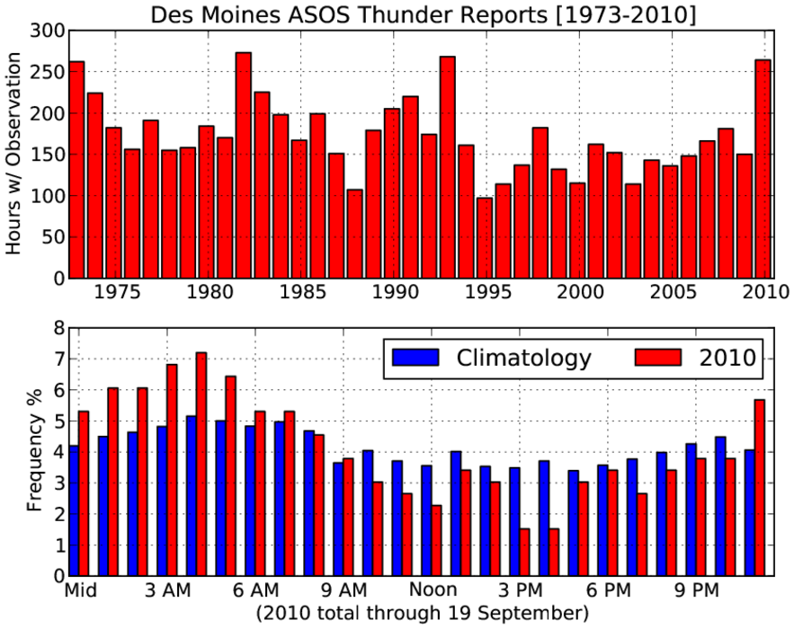
Noisy Nights
20 Sep 2010 05:55 AMNumerous rounds of thunderstorms dumped hail and heavy rainfall on primarily southern Iowa this past weekend. The featured chart presents a summary of the number of automated weather station reports of thunderstorms from the Des Moines airport sensor. The 2010 total surpasses each of the previous years since 1993. The bottom sub chart shows the hourly normalized frequency. This year has seen relatively more thunderstorms during the night time hours than previous years. This has made for a number of nights of difficult sleeping weather. More thunderstorms are in the forecast for this week.
Voting:
Good: 17
Bad: 6
Tags: climate lightning
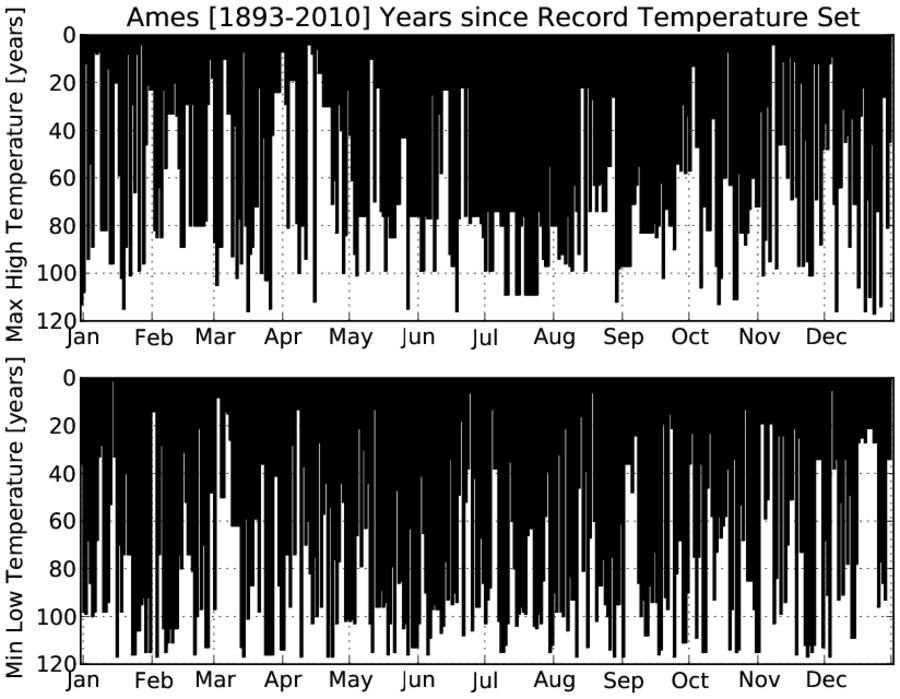
Years since the record
13 Sep 2010 05:55 AMThe featured chart presents the number of years since the record high or low temperature was set for Ames. Ties were not considered. Ames went another meteorological summer without setting a record high temperature. One has to go back to 1988 to find the last record high for Ames during June, July, and August. For July, the youngest record for high temperature was back in 1955! No records are in the forecast for this week.
Voting:
Good: 18
Bad: 3
Tags: climate high low
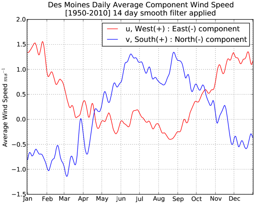
Wind components
09 Sep 2010 06:01 AMThe wind speed and direction can be broken into two components. These are a south to north (v wind) and west to east (u wind) component. [Those of you that failed geometry may wish to vote bad now]. The featured graph presents the daily averaged u and v wind speed component. This chart shows a clear annual cycle. Outside of the summer months, the jet stream is often nearby and tends to help promote dominant westerly winds. The v winds show us the dominant air temperature advection regimes with northerly (negative v values) during the winter time and warm southerly (positive v) in the summer time. September is shown as a transition period with westerlies increasing and southerlies decreasing.
Voting:
Good: 43
Bad: 6
Tags: wind climate

Precip Duration
02 Sep 2010 06:00 AMThe featured chart presents the frequency of precipitation events as measured by the number of consecuative hours at least one hundredth of an inch is reported by the Des Moines weather sensor. Events lasting 10 or more hours are highlighted with the white crosses. The chart shows that long duration events are extremely rare during the summer time when storms tend to be more isolated and not associated with large storm complexes. The largest concentration of long duration events is in March and April.
Voting:
Good: 51
Bad: 16
Tags: climate precip
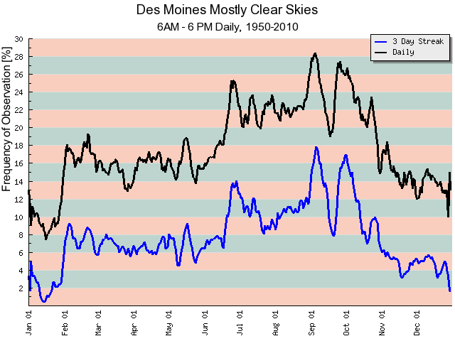
On a clear day
27 Aug 2010 05:57 AMOur stretch of sunny days looks to continue today. The featured chart looks at the observed frequencies of having one day (black line) and three days in a row (blue line) of mostly clear or clear skies as observed at the Des Moines Airport. The chart shows September as having the highest frequencies with an interesting dip in the trend during the middle of the month. It is not clear what would be causing that, but this is another chart that would indicate perhaps fall is the best season of the year in Iowa!
Voting:
Good: 57
Bad: 15
Tags: climate clouds
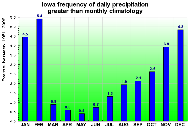
A month's worth in a day
08 Jun 2010 05:09 AMYesterday's feature highlighted the rainfall recorded at Lamoni. The station reported more rainfall in a day than what on average falls during the entire month of June! The featured chart today displays the frequency of a climate site in Iowa picking up more rainfall in a day than what is average for the month. While the chart may seem counter intuitive, monthly precipitation averages during the winter months are much lower and so a bit easier to exceed than the summer months. More heavy rainfall is occurring this morning.
Voting:
Good: 77
Bad: 41
Tags: climate precip
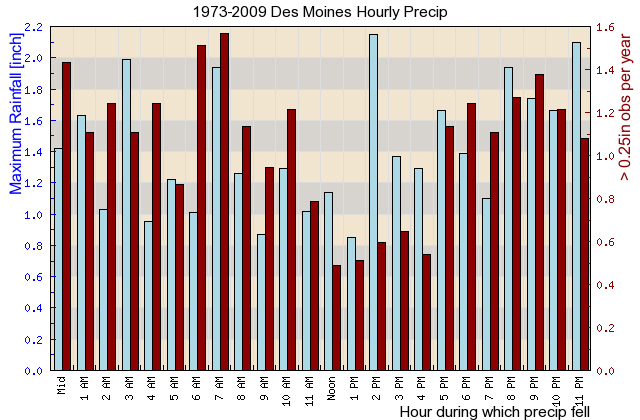
Hourly precip rates
22 Apr 2010 05:11 AMThe featured graph looks at the frequency of hourly precipitation rates over a quarter of an inch (red bars) and the largest amount of precipitation reported during an hour (blue bars) from the Des Moines Airport since 1973. The lowest and less frequent rates occur during the 1 PM hour with maximums in the late afternoon and very early morning around sunrise. The heavy rainfall events tend to occur in the late afternoon forced by peak solar heating and early morning forced by low level jet activity. The middle of the day tends to be a lull in the forcing activity. For Iowa, peak rainfall rates usually do not exceed around 2 inches per hour.
Voting:
Good: 22
Bad: 11
Tags: climate precip

Warnings by Hour
09 Apr 2010 07:09 AMThe featured image displays a climatology of NWS issued tornado and severe thunderstorm warnings by month and by hour. In general, these warnings are issued during the spring and summer months in the late afternoon into the evening. The month of June sticks out as the most active month and the winter months the least.
Voting:
Good: 46
Bad: 12
Tags: climate nws
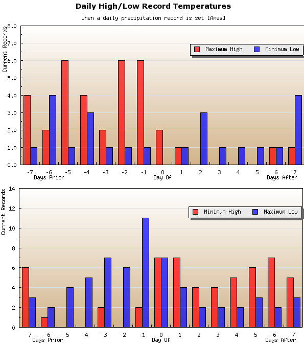
Record rainfall and temperatures
08 Apr 2010 05:12 AMRoughly a week ago, some places in Iowa were setting records for warmest temperatures and then with the most recent storm, record rainfall. The featured chart looks at the frequency of having a record temperature around the days of having a record daily rainfall based on data for Ames. You can see how record maximum high temperatures frequently occur before a record rainfall as very warm air masses would imply stronger fronts, which should help produce higher rainfall amounts (as what recently happened). Record minimum highs (cold) also appear to be a common after a record rainfall. The climatology for any of the days shown on the chart would be one record.
Voting:
Good: 29
Bad: 10
Tags: climate high low
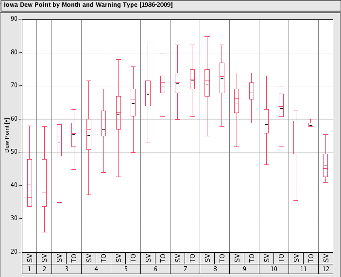
Dew Points and Severe Weather
05 Apr 2010 05:09 AMThe featured chart presents a quick analysis of near storm environment for the archive of NWS issued Tornado and Severe Thunderstorm warnings back to 1986 by month. The box and whisker plots help to visualize the range of values common during the issuance of the warning. In general, dew points are a bit higher for tornado warnings, which is expected as higher dew points indicate more energetic environments and perhaps higher relative humidities (lower cloud heights). For April, once the dew points reach the 50s severe weather appears to be more possible. Some severe weather occurred on Sunday over far southeast Iowa, where surface moisture was available (dew points much higher than the rest of the state). Higher dew points are expected to make their way north today with a warm front and our chances of severe weather will as well.
Voting:
Good: 18
Bad: 12
Tags: climate nws dewpoint
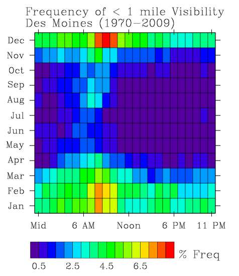
Visibility Frequencies
09 Mar 2010 06:13 AMWith a good portion of the state stuck in dense fog for the past few days, the featured chart looks at the hourly frequencies by month having observed visibilities below one mile for Des Moines. The largest values are shown during the morning hours in winter time and another maximum late summer just after sunrise. Overall frequencies are higher during the winter time due to the occurrence of visibility limiting snow fall.
Voting:
Good: 24
Bad: 6
Tags: climate visibility
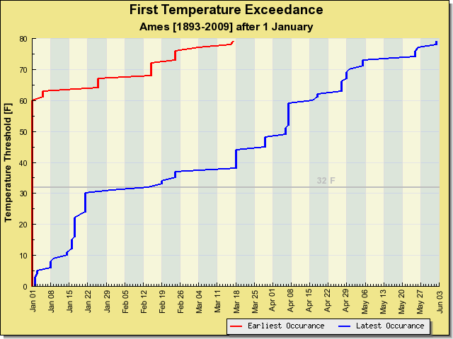
Late this year
03 Mar 2010 06:11 AMThe featured chart presents the earliest and latest occurrence of a temperature threshold after the first of the year. Many parts of the state have yet to reach 40 degrees, which is approaching a record as shown on the chart for Ames. It is interesting to note how the "latest" line flattens out around 32 F, which basically shows the influence of a deep snowpack in February and early March (much like what is happening this year). This chart also shows that some years, by this date, we have experienced temperatures above 70 degrees. Imagine what that must feel like!
Voting:
Good: 30
Bad: 8
Tags: climate high
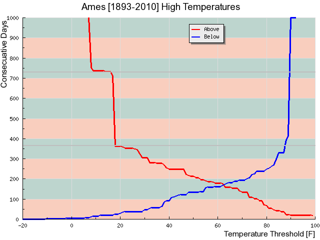
Temperature streaks
23 Feb 2010 06:13 AMAmes has not seen a temperature at or above 40 degrees since the first of December (83 days). The featured graph looks at the longest periods of consecutive days above or below a certain high temperature threshold for Ames. The record for consecutive days below 40 appear is around 92, so we'll have to make it to March to set that record. The plot is truncated at 1000 days, but values at the extremes go well beyond 1000.
Voting:
Good: 27
Bad: 10
Tags: climate high
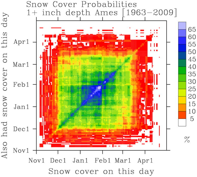
Snow cover probabilities
19 Feb 2010 06:13 AMThe featured chart looks at the probability of having snow cover on a day during the winter contingent on having snow cover for a given date. Confused? In other words, if there is snow cover for this date, how likely was there also snow cover on March 1rst or December 25th of that same winter. One of the disappointing aspects of the chart are the clear month boundary effects as often the data was manually quality controlled a month at a time (the end of one month doesn't match the beginning of the next). The second week of March shows up nicely as an elevated chance of snow cover, but those events can then be associated with elevated probabilities in mid January.
Voting:
Good: 30
Bad: 26
Tags: snowcover climate
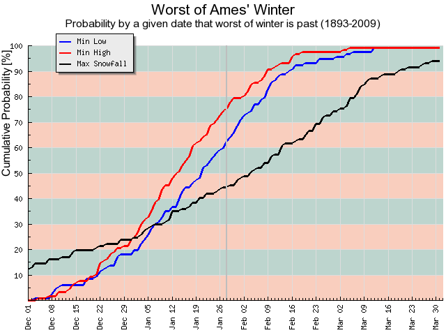
Is the worst behind us?
29 Jan 2010 06:11 AMThe featured chart looks at the cumulative probability that by a given date, the min low, min high or maximum snowfall has occurred for the winter season. For example, by Jan 28th the lowest high temperature for the season occurred 75% of the time prior to the date (meaning the coldest highs are hopefully behind us). It is interesting to note the slope of the maximum snowfall line and how the current value is around 40%. Big snowfalls are still possible, especially as we transition to spring (imagine that).
Voting:
Good: 77
Bad: 13
Tags: winter climate

Monthly ranges
13 Jan 2010 06:11 AMThe featured chart looks at the largest and smallest temperature range for a month based on all COOP observations in Iowa for a given year compared to what was observed in 2009. The months of September, October, and November had an exceptionally small amount of temperature range with November unofficially being the smallest on record. The smallest number on this chart is 44, which means that for any given month, we Iowans will probably experience a 44 degree difference between the warmest high and coldest low temperature.
Voting:
Good: 16
Bad: 8
Tags: climate 2009
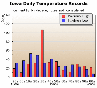
Records by decade
04 Jan 2010 07:28 AMThe end of 2009 also brought the end of the first decade of the 21st century. The featured graph looks at the number of days per decade our current set of daily high and low temperature records consists of. Roughly 1/3 of our current daily high temperature records occurred during the 1930s and most of our daily low temperature records occurred before the 1950s.
Voting:
Good: 15
Bad: 7
Tags: climate high low

Before the first freeze
24 Sep 2009 06:08 AMThe featured chart shows the frequency of low temperature thresholds for the fall period before the first freezing temperature. For instance, on average we would expect to see around 10 days with a low temperature at or below 45 degrees before the first freeze (blue dots). The maximum and minimum values are shown as well along with the current observation this fall. The moral of the story is that we probably should see a few more cool mornings before the first freeze with a day or two in the 30s and then finally that first fall freeze.
Voting:
Good: 25
Bad: 7
Tags: freeze climate
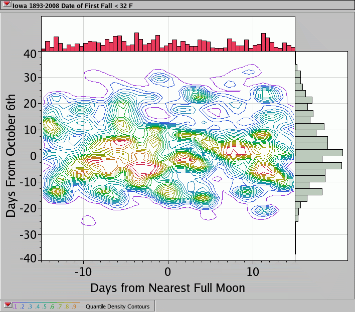
First Freeze and Full Moons
05 Sep 2009 11:22 AMIt is commonly said that the first fall season freeze occurs during a full moon in late September or October. The featured plot shows that this simply is not the case in Iowa. The horizontal axis contains the number of days from the nearest full moon and the vertical axis is the number of days that observation was from the 6th of October (the median first freeze date). The contours indicate the relative frequency of the data. The important portion of the plot is the histogram in red at the top of the page clearly showing no full moon date dependence. Here is an Excel file with this data.
Voting:
Good: 20
Bad: 7
Tags: climate moon freeze
Diurnal Cycle
03 Aug 2009 06:05 AMOn Friday, the featured plot shown two seasonal maxima of difference between the daily average computed by taking the high and low temperature to that of taken by averaging hourly observations. The question remains as to why these appear... Today's featured plot displays the composite diurnal temperature cycle for four months of interest. The plots are normalized by their respective daily average temperature computed by averaging the high and low. The plot means are displayed in the legend for each month. It may take another feature plot before this mini-mystery is resolved!
Voting:
Good: 16
Bad: 4
Tags: climate temperature
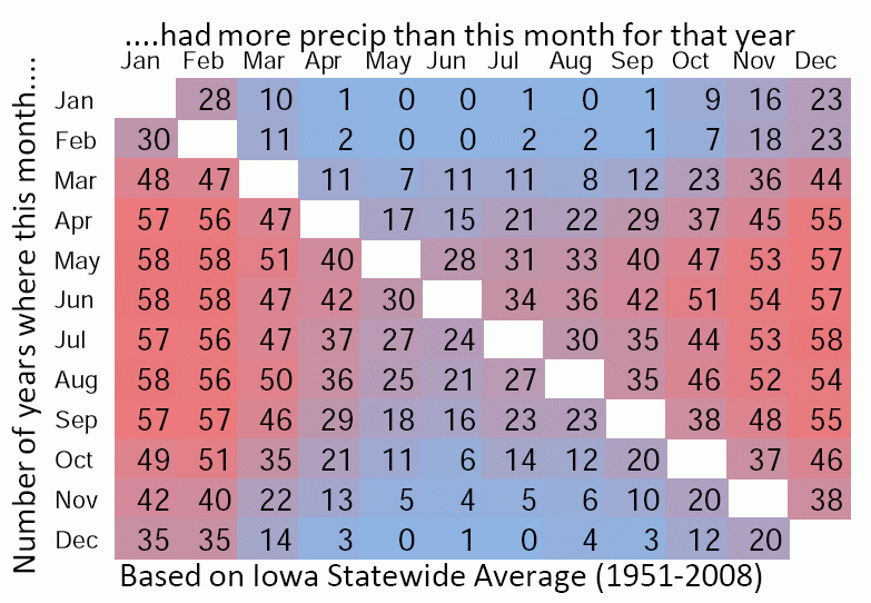
Wettest month
23 Jul 2009 06:08 AMYesterday, the months of the year battled for the being warmer than the others. Today's feature looks at the frequency of having a month being wetter than another. This time there is no clear winner. The summer months are generally wetter, but fall and spring months can top the summer months.
Voting:
Good: 19
Bad: 8
Tags: climate precip
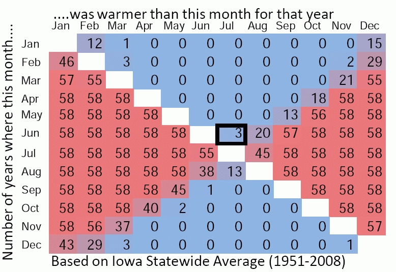
July should be the warmest
22 Jul 2009 06:12 AMThe featured chart compares the average temperature for a month with the other months for the same year. The number represents the years for which the given month was warmer than the other. So far June has been warmer than July, which is somewhat rare (happening only 3 times since 1951). There is time for July to make a comeback and assume its rightful place as warmest month this year.
Voting:
Good: 22
Bad: 12
Tags: climate
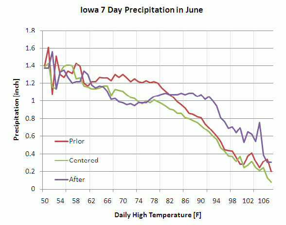
7 days of rainfall v. High
05 Jun 2009 06:06 AMBuilding off of yesterday's feature, today's feature looks at the mean amount of rainfall in three different 7 day periods for a given high temperature in June for all sites in Iowa. For a given day, these 7 day periods are the 7 days prior to the high temperature, the 7 days centered on the high temperature, and the 7 days after. The plot indicates an interesting regime change from when we have highs in the 70s versus highs in the 90s. Notice how in the 70s, the centered and after lines mostly track, while in the 90s the prior and centered lines track. One interuptation would be that when temperatures warm up, more rainfall comes in the forecast and effectively knocks temperatures back down into what is shown in the 70s with more precipitation in the prior period. The overall decrease in precipitation for increasing temperatures is also important (the sun can more effectively warm the ground when it is drier [less precip] ). Rain is in the forecast for this weekend with some strong storms possible.
Voting:
Good: 18
Bad: 12
Tags: climate high precip

Warmth and rain
04 Jun 2009 06:04 AMThe featured graph displays the frequency of rainfall observations a day after a given high temperature for Ames. The three lines are the frequency of given minimum precipitation thresholds. While there are a number of things going on to make this plot appear the way it does, it generally shows that the frequency of rainfall events increases as our temperature increases (more rainfall in the summer). The interesting detail is to note what happens when temperatures reach the 90s. Our chances of rainfall decrease as the temperature gets even warmer. One could speculate that when our temperatures get really warm, the air mass is often drier and soil moisture state is drier as well allowing more efficient warm ups. Rewording, having temperatures in the 90s for Ames is probably associated with a dry weather pattern.
Voting:
Good: 15
Bad: 6
Tags: climate precip highs

One inch rains add up
13 May 2009 06:13 AMThe featured graph shows the contribution of various daily rainfall total amounts to the monthly average for Ames. The red portion of the bar chart represents when an inch plus of rain falls. If you were to eliminate the red (stop daily rainfalls over an inch) portion of this chart, our wettest month would only see a bit over 2 inches of rain. Another interesting part of this graph is this insignificance of less than 0.05 inch rainfalls to the overall totals (can not see the blues). Heavy rainfall is currently occuring in Iowa today with some locations definitely picking up more than an inch.
Voting:
Good: 21
Bad: 6
Tags: climate precip
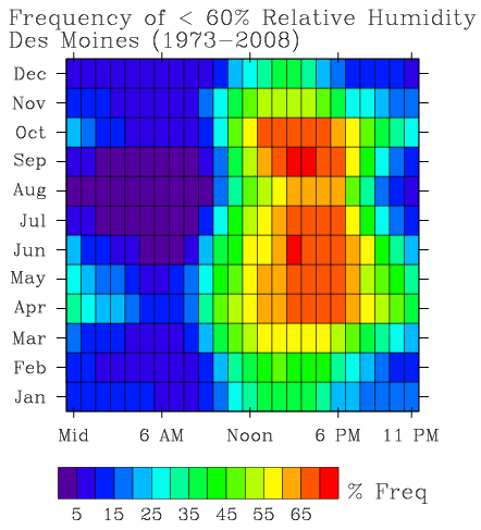
Relative Humidity
21 Apr 2009 06:14 AMThe featured image presents an hourly climatology of the frequency of having a relative humidity observation below 60 percent. Since relative humidity is a function of temperature, as the air warms during the daytime the rh value will drop. The plot indicates two maximum in the late springtime and fall. These times of year have strong heating and less profilic sources of evapotranspiration. July into August are a time of maximum corn and soy plant transpiration which helps to keep relative humidity values even while temperatures warm.
Voting:
Good: 18
Bad: 4
Tags: climate rh
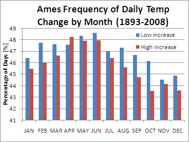
Best chance for warmer days
10 Apr 2009 06:17 AMThe featured chart is the percentage of days per month that experience either high or low temperatures at least 1 degree warmer than the previous day. April has the largest value for high temperature, but is just a mere few percentage points larger than October which only equates to approximately 1 more day per month. This chart would imply that climatology does not have a strong influence on actually seeing our day to day temperatures warm. Day to day temperatures are more strongly influenced by the passage of air masses.
Voting:
Good: 22
Bad: 18
Tags: climate high low

Days above average
02 Mar 2009 06:16 AMThe featured chart is the yearly difference between the number of days with a high temperature above average versus below for Ames. Negative numbers represent having more days below average than above. 1932 has the largest positive value while 1993 the lowest. For our recent decade, 2008 was the only year with a considerable number of more days below average. The number thus far for 2009 is a mere -4. Our weather is expected to creep above average later this week.
Voting:
Good: 27
Bad: 4
Tags: highs yearly climate
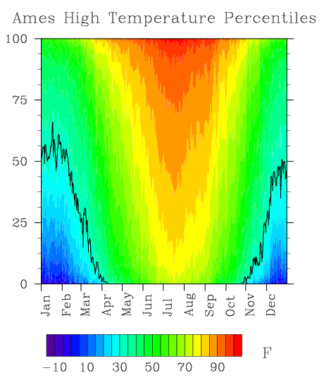
High Temperature Profile
05 Feb 2009 06:23 AMThe featured plot is of daily high temperature percentiles from Ames based on data for the past 100 years. The plot provides a colorful look at the climatology of Ames. The black line is the 32°F contour. For February, this contour rapidly decreases, which implies that our chance for having a high temperature above freezing is rapidly increasing. The forecast calls for temperatures above freezing for most of the state and even thunder showers expected next week.
Voting:
Good: 15
Bad: 11
Tags: percentile climate
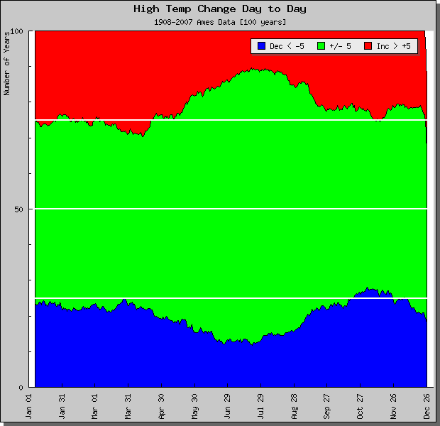
Day to Day High Temp Changes
27 Jan 2009 05:48 AMLike yesterday's feature on snow pack, today's feature presents a similiar plot for high temperature. The plot summarizes the day to day change in high temperature based on 100 years of data from Ames. The green area represents when the next day high temperature is within 5 degrees of the previous high. The red area represents when the high temperature change is greater than 5 degrees and blue area less then negative five degrees. The white lines denote 25, 50, and 75 years. The plot indicates that our next day high temperature is within 5 degrees of the previous high roughly 50% of the time. An interesting note is to notice where the blue and red areas exceed the 25 and 75 thresholds. These are times of year marked by warming (springtime) and cooling (fall).
Voting:
Good: 23
Bad: 14
Tags: climate hightemp

Wind reliability
07 Jan 2009 06:18 AMContinuing in the series of climate features, today's plot is of the hourly frequency of an observed 10+ mph wind speed by month based on archived data from Des Moines. Those of us that live in Central and Northwest Iowa notice the many wind farms that are being built. Obviously, these turbines need reliable wind speeds to generate power. This plot indicates that outside of the afternoon hours in the spring and fall, having 10+ mph winds is roughly a 50% or lower chance on a daily basis.
Voting:
Good: 17
Bad: 5
Tags: climate wind
Difference between high and low
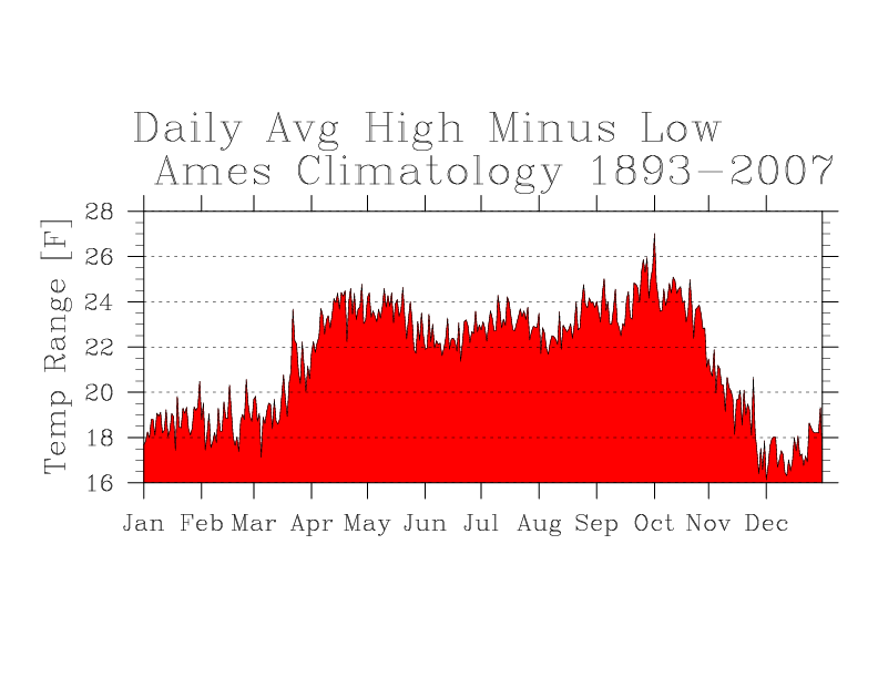
06 Jan 2009 06:22 AMThe featured chart is the daily difference between average high and low temperature climatology from Ames. The largest values occur during the spring thru fall months while the sun is more able to warm us up during the day due to the increased incidence angle.
Voting:
Good: 20
Bad: 11
Tags: climate
Sub-freezing days
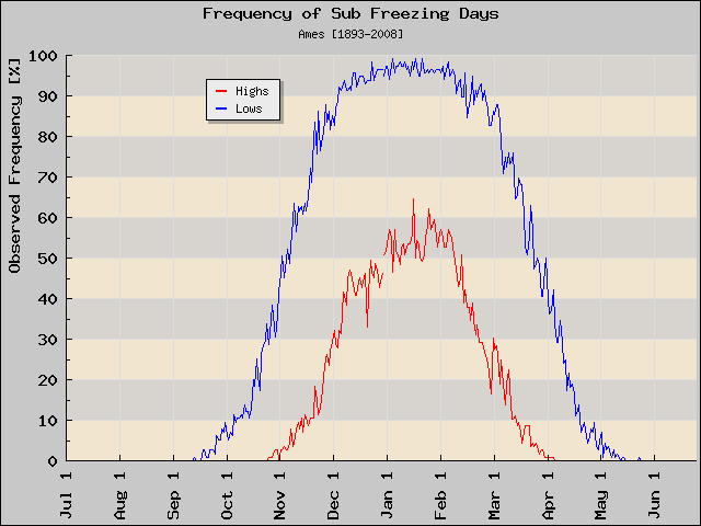
11 Dec 2008 06:22 AMThe featured graph shows the daily frequency of observed sub freezing high and low temperatures for Ames based on data since 1893. For this time of year, roughly a 45% chance exists that the high temperature will be below freezing. On the other hand, low temperatures are almost always below freezing this time of year. Our high temperature today may creep above freezing to help balance out our day yesterday below freezing.
Voting:
Good: 20
Bad: 10
Tags: climate below-freezing
Hourly wind climatology
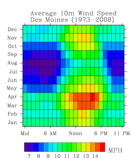
03 Dec 2008 06:17 AMThe featured plot continues the series of hourly climatology plots. This plot is of average hourly wind speeds by hour and by month. The windiest time of year appears to be 4 PM in April and the least in the early morning in August. This plot nicely shows two maximums in the spring and fall. These are a result of the season transition periods as warm and cold air fights over Iowa! Large temperature gradients result in stronger winds.
Voting:
Good: 18
Bad: 14
Tags: climate wind
Relative Humidity Climatology
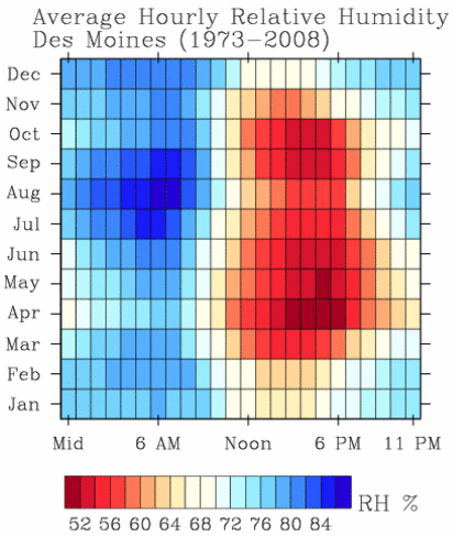
20 Nov 2008 06:27 AMThe fun never stops with these hourly climatology plots. Today's feature is a simple hourly climatology of the average relative humidity observed at Des Moines. This plot shows a strong annual and diurnal signal! While dew point temperature is not a function of air temperature, relative humidity is! While the atmosphere cools during the night, relative humidities rise (air temperature drops, dew point remains nearly constant). This plot also shows the least humid time of year being in April, when temperatures are warming nicely and vegetation is not transpiring yet.
Voting:
Good: 29
Bad: 10
Tags: climate rh
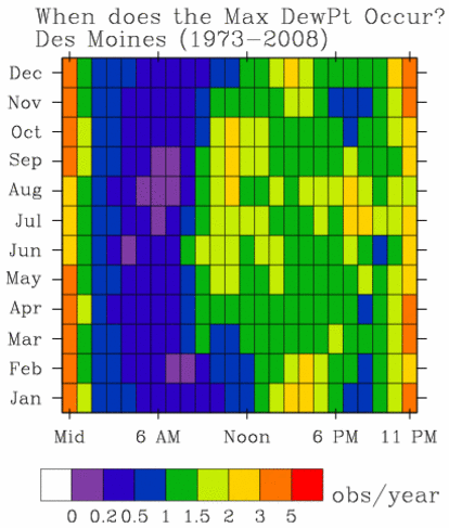
When does the max dewpoint occur?
19 Nov 2008 06:09 AMContinuing with the series of climate features, today a plot of when the highest dew point temperature for the local day occurs. First off, let us start by saying that dew points are much less diurnal in nature than air temperature and outside of sensor bias, dew point is not a function of air temperature. The featured plot shows two obvious extremes around midnight, this is due to air mass advection bringing in more or less moist air during most of the 24 hour period (excuse brevity of explanation please). The plot also shows maxima:
- in the mid morning during the growing season due to dew evaporation before drier air is mixed down due to boundary layer growth,
- the early evening in the late summer probably due to increased corn/soy plant evapotranspiration and thunderstorm/frontal activity,
- and mid afternoon in the winter perhaps due to evaporation(?).
As with the other features, let me know what you think and how you
think this is explained incorrectly. :)
Voting:
Good: 26
Bad: 6
Tags: climate dewpoint

When do lows occur?
18 Nov 2008 06:21 AMKeeping with the recent features, today's feature is a chart of the hour during which the low temperature occurs. Low temperatures tend to occur just after sunrise when net radiation finally becomes positive (downward). This chart shows this trend with lows happening earlier in the morning during the summer. You can also see a secondary maximum around 11 PM, which is often the case when clear skies at night follow a cloudy day allowing temperatures to drop rapidly below levels during the cloudy morning.
Voting:
Good: 23
Bad: 12
Tags: climate lows
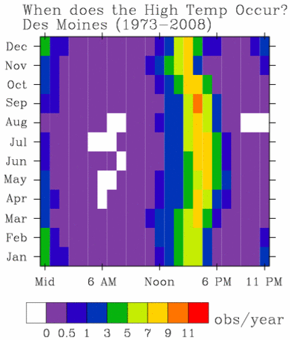
When do highs occur?
17 Nov 2008 06:18 AMLast Friday, we featured the favored times of rainfall. Today we featured the favored times of day when the high temperature occurs. This plot has a number of interesting features including the increased chance of the high temperature coming at midnight during the winter season. This is often associated with air mass changes with a steady feed of colder air during the day. Another interesting feature is the shift of high temperature shown between Feb/Mar and Oct/Nov. This is due to the change of daylight savings time. The hourly time axis on the plot is in local (standard/daylight) time depending on the time of year.
Voting:
Good: 27
Bad: 7
Tags: climate highs

When does it rain?
14 Nov 2008 06:20 AMThe featured chart shows the hourly frequency of rainfall observations based on observations from the Des Moines Airport since 1973. The units of this chart are average number of hourly observations per month per year for that hour. Confused? For example, the red square represents a number around 4. This means that during the month of May, approximately 4 days during May have rainfall reported during the 7 oclock hour, which is the rainiest time of the year. According to this plot, the driest time is roughly 5 PM in August. There are many other interesting things in this plot. Compare October and November versus July and August. During the summer, rainfall comes during the nighttime. During the fall, it mostly comes during the afternoon.
Voting:
Good: 42
Bad: 24
Tags: climate precip
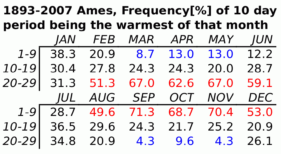
Middle of October is cooler
15 Oct 2008 06:18 AMThe featured chart shows the frequency of a certain 10 day period of a month being the warmest of that month. Rewording, which 10 day period of a month is usually the warmest. This is based on observations from Ames since 1893. For example, for October the first 10 days are the warmest for roughly 70% of the years. This will appear to be the case for us this year. This chart also shows interesting asymmetry during the spring and fall months.
Voting:
Good: 16
Bad: 14
Tags: climate temps
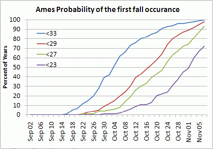
The chances for frost
03 Oct 2008 06:37 AMThe featured chart shows the percentage of years since 1893 that a certain temperature threshold was exceeded by a certain date in the fall for the Ames climate site. For instance, the chance (observational frequency) of a sub-33 temperature by this time of year is roughly 50%. This means half of the years prior to this one have seen a sub-33 temperature by October 4th.
Voting:
Good: 42
Bad: 24
Tags: freeze climate
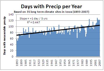
Rainy days increasing
12 Sep 2008 06:23 AMThe featured chart is the number of days with measurable precip per year for the long term climate sites. This chart would indicate that the number of rainy days is increasing at a rate of roughly 1 day per 5 years. 2008 will continue this trend with more rainy days in the forecast today and this weekend.
Voting:
Good: 41
Bad: 14
Tags: precip climate
Days below 90
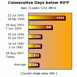
02 Jul 2008 07:26 AMThe featured chart presents the longest consecutive day periods where the high temperature was less than 90 degrees. Our current streak has a long ways to go to catch the 1000 day streak back in the early 90s. The current forecast does not look to end this anytime soon with highs back in the 70s tomorrow.
Voting:
Good: 27
Bad: 9
Tags: climate

Recovery is more likely
13 Sep 2007 07:07 AMAfter a cold start on Wednesday, temperatures warmed 30+ degrees to comfortable afternoon values. The featured plot graphs the daily average temperature range, which can be thought of as the amount of warming that occurs. You can see that September and October experience the largest temperature swings, so cold mornings are more often recovered into nice afternoons. The reason for this is the decreasing humidity levels allowing more efficient warming and ground temperatures which are still very warm.
Voting:
Good: 23
Bad: 3
Tags: climate
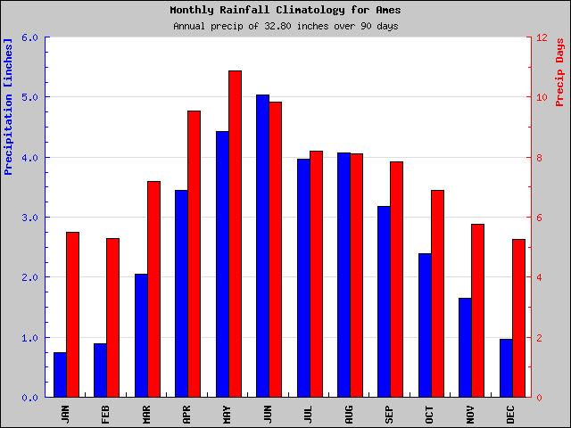
It should be a wet month
13 Jun 2007 07:00 AMThe featured bar chart is of monthly precipitation climatology for Ames. The blue bars are the average monthly accumulation and red bars are the average number of days during the month which have measurable precip. So for June, we average roughly 5 inches of rainfall spread over 10 days. In other words, we average 0.50 inches of rain every 3 days. Our recent weather for this month has been rather dry thanks to slow moving ridge that has kept the rainfall west of the state.
Voting:
Good: 12
Bad: 3
Tags: climate precip
Hourly rainfall
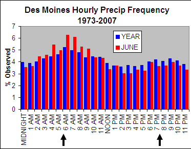
12 Jun 2007 07:20 AMThe featured graph is the distribution of hourly rainfall observations from the Des Moines Airport for the month of June (red) and for the year (blue) since 1973. The graph shows two clear modes for rainfall in Iowa. The first being around 6 AM due to the night time thunderstorm complexes feed by the low level jet in the summertime. The second being around 7 PM due to storms fueled by the heating of the day. In general, the night time is clearly the rainiest period during June with the other summer months showing a similiar distribution.
Voting:
Good: 13
Bad: 3
Tags: climate precip