Past IEM Features tagged: high
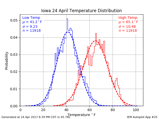
High and Low Distributions
25 Apr 2017 05:35 AMHigh and low temperatures on Monday were on the mild side of average with lows generally in the mid 40s and highs in the mid to upper 70s. The featured chart presents histograms for April 24th highs and lows based on period of record observations from long term Iowa climate sites. The stepped line represents the actual distribution, while the dashed line is the simple normal distribution based on the mean and standard deviation. The high temperature distribution is slightly wider showing the increased variability over low temperatures for this time of year.
Voting:
Good: 4
Bad: 0
Abstain: 1
Tags: high low

Mostly Record Highs
06 Mar 2017 05:34 AMThe pleasantly warm weather this weekend was a reminder of the record warm just a while back during February. During which time we were setting a number of new daily record high temperatures. The featured chart presents the record high and low temperature set dates and beat margin. These events are computed as they are established with the passage of time. For example, records set in the 1940s may no longer still be records today, but are included in this chart. Anyway, the point of the plot is to show that recently we have certainly seen a larger share of record high temperatures set vs record lows.
Voting:
Good: 15
Bad: 2
Tags: high low record
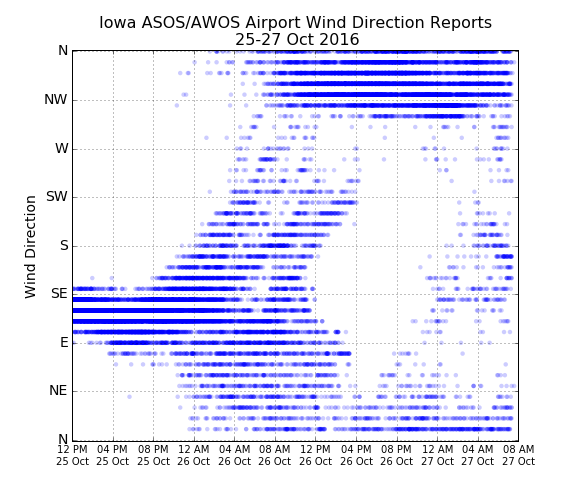
Wind Direction
27 Oct 2016 05:40 AMThe featured chart displays a time series of wind direction reports from all automated airport weather stations in the state. A low pressure system moved over the state yesterday and a high pressure system settled into the state overnight. The impact of both systems on the distribution of wind direction reports is interesting to look at! The chart shows consistent wind direction reports on Tuesday from the east and southeast. The circulation around the low pressure system on Wednesday spread all the reports to show all directions reported at the same time in the state. The high pressure overnight effectively reversed all those reports as the circulation is opposite. Kind of neat!
Voting:
Good: 10
Bad: 0
Tags: low high wind
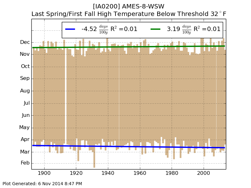
Last and First Frozen Day
07 Nov 2014 05:44 AMThere is considerable buzz regarding the anticipated cold air outbreak next week for the eastern half of the CONUS. Forecasted highs are below freezing for much of the state for a few days next week! The featured chart presents the last spring and first fall occurrence of a day with a sub freezing high temperature for Ames. Having this type of weather for the second week of November is not far from long term average.
Voting:
Good: 23
Bad: 16
Abstain: 13
Tags: high
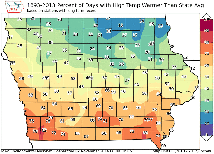
Warmest Half of State
03 Nov 2014 05:44 AMThe featured map displays the frequency of a long term climate site being above the statewide average daily high temperature. Rewording, how often is the location in the warmest half of the high temperatures reported for the date (assuming that the statewide average is close to the median). The north to south gradient should not be a surprise to Iowans, but there are some subtle features such as the difference over the southern tier of counties. Decorah is analyzed with the lowest frequency, so if you don't mind seeing warmer temperatures over much of the state than your location, you should consider living there.
Voting:
Good: 8
Bad: 5
Abstain: 2
Tags: high

Trap Weather
28 Oct 2014 05:40 AMAfter a very nice stretch of mid-fall weather, our weather looks to turn cooler. Temperatures on Tuesday will be a trap for those expecting to see a repeat of the recent past of warm temperatures. The featured chart looks at the maximum increases and decreases from a period of the five days of high temperatures. For example, the past five days for Ames had a high temperature at least above 69 degrees. If the high temperature on Tuesday is 54 degrees, this would be considered a negative 15 degree jump down for this plot. The chart shows that the expected change today is still much smaller than the most extreme on record. The high today would have to be about 39 degrees to match the shown extreme.
Voting:
Good: 11
Bad: 6
Abstain: 7
Tags: high
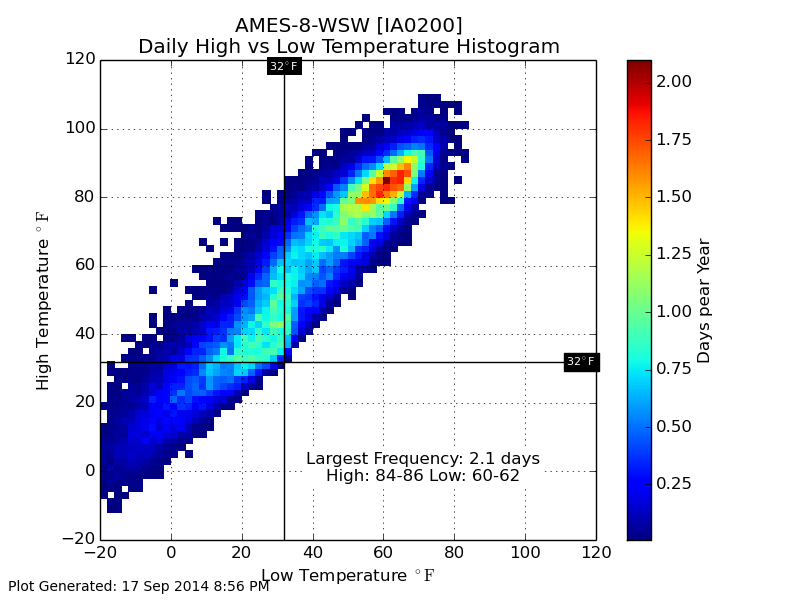
Common Temperatures
18 Sep 2014 05:47 AMThe featured chart presents the frequency of daily high and low temperature combinations for Ames. The largest frequency to have a high of 84 to 86 and a low of 60 to 62, which is roughly the climatology for much of the summer season. The chart shows an interesting artifact around the freezing mark with higher frequencies showing up just below freezing for the daily low temperature. It is relatively more common to have a low temperature just below freezing than to have one just above. The reason being during the cold season with snow on the ground and/or cold soils, the temperature will often drop to below freezing after a daytime temperature above freezing. Restating, it is difficult for the air to maintain a warm temperature at night when the soil and/or snow are at sub-freezing temperatures.
Voting:
Good: 13
Bad: 6
Abstain: 4
Tags: high low
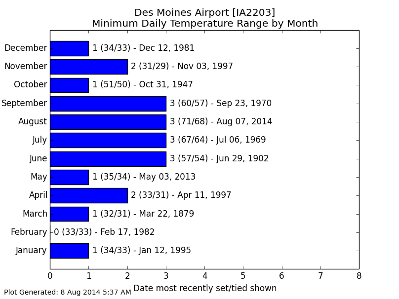
3 Degrees in August
08 Aug 2014 05:44 AMTemperatures were again a struggle on Thursday with highs near 70 instead of our average near 85! For Des Moines, the high temperature was only 71 with a low temperature of 68. This three degree difference between the high and low was the smallest such difference on record for the site for August. The featured chart presents the smallest difference in daily high and low temperature by month. The "largest" values are during the summer time when it is extremely difficult to prevent the sun from even slightly heating the ground. The forecast looks cool and dry, which should make for great Iowa State Fair weather!
Voting:
Good: 18
Bad: 10
Abstain: 12
Tags: high low
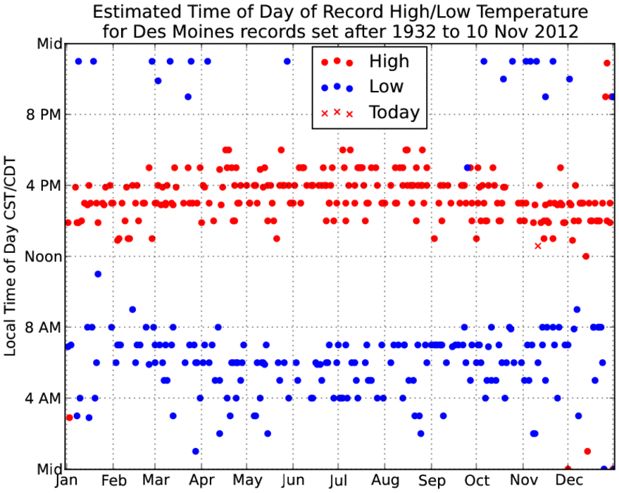
Time of Record Temps
10 Nov 2012 01:35 PMVery warm air is surging into Iowa this Saturday with numerous record high temperatures being set. Des Moines set its record high today by reporting 78 degrees at 12:35 PM. Is it unusual for a record high to be set just after noon? The featured chart provides an estimate of the time of day record high and record low temperatures occurred at. The daily records are from a different dataset than the hourly temperature archive, so some estimates were done and a constraint that the extreme hourly temperature was within 4 degrees of the record temperature. Having a record high near 1 PM has happened previously, but that won't put a damper on today.
The lone blue dot (record low) shown at 5 PM on 25 Sep 1942 appears
to be legitimate estimate.
Voting:
Good: 42
Bad: 13
Tags: record high low

Biggest Changes
21 Feb 2011 09:38 PMRecently, Bartlesville Oklahoma went from a low temperature of -28 F on the 10th of February to a high temperature of 82 F on the 17th. This is a remarkable 110 degree change on the seventh day. Can any site in Iowa compete with this? The featured chart presents an IEM computation of historical climate data in Iowa and the largest value is 106 degree change on the 9th day. This happened during a remarkable period in February 1930 for Webster City after a low temperature of -34 was followed by highs in the 60s and then 72 on the 24th. Please note that the number for the 0th day is simply the difference between the high and low temperature (Tripoli 18 Jan 1996).
Voting:
Good: 13
Bad: 3
Tags: climate high low extreme

High temperature streaks
11 Feb 2011 05:53 AMThe forecast holds a great deal of optimism for a streak of at least a week of above freezing daily high temperatures this would follow a period of 12 days with highs at or below (AOB) freezing. The featured chart looks at the longest streaks of having daily highs AOB freezing and then having them above freezing. There are two dots presented for each year denoting the longest streak on each side of the regime change. One of the interesting outliers in this plot is what happened last spring. After a period of 37 days below freezing, temperatures warmed on 2 March and we had 265 straight days of high temperatures above freezing. So the longest streak of 37 days was followed by a streak of 265 days. The crosses represent the longest second part of the streak and what the streak was below freezing before that streak. Kind of confusing, so please comment if this does not make any sense!
Voting:
Good: 32
Bad: 15
Tags: high freeze
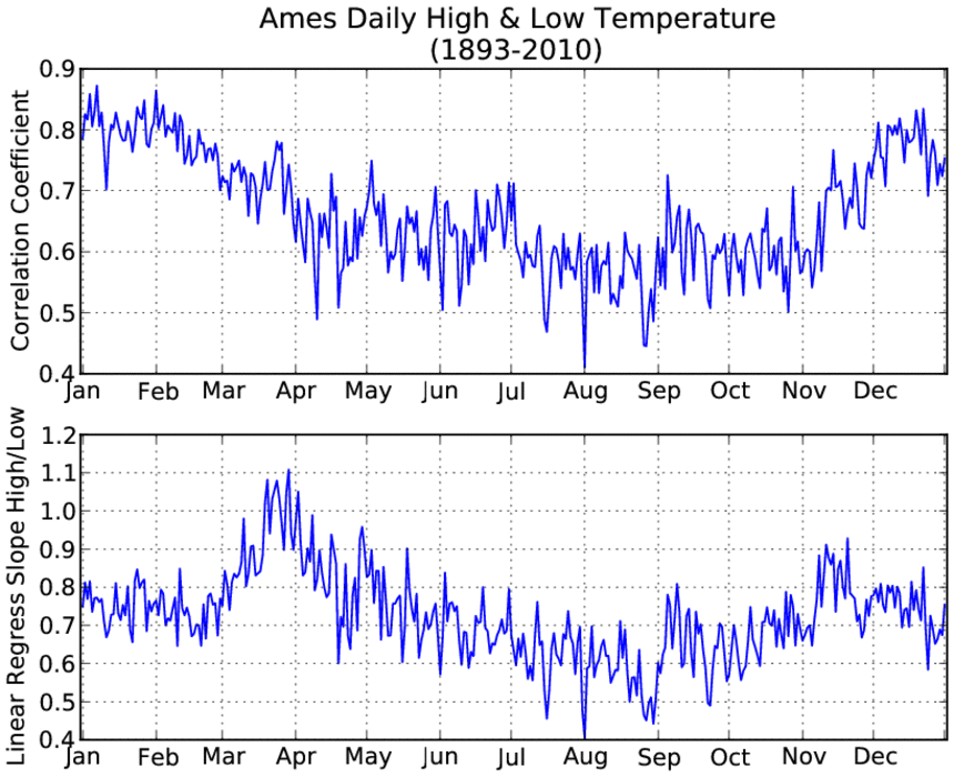
Daily High & Low Correlation
05 Feb 2011 05:46 AMThe featured chart presents the daily computed correlation between the high and low temperature. Higher values imply a closer relationship between changes in highs and lows. For example, a cold low temperature would typically imply a cold high temperature for that day. There is a clear annual signal shown, but the question is what causes it... One reason may be that the increase in moisture and warming soil temperatures cause overnight lows to moderate and not vary as much. Another potential explanation is that air masses dominate in the winter season and perhaps that causes highs and lows to be more regular. What do you think? Feel free to comment on this via facebook!
Voting:
Good: 20
Bad: 7
Tags: climate high low
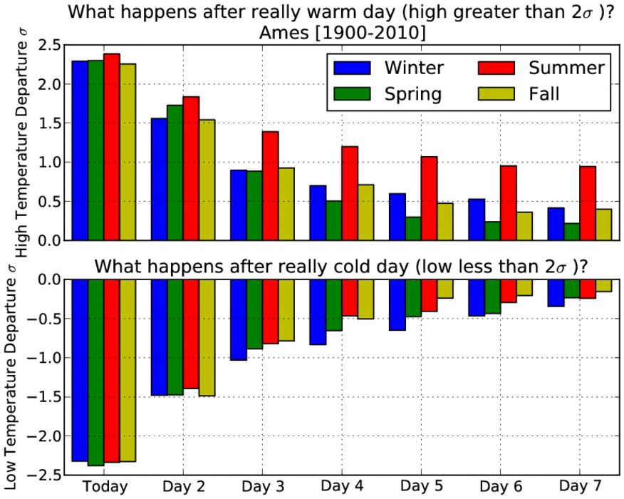
How fleeting are hot or cold days?
07 Jan 2011 05:56 AMThe featured chart presents the average temperature departure from average after a day that has either a high temperature two standard deviations (two sigma) warmer than average or a low temperature two sigma colder than average. You could think of this plot as examining how persistent really warm or cold days are. The plot is divided up by seasons showing how warm temperatures in the summer time tend to stick around longer than in the other seasons. Warm weather in the winter time is not as fleeting as one might have expected. Cold weather tends to stick around slightly more in the winter time than other seasons. Very cold air is set to arrive this weekend and stick around for most of next week.
Voting:
Good: 20
Bad: 7
Tags: climate high low extreme

Where to go for warmest weather?
04 Oct 2010 07:44 AMWith the past two mornings being frosty ones in parts of Iowa, one may wish to find the warmest spot in Iowa. The featured image presents the frequency of a climate location in the state having the warmest temperature for any given day. The plot shows three favored locations: far southeast Iowa, southwest Iowa, or along the Missouri River near Sioux City. The least frequent being far northeast Iowa.
Voting:
Good: 31
Bad: 9
Tags: high
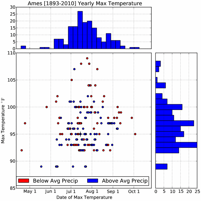
Yearly Max Temperature
28 Sep 2010 05:04 AMYesterday, Los Angeles, California set their all time record high temperature of 113! This may seem weird for the calendar showing the near end of September. The featured chart shows the yearly maximum temperature for Ames and the day of the year that high was reported (ties are included). The distribution of that high temperature and day of year is presented as well. For the most part, the warmest temperature occurs in July and it is somewhere in the mid 90s. The color coding of the dots shows if that year had above or below normal precipitation. It makes sense that most of the warmest numbers occured during relatively drier years.
Voting:
Good: 19
Bad: 8
Tags: high
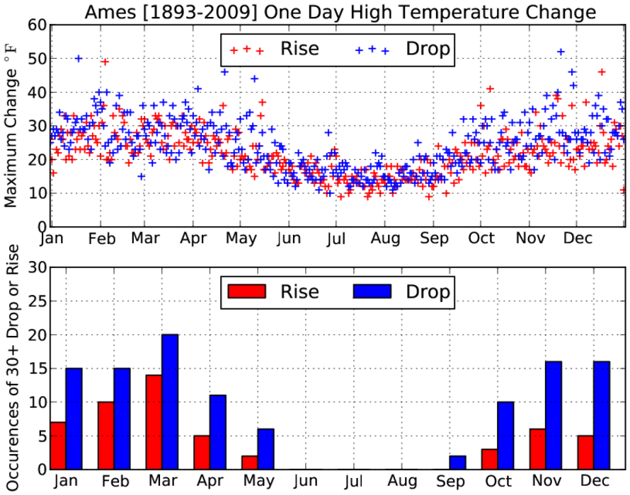
30 degree jumps
21 Sep 2010 05:59 AMAfter having high temperatures in the 50s on Sunday, warm air rushed the state on Monday pushing highs well into the 80s. For some places like Ames, the jump in high temperature was over 30 degrees in just one day! The featured chart presents the largest one day high temperature rise and drop along with the number of occurences of a 30+ degree change based on data for Ames. You can see in the summertime that these large of changes do not occur and are rare for September.
Voting:
Good: 36
Bad: 8
Tags: high 2010
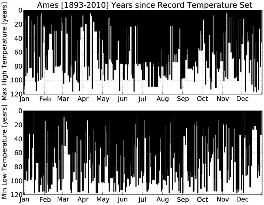
Years since the record
13 Sep 2010 05:55 AMThe featured chart presents the number of years since the record high or low temperature was set for Ames. Ties were not considered. Ames went another meteorological summer without setting a record high temperature. One has to go back to 1988 to find the last record high for Ames during June, July, and August. For July, the youngest record for high temperature was back in 1955! No records are in the forecast for this week.
Voting:
Good: 18
Bad: 3
Tags: climate high low
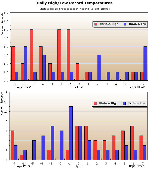
Record rainfall and temperatures
08 Apr 2010 05:12 AMRoughly a week ago, some places in Iowa were setting records for warmest temperatures and then with the most recent storm, record rainfall. The featured chart looks at the frequency of having a record temperature around the days of having a record daily rainfall based on data for Ames. You can see how record maximum high temperatures frequently occur before a record rainfall as very warm air masses would imply stronger fronts, which should help produce higher rainfall amounts (as what recently happened). Record minimum highs (cold) also appear to be a common after a record rainfall. The climatology for any of the days shown on the chart would be one record.
Voting:
Good: 29
Bad: 10
Tags: climate high low
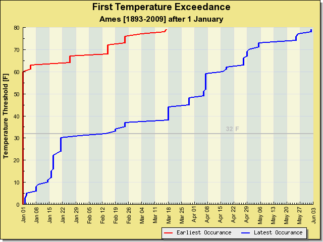
Late this year
03 Mar 2010 06:11 AMThe featured chart presents the earliest and latest occurrence of a temperature threshold after the first of the year. Many parts of the state have yet to reach 40 degrees, which is approaching a record as shown on the chart for Ames. It is interesting to note how the "latest" line flattens out around 32 F, which basically shows the influence of a deep snowpack in February and early March (much like what is happening this year). This chart also shows that some years, by this date, we have experienced temperatures above 70 degrees. Imagine what that must feel like!
Voting:
Good: 30
Bad: 8
Tags: climate high
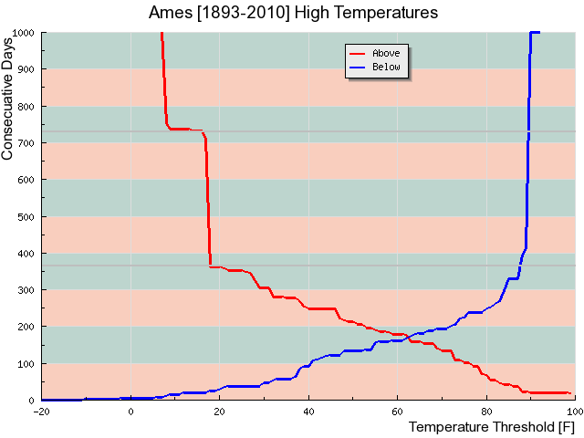
Temperature streaks
23 Feb 2010 06:13 AMAmes has not seen a temperature at or above 40 degrees since the first of December (83 days). The featured graph looks at the longest periods of consecutive days above or below a certain high temperature threshold for Ames. The record for consecutive days below 40 appear is around 92, so we'll have to make it to March to set that record. The plot is truncated at 1000 days, but values at the extremes go well beyond 1000.
Voting:
Good: 27
Bad: 10
Tags: climate high
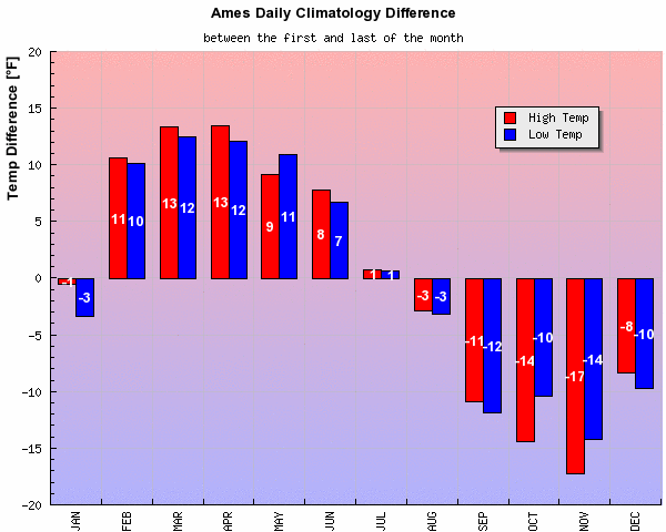
Hope for warming
03 Feb 2010 06:10 AMThe featured graph displays the difference in climatological average high and low temperature for Ames between the first and the last of the month. Positive values would indicate that the trend for the month is warming. The ten degrees of warming shown for February would feel nice right about now with bitterly cold air once again settled into the state. Some warmer weather is in the immediate forecast, but with the chance of more winter storms.
Voting:
Good: 20
Bad: 6
Tags: high low
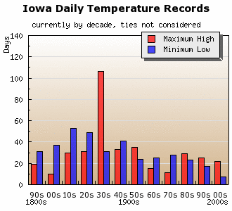
Records by decade
04 Jan 2010 07:28 AMThe end of 2009 also brought the end of the first decade of the 21st century. The featured graph looks at the number of days per decade our current set of daily high and low temperature records consists of. Roughly 1/3 of our current daily high temperature records occurred during the 1930s and most of our daily low temperature records occurred before the 1950s.
Voting:
Good: 15
Bad: 7
Tags: climate high low

View larger image
Days are not double counted if there was both a two sigma high and low on a given day.
Two Sigma Weather
22 Oct 2009 06:12 AMThe featured chart plots the number of days per year that experienced a high or low temperature exceeding two standard deviations from average for Ames. For example, some of last week's cool high temperatures in the 40s were two sigma below average. This chart is an attempt to quantify how "extreme" a given year was. In general, the highest values were prior to 1940 which is probably a reflection of the data quality for that period, although the very hot years in the 1930s show up nicely in this chart.
Voting:
Good: 14
Bad: 5
Tags: high low
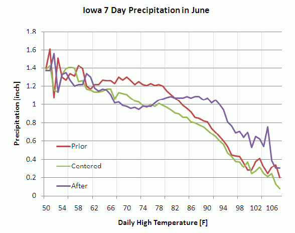
7 days of rainfall v. High
05 Jun 2009 06:06 AMBuilding off of yesterday's feature, today's feature looks at the mean amount of rainfall in three different 7 day periods for a given high temperature in June for all sites in Iowa. For a given day, these 7 day periods are the 7 days prior to the high temperature, the 7 days centered on the high temperature, and the 7 days after. The plot indicates an interesting regime change from when we have highs in the 70s versus highs in the 90s. Notice how in the 70s, the centered and after lines mostly track, while in the 90s the prior and centered lines track. One interuptation would be that when temperatures warm up, more rainfall comes in the forecast and effectively knocks temperatures back down into what is shown in the 70s with more precipitation in the prior period. The overall decrease in precipitation for increasing temperatures is also important (the sun can more effectively warm the ground when it is drier [less precip] ). Rain is in the forecast for this weekend with some strong storms possible.
Voting:
Good: 18
Bad: 12
Tags: climate high precip
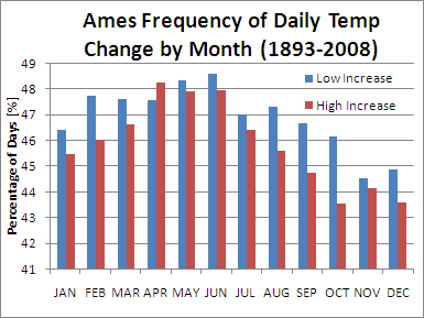
Best chance for warmer days
10 Apr 2009 06:17 AMThe featured chart is the percentage of days per month that experience either high or low temperatures at least 1 degree warmer than the previous day. April has the largest value for high temperature, but is just a mere few percentage points larger than October which only equates to approximately 1 more day per month. This chart would imply that climatology does not have a strong influence on actually seeing our day to day temperatures warm. Day to day temperatures are more strongly influenced by the passage of air masses.
Voting:
Good: 22
Bad: 18
Tags: climate high low
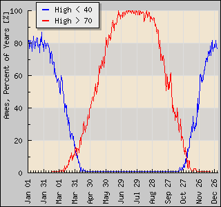
Winter less likely
14 Apr 2008 07:05 AMThe featured graph displays the frequency of having a high temperature less than 40 and a high greater than 70. High temperatures on Saturday were in the 30s, which was extremely rare for this time of year. Having highs in the 70s are rare for this time of year as well, but the chances are increasing each day! The forecast was highs approaching 70 by mid week.
Voting:
Good: 26
Bad: 10
Tags: high