Day to Day High Temp Changes
Posted:
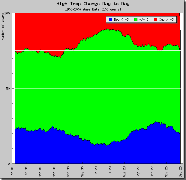
Like yesterday's feature on snow pack, today's feature presents a similiar plot for high temperature. The plot summarizes the day to day change in high temperature based on 100 years of data from Ames. The green area represents when the next day high temperature is within 5 degrees of the previous high. The red area represents when the high temperature change is greater than 5 degrees and blue area less then negative five degrees. The white lines denote 25, 50, and 75 years. The plot indicates that our next day high temperature is within 5 degrees of the previous high roughly 50% of the time. An interesting note is to notice where the blue and red areas exceed the 25 and 75 thresholds. These are times of year marked by warming (springtime) and cooling (fall).
Voting:
Good = 23
Bad = 14
Tags: climate hightemp
Voting:
Good = 23
Bad = 14
Tags: climate hightemp