Automated Data Plotter
This application dynamically generates many types of graphs derived from various IEM data sources. Feel free to use these generated graphics in whatever way you wish.
1 Select a Chart Type
2 Configure Chart Options
Plot Description:
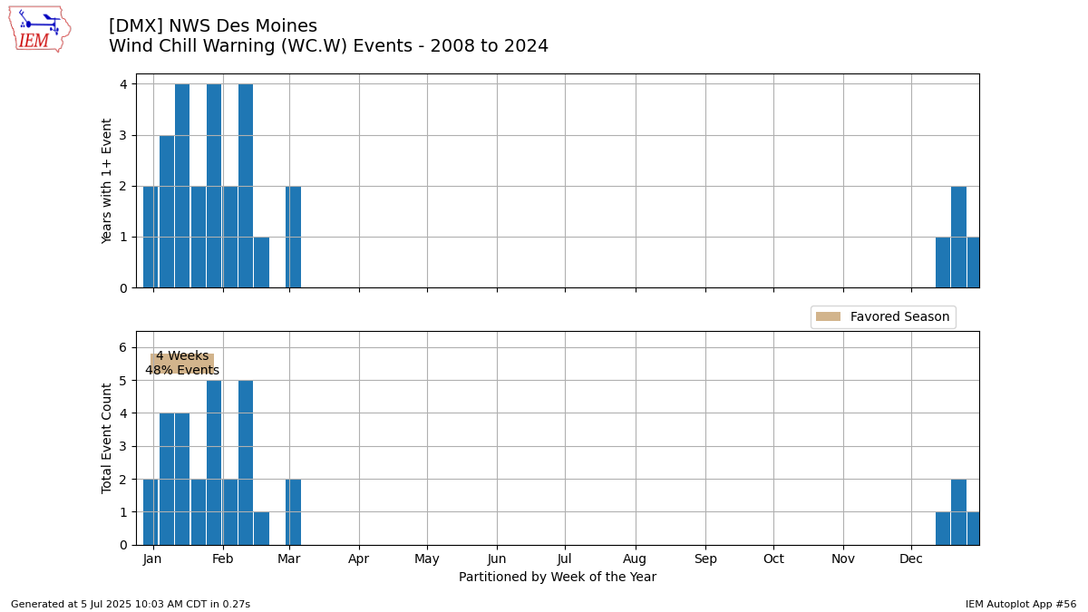
This chart shows the time partitioned frequency of having at least one watch/warning/advisory (WWA) issued by the Weather Forecast Office (top plot) and the overall number of WWA issued events (bottom plot). This plot hopefully answers the question of which day/week/month of the year is most common to get a certain WWA type and which week has seen the most WWAs issued. The plot only considers issuance date. When plotting for a state, an event is defined on a per forecast office basis.Updated 21 Nov 2023: An experimental attempt is now included on the plot to estimate the climatological favored period for the given event type. This algorithm is experimental and attempts to make life choices on if it thinks the climatology is bimodal or not. Feedback welcome!
3 Generated Chart
Based on recent timings, plot generation averages 2 seconds. Please wait while your chart is being generated...
IEM Daily Features using this plot
The IEM Daily Features found on this website often utilize plots found on this application. Here is a listing of features referencing this plot type.
- 06 Jun 2025: Nearing Season Peak
- 12 Oct 2023: Weekly SVR Warnings
- 04 Jan 2022: Wind Advisories by Week
- 06 May 2020: Severe TStorm Warning Season
- 25 Sep 2018: Severe Season Winding Down
- 20 Jan 2017: Dense Fog Advisory Counts
- 19 Jan 2015: Wind Advisories